Scoring genre clarity...

Wayward Valley capsule

Wayward Valley

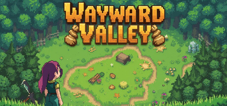
Die in your world, awaken in Wayward Valley. Build a village, craft gear, and battle through the Tower in this turn-based RPG where grinding equals glory. Warning: Serious grinding required. Your second life starts now, Hunter!

$14.992 user reviews
RPGStrategyTurn-Based Strategy
PixelPulse StudioFeb 21, 2026

Wayward Valley scores 68/100 — better than 23% of RPG capsules (n=3,544).

2 user reviews · $14.99 · Released Feb 21, 2026 · By PixelPulse Studio

Quick text summary

Wayward Valley scored 68/100 on Steam Analyzer — Solid for a RPG capsule. Top priority fix: [uniqueness_polish] Add a visual signature element—such as a unique tower silhouette, game mechanic indicator (grinding symbol), or distinctive NPC character—that communicates the core gameplay hook and differentiates from generic village-builder visuals.

Capsule scores by dimension

  • Genre Clarity: 7/10 — Pixel RPG with village builder cues. The pixelated art style, character silhouette on the left, and overhead isometric village layout clearly signal a top-down indie RPG with strategy elements. At tiny size, the character pose and pastoral green setting remain readable, though the specific tower-climbing/grinding mechanic is not visually obvious from the scene alone. The tower icon and scattered structures hint at strategy and building gameplay.
  • Title Readability: 8/10 — Bold yellow text, excellent legibility. The golden-yellow title 'WAYWARD VALLEY' uses thick, blocky letterforms with strong outline definition that maintains full readability from full header down to tiny thumbnail sizes. The title placement in the upper-middle area sits on a relatively clear background with minimal texture interference, and the color choice contrasts well against the green foliage. At tiny size the text remains clear and recognizable without collapse.
  • Contrast & Color: 7/10 — Good separation, warm golden highlights. The golden-yellow title pops strongly against the dark Steam background and the green environment, while the character's purple hair provides a complementary accent. The foreground character silhouette separates cleanly from the lighter midground forest. In grayscale, the value ladder from dark character to bright title to mid-tone grass remains readable, though some texture detail in the foliage becomes harder to parse at tiny sizes.
  • Uniqueness & Polish: 6/10 — Competent pixel art, familiar indie trope. The pixel art is clean and well-rendered with consistent lighting and detail work, but the scene itself—character in a village setting with pastoral landscape—reads as a fairly standard indie RPG visual trope without a distinctive hook or memorable selling point. The color palette and composition follow expected conventions rather than pushing toward a signature look that would stand out in a crowded storefront. Solid execution, but not visually distinct enough to command attention at quick scroll.
  • Brand Consistency: 6/10 — Consistent pixel style, no iconic motif. The pixel art rendering is uniform and coherent throughout the visible elements—character, structures, foliage—suggesting good internal art direction alignment. However, there are no memorable brand identity signals such as a signature character design, unique symbol, or distinctive visual pattern that would allow recognition of Wayward Valley from this capsule alone. The purple-haired protagonist is distinctive but not yet iconic without broader context.
  • Composition: 7/10 — Clear focal hierarchy, well-balanced layout. The character on the left foreground serves as the primary focal point, with the title anchoring the upper region and the village layout providing supportive visual interest in the background. The composition uses good depth layering—character, structures, and distant treeline—that creates a readable visual stack even at small sizes. Safe margins protect key elements, though the title sits slightly center-top which could risk minor cropping on extreme Steam resizes, and the right-side landscape feels slightly empty compared to the busy left half.

What works

  • Title legibility across all sizes. Golden-yellow bold lettering remains perfectly readable from full header to tiny thumbnail without any collapse or legibility loss.
  • Clear primary focal point. The purple-haired character on the left immediately draws the eye and anchors the composition with strong silhouette definition.
  • Coherent pixel art craft. Consistent rendering quality and color consistency across all visual elements signals polish and attention to detail.

What hurts the capsule

  • Generic visual premise. The village-building pastoral scene with a character does not communicate a distinctive unique selling point or memorable hook compared to similar indie RPG capsules.
  • Right-side composition imbalance. The right half of the capsule contains mostly empty green space while the left half clusters all character and structural interest, creating uneven visual weight.
  • No iconic brand identity signal. The character and setting are readable but not distinctive enough to create a recognizable brand motif that would be remembered in future interactions.

Priority fixes

  1. [uniqueness_polish] Add a visual signature element—such as a unique tower silhouette, game mechanic indicator (grinding symbol), or distinctive NPC character—that communicates the core gameplay hook and differentiates from generic village-builder visuals.
  2. [composition] Redistribute visual weight by adding secondary interest or detail to the right-side landscape area, or adjust character/title placement to create stronger left-right balance.
  3. [brand_consistency] Consider introducing a consistent icon, color motif, or symbol (tower of power, grinding wheel, resurrection theme) that could become a recognizable identity marker across future marketing materials.

Store copy priority fixes

  1. [feature_communication] Clarify Early Access scope by adding a line such as 'Estimated current playtime: X hours. All core systems (village, crafting, combat, Tower floors 1-X) are fully playable' to set purchase expectations.
  2. [uniqueness] Add one sentence explicitly comparing or differentiating Wayward Valley from similar games (e.g., 'Unlike pure farming sims, your village directly defends a living Tower dungeon where your hunters must grow stronger' or reference a specific title).
  3. [genre_clarity] In the short description, consider rephrasing 'where grinding equals glory' to reinforce the turn-based tactical element: 'Build a village, craft gear, and battle through the Tower in tactical turn-based combat—where grinding equals glory.'

Related guides

Steam app ID: 3940940 · Tags: RPG, Strategy, Turn-Based Strategy, Strategy RPG, Dungeon Crawler