Scoring genre clarity...

KatanaHime capsule

KatanaHime

A short game about simple command-based Katana Slashes... and saving a cat.

$0.69Positive(45)
2DAnimeFemale Protagonist
Heuristic ForgeOct 7, 2025

KatanaHime scores 72/100 — better than 43% of 2D capsules (n=9,108).

Positive (45 reviews) · $0.69 · Released Oct 7, 2025 · By Heuristic Forge

Quick text summary

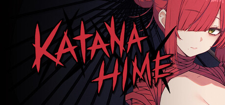
KatanaHime scored 72/100 on Steam Analyzer — Good for a 2D capsule. Top priority fix: [composition] Add subtle cat element or UI command-indicator icon to the composition to reinforce the unique 'save a cat' hook and command-based gameplay without cluttering the focal point.

Capsule scores by dimension

  • Genre Clarity: 7/10 — Anime action with katana focus. The bold red katana-styled title text and sharp character silhouette with sword imagery clearly signal action gameplay, though the anime art style and character design could initially suggest visual novel or casual game rather than command-based action. At TINY size, the red katana letterforms and dynamic character pose still read as action-oriented, though the specific 'command-based' mechanic is not visually apparent.
  • Title Readability: 8/10 — Strong title legibility at all sizes. KATANA HIME uses aggressive red angular letterforms with high contrast against the dark background, positioned in the left-center area with controlled spacing. The title remains clearly readable at SMALL and TINY sizes due to thick stroke weight and saturated color; the design avoids decorative fragility and maintains strong silhouette integrity when scaled down.
  • Contrast & Color: 8/10 — High-impact red against dark base. The vibrant red title and character accent colors create strong value separation against the dark blue-black background, with the character's pink/red tones providing visual continuity. In grayscale mental test, the bright reds maintain clear distinction, and the silhouette of the character with flowing hair reads cleanly even at reduced sizes due to edge definition and lighting separation.
  • Uniqueness & Polish: 7/10 — Stylized anime aesthetic, solid execution. The capsule features polished anime-inspired character art with intentional color grading (warm rose tones, cool shadows) and a distinctive katana typography treatment that feels custom rather than templated. While anime action aesthetics are not uncommon in indie games, the confident execution and cohesive lighting treatment elevate it above generic—though it does not yet feel as universally memorable as DAVE THE DIVER or HADES II in its genre space.
  • Brand Consistency: 6/10 — Coherent internal style, limited identity. The image maintains consistent rendering style with unified color palette (reds, pinks, cool shadows) and clean character portrayal, establishing a recognizable look within this capsule. However, without reference to the 7 store screenshots, there are no immediately iconic symbols, repeating motifs, or signature elements visible that would create strong brand recall—the aesthetic is polished but could apply to several anime-action titles.
  • Composition: 7/10 — Clear focal point, minor edge tension. The character portrait on the right and bold title on the left create a balanced two-point composition with clear hierarchy at FULL size. At SMALL and TINY sizes, the character silhouette remains the dominant focal point with title support, though the character's right edge sits close to the frame boundary and could risk cropping on some Steam layouts; the composition handles scaling reasonably well but has minor margin safety concerns.

What works

  • Bold, readable title treatment. The red katana-styled KATANA HIME letterforms maintain excellent legibility and saturation at all viewport sizes due to thick stroke weight and strategic placement.
  • Strong color-to-background contrast. Vibrant red and pink tones pop distinctly against the dark blue-black background, ensuring the capsule stands out in a crowded Steam store scroll.
  • Cohesive anime art style. The character rendering, lighting, and palette treatment feel intentional and polished rather than asset-assembled or generic.

What hurts the capsule

  • Limited brand identity signals. No immediately iconic character, symbol, or signature motif is visible that would make this capsule uniquely recognizable on repeat exposure.
  • Character edge proximity to frame. The character silhouette sits close to the right boundary, creating minor risk of awkward cropping or edge tension depending on Steam layout variations.
  • Core mechanic not visually communicated. The 'command-based katana slashes' gameplay loop and 'save a cat' hook are not visually apparent from the capsule alone; a viewer would only perceive anime action without the unique selling points.

Priority fixes

  1. [composition] Add subtle cat element or UI command-indicator icon to the composition to reinforce the unique 'save a cat' hook and command-based gameplay without cluttering the focal point.
  2. [brand_consistency] Introduce a recurring visual motif or palette signature (e.g., a specific red-to-pink gradient style, kanji element, or character mark) that will remain recognizable across store assets and future marketing.
  3. [genre_clarity] Incorporate a small visual cue (command prompt, UI frame, or simplified sword-strike effect) that signals the command-based or puzzle-like nature of the gameplay, differentiating it from standard action-game expectations.

Store copy priority fixes

  1. [hook_strength] Elevate the cat rescue hook in the short description to lead with emotion: 'Help a sword-wielding villain save a stray cat with simple, satisfying slashes—in under 20 minutes.' This leads with the unexpected heartwarming angle rather than burying it.
  2. [uniqueness] Add a sentence comparing or contrasting to similar games to clarify what makes KatanaHime distinct: 'Unlike complex combo-fighters, KatanaHime strips action down to rhythm-based timing and physics-driven destruction—pure satisfaction in bite-sized form.'
  3. [audience_targeting] Insert an explicit audience signal after the short description or in the first paragraph: 'Perfect for anime fans, arcade players, and anyone who wants charming action without memorizing combos.' This removes guesswork about who should buy.
  4. [feature_communication] Rename or reframe the '2D Girls' section header to 'Meet the Cast' or 'Charming Characters' to better reflect the warmth of the character introductions that follow.

Related guides

Steam app ID: 3942700 · Tags: 2D, Anime, Female Protagonist, Indie, Short