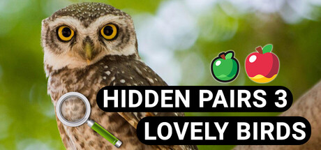
Hidden Pairs 3: Lovely Birds - Hidden Objects scores 70/100 — better than 28% of Casual capsules (n=10,512).
$9.99 · Released Sep 6, 2025 · By BrainVM Games
Hidden Pairs 3: Lovely Birds - Hidden Objects scored 70/100 on Steam Analyzer — Good for a Casual capsule. Top priority fix: [uniqueness_polish] Develop a signature art style or character design that elevates the capsule beyond generic photographic treatment—consider illustrated owl or stylized visual language that aligns with premium casual game benchmarks.
Steam app ID: 3943900 · Tags: Casual, Puzzle, Hidden Object, 2D, Colorful