End Of Line scores 68/100 — better than 23% of Horror capsules (n=3,118).

Quick text summary

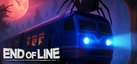
End Of Line scored 68/100 on Steam Analyzer — Solid for a Horror capsule. Top priority fix: [uniqueness_polish] Integrate a distinctive visual element or motif—such as a stylized train detail, thematic symbol, or atmospheric effect unique to End of Line—to elevate the capsule above generic horror imagery.

Capsule scores by dimension

  • Genre Clarity: 7/10 — Horror atmosphere clear, genre less so. The menacing train silhouette, glowing headlights, eerie moon, and dark atmosphere strongly signal horror-puzzle. At TINY size the train and sinister mood remain readable, though the first-person action component is not visually distinct from other horror games. The claustrophobic vehicle setting communicates the core premise effectively.
  • Title Readability: 8/10 — Bold white text, solid contrast. The title 'END OF LINE' uses white sans-serif lettering positioned in the lower left against dark background, providing strong value separation. At SMALL and TINY sizes the text remains legible with clean letterforms and no decorative flourishes that would collapse. The placement avoids the central focal point, keeping it clear of the train silhouette.
  • Contrast & Color: 8/10 — Strong color separation and silhouette. Warm magenta-orange moon and gradient contrasts sharply against cool blue-purple train and sky, creating clear value and hue separation. The bright cyan headlights pop distinctly even at TINY size. Grayscale test shows solid dark silhouette against mid-tone background with bright accent lights maintaining separation.
  • Uniqueness & Polish: 6/10 — Competent horror-thriller aesthetic. The composition uses familiar horror tropes—ominous vehicle, celestial dread, glowing lights—executed cleanly with a cohesive color palette and professional gradient work. However, the overall image reads as a well-made but somewhat generic horror scene rather than a distinctive visual identity unique to End of Line specifically. No memorable character, mechanic hint, or signature visual hook differentiates this from other horror-thriller capsules.
  • Brand Consistency: 5/10 — Generic horror tone, limited identity. The capsule communicates 'horror train game' but offers no recognizable brand cues, iconic character, or signature motif that would make End of Line immediately identifiable in a carousel of similar titles. The palette and mood are consistent internally but do not establish a memorable visual identity that connects to the game's unique claustrophobic puzzle mechanics or narrative hook.
  • Composition: 7/10 — Clear focal point, functional layout. The train dominates the center-right with a natural hierarchical draw from the headlights, while the moon and title support without competing. At SMALL size the composition reads cleanly with the train as primary subject and title anchoring the lower left. The image maintains safe margins and the title does not risk edge cropping; however, the composition lacks depth layering and feels somewhat flat despite the gradient work.

What works

  • Strong title contrast and placement. White sans-serif 'END OF LINE' text provides excellent value separation against the dark background and remains fully legible at TINY size without outline or decorative elements.
  • Cohesive color palette and mood. Warm magenta-orange moon and cool blue-purple train create intentional color contrast that reinforces the eerie horror atmosphere while maintaining visual harmony.
  • Clear primary focal point. The train with glowing cyan headlights immediately draws attention and communicates the core setting, supported effectively by the moon without competing for dominance.

What hurts the capsule

  • Generic horror-game presentation. The composition relies on familiar horror clichés (ominous vehicle, blood-tinted sky, glowing lights) without a distinctive visual element that signals End of Line's unique claustrophobic puzzle identity.
  • No memorable brand identity. The capsule establishes mood but lacks an iconic character, symbol, or signature visual motif that would make the game recognizable on subsequent viewings or in comparison to similar horror titles.
  • Limited depth and layering. The composition is relatively flat despite gradient work, with minimal midground staging that would create visual breathing room and enhance the claustrophobic premise through foreground-to-background separation.

Priority fixes

  1. [uniqueness_polish] Integrate a distinctive visual element or motif—such as a stylized train detail, thematic symbol, or atmospheric effect unique to End of Line—to elevate the capsule above generic horror imagery.
  2. [brand_consistency] Add a recognizable character, creature, or signature visual cue that would allow players to identify End of Line in a carousel of similar horror-game capsules.
  3. [composition] Layer additional foreground or midground elements (e.g., particle effects, interior details, environmental hazards) to add depth and reinforce the claustrophobic trapped-train setting.

Store copy priority fixes

  1. [hook_strength] Replace 'Stay alive in this first-person horror-puzzle game' with a verb-forward hook that hints at the unique threat or mystery, e.g., 'Survive an endless train where each carriage holds a deadlier secret—and you cannot go back.'
  2. [feature_communication] Add 2–3 concrete puzzle or survival examples under GAMEPLAY (e.g., 'use steam vents to mask sound' or 'solve conductor's cipher to access supplies'), so players understand the tactical loop.
  3. [uniqueness] Add a distinct selling point that differentiates End Of Line from Amnesia or SOMA, such as branching monster behaviors, randomized carriage layouts, or a specific story twist hinted at early.

Related guides

Steam app ID: 3960370 · Tags: Horror, Action, Survival Horror, Psychological Horror, Atmospheric