Scoring genre clarity...

Mostly Trash Sometimes Treasure capsule

Mostly Trash Sometimes Treasure

You've volunteered to clean a beach but the shore hides more than trash. Recycle the waste, upgrade your tools and discover the treasures.

$5.999 user reviews
Hidden ObjectExplorationSimulation
Bubbling Cat GamesApr 8, 2026

Mostly Trash Sometimes Treasure scores 70/100 — better than 39% of Hidden Object capsules (n=1,334).

9 user reviews · $5.99 · Released Apr 8, 2026 · By Bubbling Cat Games

Quick text summary

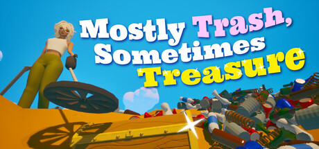
Mostly Trash Sometimes Treasure scored 70/100 on Steam Analyzer — Good for a Hidden Object capsule. Top priority fix: [uniqueness_polish] Enhance the art style with distinctive character personality—consider adding signature visual quirks, stronger silhouette design, or a more unique color palette treatment that stands out in the casual-sim category

Capsule scores by dimension

  • Genre Clarity: 7/10 — Beach cleanup casual adventure clear. The capsule immediately communicates a beach-themed casual game through the sandy shore, colorful recycled objects, and relaxed monkey character holding a tool. At tiny size, the beach setting and collection mechanic remain readable, though the 'treasure discovery' element is less obvious without text. The visual language aligns well with casual simulation and adventure expectations.
  • Title Readability: 8/10 — Bold white text with accent color. The title uses clean white and bright yellow lettering against a clear blue sky background, ensuring strong legibility at all sizes. The word breaks and sizing hierarchy guide the eye naturally through the full title at small and tiny sizes. At tiny size, while individual words compress, the bold sans-serif maintains enough contrast and structure to remain identifiable as readable game title text.
  • Contrast & Color: 8/10 — Bright blue sky strong value separation. The bright cyan-blue sky provides excellent contrast against the Steam dark background #1b2838, creating immediate visual pop during quick scrolls. White and yellow text elements further enhance separation with high value contrast, and the warm golden-yellow beach and objects stand distinct from cool sky tones. Silhouette clarity remains strong across all sizes; even in grayscale, the monkey and tool shapes read clearly against the sky.
  • Uniqueness & Polish: 6/10 — Competent casual theme, limited standout. The capsule executes a clean, friendly casual aesthetic with a cute monkey character and colorful recycled object pile that communicates the core gameplay loop. However, the execution feels somewhat generic within the crowded casual-simulation space—the beach scene, character pose, and UI style are functional but lack a distinctive visual hook or memorable art direction that would separate it from similar titles. The craft is solid but the design doesn't demonstrate a unique selling point visually.
  • Brand Consistency: 6/10 — Friendly casual style, recognizable elements. The warm golden-yellow color palette, friendly rounded character design, and bright playful typography create internal cohesion and a pleasant casual brand identity. The monkey character and beach setting form a memorable pairing, though without access to other store assets in this analysis, the broader brand recognition potential is difficult to assess beyond the capsule alone. The style is internally consistent but not distinctive enough to be instantly recognizable as 'this game' without the title.
  • Composition: 7/10 — Clear focal point with layered depth. The monkey character in the upper left serves as the primary focal point with the beach and object pile creating a natural mid-ground and background layer, establishing clear spatial hierarchy. The colorful recycled object pile on the right balances the composition without overwhelming the character focus, and the beach tool anchors the lower foreground. Title placement across the upper-middle area respects safe margins, though at tiny size the layering becomes compressed and the secondary elements blur together slightly.

What works

  • Vibrant color contrast against dark background. The bright cyan sky and golden beach elements create immediate visual pop and strong value separation that reads clearly even at tiny thumbnail size during quick scrolls.
  • Clear gameplay mechanic communication. The beach setting, colorful recycled objects, and tool-holding character immediately convey the core collect-and-recycle gameplay loop without requiring text.
  • Readable, bold title typography. White and yellow text on the clear sky background maintains excellent legibility across full, small, and tiny viewing sizes with strong contrast and clean letterforms.

What hurts the capsule

  • Generic casual-sim aesthetic. The friendly beach scene, cute character, and colorful objects feel competent but lack distinctive visual polish or memorable identity compared to top-tier casual game capsules.
  • Limited brand identity distinctiveness. While internally cohesive, the visual style lacks iconic character traits, signature motifs, or unique art direction that would make this capsule instantly recognizable as a specific game.
  • Secondary elements compress at tiny size. The pile of colorful recycled objects and layered beach elements lose individual clarity when viewed at thumbnail scale, flattening the composition's depth.

Priority fixes

  1. [uniqueness_polish] Enhance the art style with distinctive character personality—consider adding signature visual quirks, stronger silhouette design, or a more unique color palette treatment that stands out in the casual-sim category
  2. [brand_consistency] Develop a signature visual motif or icon (such as a unique tool design or treasure symbol) that could anchor brand recognition and appear consistently across store assets
  3. [composition] Increase the visual weight and clarity of the monkey character or central focal point so it commands attention even more distinctly at small and tiny sizes without relying on title text

Store copy priority fixes

  1. [uniqueness] Add one sentence explaining a specific or unusual aspect of the game's beach setting, treasure types, or upgrade system (e.g., "Uncover over 50 unique artifacts from different eras" or "Each tool upgrade unlocks new coastal areas to explore").
  2. [feature_communication] Expand the Collectibles feature with one sentence describing what collections offer: do they unlock rewards, story elements, or cosmetics? This would clarify why collecting matters.
  3. [audience_targeting] Add a sentence explicitly positioning the game for completionists or relaxation seekers (e.g., "Perfect for players who love collecting at their own pace without pressure") to strengthen audience resonance.

Related guides

Steam app ID: 3962580 · Tags: Hidden Object, Exploration, Simulation, Collectathon, Cozy