Scoring genre clarity...
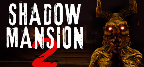
The mansion your grandfather left you is more than an inheritance. When the power comes on, not only the lights awaken, but the darkness buried inside. Shadow Mansion 2 is a first-person psychological horror focused on atmosphere, exploration, and stealth.
HK$ 46.00Positive(12)
HorrorDetectiveThriller
NEBULA NOVA GAMES24 Oct, 2025