Scoring genre clarity...

We Gotta Go capsule

We Gotta Go

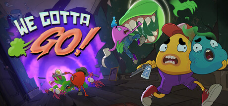
We Gotta Go is a co-op horror comedy that’ll scare the crap out of you—literally. Team up to reach the only bathroom in a haunted mansion before your bowels betray you. Scavenge for items, fend off ghosts, and fight through cursed halls together in a desperate hunt for sweet relief.

$5.99Mixed(20)
Online Co-OpComedyIndie
FuzzyBotApr 14, 2026

We Gotta Go scores 75/100 — better than 68% of Steam capsules we've analysed (n=22,658).

Mixed (20 reviews) · $5.99 · Released Apr 14, 2026 · By FuzzyBot

Quick text summary

We Gotta Go scored 75/100 on Steam Analyzer — Good for a Steam capsule. Top priority fix: [title_readability] Increase the size and weight of 'We Gotta' relative to 'GO!' so the full title reads as a unit at tiny size rather than losing the first two words.

Capsule scores by dimension

  • Genre Clarity: 8/10 — Co-op comedy horror chase clear. The two cartoon characters running in panic with a monstrous green ghost chasing them immediately communicates a co-op comedy horror tone. The plunger prop and scared expressions reinforce the absurd, humorous survival premise. At tiny size the chase dynamic and cartoony style still read as a comedic action or party game, though the horror-comedy subgenre nuance is harder to parse.
  • Title Readability: 8/10 — Bold title reads well small. The title 'We Gotta Go!' uses a chunky, heavily outlined white and yellow font with strong drop shadow that contrasts well against the mid-dark background. At full size it is very legible with clear letterforms and the exclamation mark adds energy. At tiny size the words compress significantly but the bold weight and outline keep it readable, though 'We Gotta' becomes harder to parse than the large 'GO!'.
  • Contrast & Color: 7/10 — Warm characters pop on dark bg. The yellow and cyan characters stand out well against the dark brownish-grey haunted mansion background, providing solid warm-cool contrast. The glowing green ghost element adds a secondary accent that pops against the dark environment. In grayscale the characters still separate from the background reasonably well, though the mid-tone grey walls slightly reduce silhouette crispness at tiny size.
  • Uniqueness & Polish: 7/10 — Charming cartoon style with personality. The cartoony blob characters with sweat drops and panic expressions have genuine personality and the plunger as a weapon is a clever visual nod to the bathroom humor premise. The art style is polished and cohesive, resembling quality indie animation work. Compared to genre benchmarks like Content Warning or Lethal Company, this capsule carries a stronger visual identity through its distinctive character design, though the background environment feels somewhat generic.
  • Brand Consistency: 8/10 — Cohesive cartoon identity throughout. The two signature blob characters, warm-saturated cartoon palette, and comedy-horror tone create a recognizable internal identity. The rendering style is consistent across both characters and the ghost, with matching line weights and shading approaches. The capsule establishes a clear visual brand that would likely carry through to screenshots, with the character designs serving as memorable mascots.
  • Composition: 7/10 — Clear left-right chase hierarchy. The composition uses a natural left-to-right chase dynamic with the ghost pursuing the two fleeing characters, creating clear directional energy and storytelling. The title sits in the upper-left with the characters anchoring the center-right, leaving decent breathing room. At small size the two-character grouping and ghost create a legible three-element read, though the title and character area compete slightly for the upper zone and the bottom edge feels slightly tight with the characters' feet.

What works

  • Expressive character design. The panicked blob characters with sweat drops and wide eyes immediately convey comedic distress and co-op buddy energy at a glance.
  • Strong title weight and outline. The chunky outlined font for 'GO!' in particular remains readable even at tiny thumbnail size due to its high contrast and bold stroke.
  • Humor premise communicated visually. The plunger prop subtly hints at the bathroom comedy mechanic without requiring any text, rewarding attentive viewers.
  • Warm-cool color contrast. Yellow and cyan characters against a dark background with green ghost lighting creates natural separation that holds up in dark Steam UI context.

What hurts the capsule

  • Background feels generic. The dark grey haunted hallway lacks distinctive architectural detail or lighting drama that would elevate the setting beyond a stock spooky corridor.
  • Title hierarchy slightly uneven. The size difference between 'We Gotta' and 'GO!' is dramatic, causing 'We Gotta' to nearly disappear at tiny size while 'GO!' dominates, losing the full title readability.
  • Character silhouettes soft at tiny size. The blob characters lose some definition at 120x45 due to their rounded forms and similar mid-tone values in the lower body area, reducing crisp read.
  • Ghost element slightly cluttered. Multiple smaller mouth shapes around the main ghost add visual noise that competes with the cleaner character designs at small viewing sizes.

Priority fixes

  1. [title_readability] Increase the size and weight of 'We Gotta' relative to 'GO!' so the full title reads as a unit at tiny size rather than losing the first two words.
  2. [contrast_color] Add a stronger rim light or glow around the two main characters to sharpen their silhouette separation from the dark background corridor at small sizes.
  3. [uniqueness_polish] Introduce a distinctive background element such as a glowing bathroom door sign or exaggerated mansion detail that reinforces the unique bathroom-hunt premise.
  4. [composition] Tighten the vertical crop slightly to raise the characters away from the bottom edge and reduce the risk of feet being clipped in Steam thumbnail crops.

Store copy priority fixes

  1. [feature_communication] Add a structured summary of the core loop: 'Manage your bowel meter by choosing food carefully and using farts to relieve pressure. Navigate the mansion, solve puzzles, fight ghosts with weapons and throwable items, and reach the bathroom before your meter maxes out.'
  2. [feature_communication] Clarify the bowel failure state and consequences: does the meter filling result in game over, a score penalty, a funny animation, or respawn? This directly impacts how players understand the core tension.
  3. [audience_targeting] Add a single sentence clarifying who this is for: 'Perfect for friends seeking irreverent co-op chaos and dark comedy' or 'Best played with a group that laughs at crude humor,' to segment from horror-purist audiences.

Related guides

Steam app ID: 3967470