Scoring genre clarity...

Banish 9 to 5 capsule

Banish 9 to 5

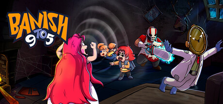
A 2D PvP asymmetric multiplayer party game of mischief, pranks, and unexpected turnarounds. Four Spirits cause chaos while a lone Banisher banishes them down. Getting banished doesn’t mean it’s over — you turn into a Banisher and chase your old teammates.

CasualIndieMultiplayer
Elwyn InteractiveComing soon

Banish 9 to 5 scores 63/100 — better than 6% of Steam capsules we've analysed (n=22,658).

Released Coming soon · By Elwyn Interactive

Quick text summary

Banish 9 to 5 scored 63/100 on Steam Analyzer — Solid for a Steam capsule. Top priority fix: [composition] Reduce the right-side character cluster to one or two dominant figures so there is a clear primary focal point that reads at tiny size

Capsule scores by dimension

  • Genre Clarity: 7/10 — Asymmetric party chaos clear. The scene of multiple cartoon characters in conflict with horror-themed antagonists (clown with chainsaw, ghostly figure) clearly signals a multiplayer party game with chaotic action. The asymmetric setup is implied by one large hooded figure facing a group of smaller characters. At tiny size the genre reads as casual action or party game but the asymmetric nuance is lost.
  • Title Readability: 7/10 — Bold logo readable at small. The BANISH 9TO5 logo uses bold yellow-orange lettering with a dark outline positioned in the top left, which gives it reasonable contrast against the swirling dark background. At full size it reads clearly, and at small size it remains identifiable due to the thick stroke and warm color. At tiny size the '9to5' numeral sub-element becomes difficult to parse but BANISH still registers.
  • Contrast & Color: 6/10 — Warm pops but midtones muddy. The warm orange and red tones of the characters contrast reasonably against the dark swirling tunnel background. However, the mid-range characters (the clown and space-suit figure on the right) partially blend into the dark browns and grays of the environment at small sizes. In a mental grayscale test the left hooded figure silhouette separates well but the right side cluster becomes a muddy mass.
  • Uniqueness & Polish: 6/10 — Charming but genre-generic feel. The cartoon art style is appealing and the horror-meets-office concept is quirky, but the capsule doesn't strongly communicate the unique 9-to-5 office spirit theme that makes this game distinctive. Compared to benchmarks like Lethal Company or Content Warning which nail their hook instantly, this reads as a generic cartoon party brawler. The craft is competent but nothing in the composition serves as a visual hook for the core mechanic.
  • Brand Consistency: 6/10 — Cohesive cartoon style internally. The character designs share a consistent cartoon rendering style with bold outlines and expressive poses, and the swirling dark vortex background ties the scene together visually. However, the identity cues are not strongly memorable — the logo style and character palette are pleasant but not immediately iconic or recognizable as a unique brand signature. There is no singular motif or symbol that would anchor brand recall.
  • Composition: 6/10 — Active scene but crowded right side. The large hooded figure on the left acts as a reasonable anchor and creates some depth, with action cascading toward the right side. However, the right side cluster of three characters is cramped and competes for attention equally, creating a scattered focal point. The title sits safely in the top left but the action scene lacks a clear primary subject that dominates at small or tiny sizes, causing the image to read as a busy crowd rather than a hero moment.

What works

  • Bold logo placement. The yellow-orange BANISH logo with dark outline in the top left reads clearly against the dark swirling background at small size.
  • Clear party conflict energy. The opposing group dynamic immediately communicates multiplayer confrontation and chaotic fun without needing text.
  • Consistent cartoon art style. All characters share bold outlines and expressive poses that give the image a coherent and polished visual identity.
  • Dark vortex background separates scene. The swirling tunnel creates depth and ensures the brightly colored characters have a contrasting backdrop to pop against.

What hurts the capsule

  • Right side character cluster is muddy. The clown and space-suit figure on the right blend partially into the dark background at small sizes, losing silhouette clarity.
  • No clear single hero focal point. At tiny size the scene reads as a crowd with no dominant subject, making it hard to anchor attention in under one second.
  • Core concept hook is missing. The office-spirit theme and asymmetric banishing mechanic are not visually communicated, making it look like a generic cartoon brawler.
  • Subtext numerals collapse at tiny size. The '9to5' portion of the logo becomes unreadable at tiny thumbnail size, weakening the brand title recognition.

Priority fixes

  1. [composition] Reduce the right-side character cluster to one or two dominant figures so there is a clear primary focal point that reads at tiny size
  2. [uniqueness_polish] Add a visual cue for the 9-to-5 office concept such as a briefcase, office prop, or environmental detail to distinguish the unique game hook
  3. [contrast_color] Brighten rim lighting or add a stronger glow to the right-side characters to separate them from the dark background in grayscale
  4. [title_readability] Increase the size of the full BANISH 9TO5 logo slightly and ensure the numeral element has stronger outline weight to survive tiny thumbnail rendering

Store copy priority fixes

  1. [feature_communication] Add one sentence explaining how each team wins: 'Spirits win by surviving until time runs out; Banishers win by eliminating all Spirits. Defeated Spirits respawn as new Banishers, shifting the odds each round.'
  2. [hook_strength] Remove the duplicate opening paragraph from the detailed description and replace it with a 2-3 sentence summary of what a typical match looks like from start to finish.
  3. [feature_communication] Expand 'Character Identity' with one concrete example: 'Each character has unique abilities—for example, [Character X] can [specific action] while [Character Y] specializes in [different action], forcing teams to adapt their strategy.'
  4. [audience_targeting] Add one sentence explicitly framing match duration and player count for new audiences: 'Perfect for 4-5 players in 10-15 minute rounds during game nights or casual streaming sessions.'

Related guides

Steam app ID: 3987970