Scoring genre clarity...

The Melty Way capsule

The Melty Way

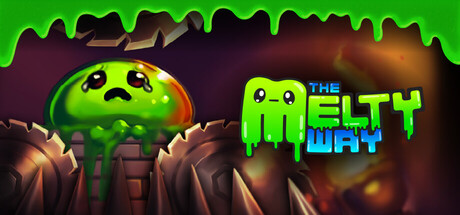
You move, you melt. You are a liquid-simulated slime where every move costs you a piece of yourself. Spend your mass to slide, shrink, and dash through pixel-perfect hazards in this challenging precision platformer where size management is critical and your only resource is your own body.

$7.99Positive(10)
PlatformerActionPrecision Platformer
G DoubléMay 15, 2026

The Melty Way scores 70/100 — better than 30% of Steam capsules we've analysed (n=22,658).

Positive (10 reviews) · $7.99 · Released May 15, 2026 · By G Doublé

Quick text summary

The Melty Way scored 70/100 on Steam Analyzer — Good for a Steam capsule. Top priority fix: [title_readability] Increase the size and weight of THE in the logo so all three words read as a unified lockup at small and tiny sizes, or integrate it into the main wordmark more boldly.

Capsule scores by dimension

  • Genre Clarity: 7/10 — Slime platformer reads clearly. The cute green slime character sitting on rocky terrain with dripping slime ceiling immediately signals a platformer with a gooey mechanic. The melting/dripping visual language connects well to the core gameplay concept of losing mass. At tiny size the slime blob character and rock platform setting still hint at platformer genre, though the precision/challenge aspect is not communicated.
  • Title Readability: 7/10 — Title reads at full, fades tiny. The chunky pixel-style font for THE MELTY WAY with the green slime drip styling on the logo is charming and readable at full header size. At small capsule size the logo still holds up reasonably well due to the bold letterforms. At tiny thumbnail size the text becomes difficult to parse, especially THE which is much smaller and lighter above the main title words.
  • Contrast & Color: 7/10 — Bright green pops on dark cave. The vivid lime green of the slime character and dripping ceiling creates strong contrast against the dark brown and black rocky cave background, which also sits well against Steam's dark #1b2838 UI. In grayscale the slime character still separates cleanly from the background due to its lighter value. The mid-range warm browns of the rocky terrain risk blending slightly with Steam's dark surround at tiny sizes.
  • Uniqueness & Polish: 6/10 — Charming but genre-familiar look. The art style is clean and appealing with a consistent cartoon slime aesthetic that fits the game concept well. However compared to top-performing indie capsules like ANIMAL WELL or Balatro which have a striking and immediately distinctive visual hook, this feels competent but somewhat familiar in the cute indie platformer space. The dripping slime motif framing the image is a nice touch that adds coherence.
  • Brand Consistency: 8/10 — Cohesive slime identity throughout. The lime green slime color, dripping motif on both the ceiling and logo, and the sad-cute slime character face create a recognizable and internally consistent identity. The logo design echoes the character design with the same drip styling, which is a strong cohesion signal. The dark cave setting and green accent palette feel like a signature combination that could be recognized across marketing materials.
  • Composition: 7/10 — Clear focal point, balanced layout. The main slime character sits slightly left of center in the foreground on a rocky platform, with the logo occupying the right side creating a functional two-element split. The dripping slime ceiling acts as a natural top frame. At small size the slime character remains the clear primary focal point with the logo still competing without overwhelming. The composition is safe and functional with no major cropping risks, though the layout is fairly conventional for the genre.

What works

  • Strong color identity. Vivid lime green slime creates immediate recognition and high contrast against the dark cave background and Steam's dark UI.
  • Logo and character visual unity. The drip styling on the logo directly mirrors the slime character design, creating cohesive brand identity signals.
  • Concept communicated through visuals. The melting sad slime on rocky terrain instantly communicates the core mechanic premise without needing to read the description.
  • Natural framing device. The dripping slime ceiling acts as an effective top border that frames the scene and reinforces the game's theme.

What hurts the capsule

  • THE is too small in logo. The word THE sits significantly smaller above MELTY WAY and becomes unreadable at tiny thumbnail size, weakening logo hierarchy.
  • Genre ambiguity at tiny size. The precision platformer challenge aspect is not communicated visually and could be mistaken for a casual cute game at tiny size.
  • Mid-tone cave background bleeds into Steam surround. The warm brown rocky terrain has limited value contrast against Steam's dark sidebar and can cause the edges of the capsule to feel undefined.
  • Composition is conventional. The character left, logo right split is a very common capsule layout formula that does not distinguish itself from the wider indie platformer category.

Priority fixes

  1. [title_readability] Increase the size and weight of THE in the logo so all three words read as a unified lockup at small and tiny sizes, or integrate it into the main wordmark more boldly.
  2. [genre_clarity] Add a subtle visual cue to the background or character that signals challenge or precision, such as visible spikes, hazards, or a tension-implying pose, to differentiate from casual cute games.
  3. [contrast_color] Darken or add a subtle vignette to the outer edges of the cave background so the capsule has a clearly defined border against Steam's dark UI at all sizes.
  4. [uniqueness_polish] Consider a more dynamic character pose or expression that communicates the stress of mass loss to add emotional storytelling and differentiate from generic cute slime games.

Store copy priority fixes

  1. [feature_communication] Specify what types of new mechanics are introduced in each biome (e.g., 'ice physics,' 'pressure systems,' 'momentum conservation') rather than leaving it vague as 'new mechanics.'
  2. [tone_match] Replace 'using your big beautiful brain to stay alive' with more straightforward language like 'only careful observation and strategic planning will keep you alive' to maintain consistency with the mechanical tone.
  3. [uniqueness] Add one sentence explicitly comparing or contrasting this game's mass system to standard platformers to strengthen the differentiation claim.

Related guides

Steam app ID: 3990570