Scoring genre clarity...

Monster Train 2: Destiny of the Railforged capsule

Monster Train 2: Destiny of the Railforged

Lead the new Railforged clan in your battle against the Titans!

$7.99Very Positive(312)
Roguelike DeckbuilderStrategyCard Game
Shiny ShoeFeb 2, 2026

Monster Train 2: Destiny of the Railforged scores 73/100 — better than 56% of Steam capsules we've analysed (n=22,658).

Very Positive (312 reviews) · $7.99 · Released Feb 2, 2026 · By Shiny Shoe

Quick text summary

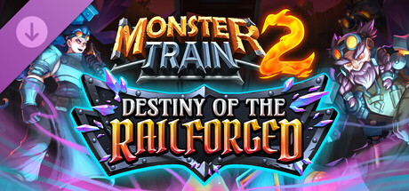
Monster Train 2: Destiny of the Railforged scored 73/100 on Steam Analyzer — Good for a Steam capsule. Top priority fix: [title_readability] Either enlarge the subtitle text significantly or remove it entirely from the capsule to reduce clutter at tiny size, keeping only Monster Train 2 as the legible identity anchor.

Capsule scores by dimension

  • Genre Clarity: 7/10 — Deck-builder roguelike implied well. The two stylized character figures flanking a central logo with combat poses and glowing energy effects suggest a hero-based strategy or card battler genre. The 'clan' framing and fantasy-mechanical aesthetic (gears, crystals, armored characters) aligns well with deck-building roguelikes like the original Monster Train. At tiny size the characters become silhouette blobs but the energy and combat framing still implies action-strategy rather than pure puzzle or simulation.
  • Title Readability: 8/10 — Logo reads clearly at most sizes. Monster Train 2 uses a bold, outlined logo treatment with strong contrast against the dark background, and the large numeral '2' anchors the brand identity instantly. The subtitle 'Destiny of the Railforged' uses a secondary metallic banner treatment that reads at full size but collapses to near-illegibility at tiny thumbnail size. At small capsule size the main title still parses well, though the subtitle becomes decorative noise rather than readable text.
  • Contrast & Color: 7/10 — Warm orange pops on dark background. The warm orange and gold logo combined with the cyan-magenta character glow effects create strong value separation against the dark gradient background, which plays well against Steam's #1b2838. The left character in lighter tones and right character in darker tones create reasonable silhouette variety, though at tiny size both characters risk merging into the busy midground. In grayscale the central logo still reads clearly due to strong luminance contrast, but character edges are softer.
  • Uniqueness & Polish: 7/10 — Polished sequel branding, familiar formula. The capsule demonstrates professional craft with clean composite character art, intentional glow layering, and a recognizable sequel logo structure. However, the two-characters-flanking-a-logo composition is a very common DLC and sequel capsule template, reducing distinctiveness. The Railforged mechanical aesthetic with crystal and gear motifs adds genre-specific personality but does not deliver a surprising or singular visual hook that would stand out in a crowded genre scroll.
  • Brand Consistency: 8/10 — Strong Monster Train visual identity maintained. The capsule clearly extends the Monster Train visual language with the recognizable logo treatment, dark fantasy-mechanical aesthetic, and bold character illustration style. The orange-fire palette from the original series is preserved in the logo, while the new Railforged clan introduces steel-blue and purple crystal accents that feel like a deliberate extension rather than a departure. The consistent rendering style between both character figures and the logo treatment reinforces a cohesive brand identity.
  • Composition: 7/10 — Symmetrical flanking with clear center logo. The composition places the Monster Train 2 logo centrally with characters anchoring the left and right edges, creating a readable symmetrical hierarchy. The central logo acts as the clear focal point and the characters serve as framing elements without fully competing for attention. At small and tiny sizes the characters get cropped or compressed at the horizontal edges, and the subtitle banner becomes a muddy middle band, though the logo retains its dominant read across sizes.

What works

  • Strong central logo contrast. The bold orange and gold Monster Train 2 logo maintains clear legibility against the dark background even at small capsule size.
  • Recognizable sequel brand extension. Returning visual language from the original Monster Train immediately signals franchise continuity to existing fans.
  • Dynamic character energy effects. The cyan and magenta glow effects around both characters add visual energy and reinforce a magical combat theme at full size.
  • Clear genre silhouette framing. Combat-posed hero characters flanking a fantasy-mechanical logo effectively communicates a hero-driven strategy game without ambiguity.

What hurts the capsule

  • Subtitle collapses at tiny size. The 'Destiny of the Railforged' banner text becomes entirely unreadable at 120x45 thumbnail size, adding visual clutter rather than information.
  • Generic two-character flanking layout. The symmetrical hero-logo-hero composition is a heavily used template in DLC and sequel capsules, reducing memorability in a scroll.
  • Character edges soften at small size. Both character silhouettes lose definition at small and tiny sizes, blending into the busy mid-tone background.
  • Busy background competes with subjects. The glowing floor effects and radiant background energy add noise that reduces clean separation between characters and environment at reduced sizes.

Priority fixes

  1. [title_readability] Either enlarge the subtitle text significantly or remove it entirely from the capsule to reduce clutter at tiny size, keeping only Monster Train 2 as the legible identity anchor.
  2. [contrast_color] Add a stronger dark vignette or controlled dark zone behind both character figures to improve silhouette separation in grayscale and at small sizes.
  3. [composition] Tighten the character positioning inward slightly so their key features are not cropped by Steam's horizontal edge crop at smaller display sizes.
  4. [uniqueness_polish] Introduce a single distinctive Railforged visual motif such as a prominent gear-crystal symbol into the central composition to create a more memorable and non-generic identity hook.

Store copy priority fixes

  1. [hook_strength] Rewrite the short description to lead with the core differentiator: 'Forge powerful units and equip collected Souls to build an unstoppable army—lead the Railforged clan with two unique blacksmith champions.'
  2. [feature_communication] Add a concrete example of Forge gameplay: 'Spend resources to Forge train stewards, turrets, and machines in real time during combat, adapting your army to each enemy.'
  3. [uniqueness] Clarify the Soul system's strategic role: 'Equip Souls to your cards as permanent upgrades that persist and grow stronger across a run, creating synergies with your deck composition.'
  4. [audience_targeting] Add a line addressing expansion scope: 'Designed for Monster Train 2 veterans seeking fresh deck-building paths, though new players can experience Railforged content from their first run.'

Related guides

Steam app ID: 3993450