Scoring genre clarity...
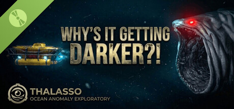
Why's It Getting DARKER?! Demo capsule

Why's It Getting DARKER?! Demo

The light is your only lifeline. Descend into a crushing, thalassophobic abyss where every photograph could be your last. Investigate unpredictable deep-sea horrors and explore the vast, dark unknown - all while being 'assisted' by a darkly sarcastic AI.

Free to Play1 user reviews
Psychological HorrorHorrorSurvival Horror
Kenan'sGamesSep 7, 2025

Why's It Getting DARKER?! Demo scores 77/100 — better than 87% of Psychological Horror capsules (n=2,245).

1 user reviews · Free to Play · Released Sep 7, 2025 · By Kenan'sGames

Quick text summary

Why's It Getting DARKER?! Demo scored 77/100 on Steam Analyzer — Good for a Psychological Horror capsule. Top priority fix: [title_readability] Enlarge or simplify the THALASSO logo to ensure legibility at tiny thumbnail size, or reduce its visual weight to avoid competing with the main title.

Capsule scores by dimension

  • Genre Clarity: 8/10 — Strong horror-adventure atmosphere. The deep-sea creature with glowing red eyes, dark mechanical design, and abyssal background immediately signal thalassophobic horror-adventure. The descending perspective and bioluminescent elements reinforce underwater exploration gameplay. At tiny size, the creature silhouette and color palette remain readable enough to communicate 'dangerous deep-sea' genre.
  • Title Readability: 7/10 — Bold headline, minor tiny-size loss. The large gold 'WHY'S IT GETTING DARKER?!' text is strategically placed on a dark background with solid contrast and reads well at small size. At tiny size, letter clarity degrades slightly but the dramatic caps lock phrase remains recognizable due to its size and weight. The secondary 'THALASSO' logo at bottom-left is legible at small size but becomes difficult to parse at tiny size.
  • Contrast & Color: 8/10 — Excellent value separation and pop. The gold title text punches strongly against the dark navy-black background, and the creature's red eyes and pale skin create a clear luminous focal point. The warm gold-to-cool cyan gradient in the ship element adds layered depth. Even in grayscale simulation, the creature and text maintain clear silhouette separation from the starfield background.
  • Uniqueness & Polish: 8/10 — Premium craft, distinctive voice. The design feels polished with intentional typography hierarchy, consistent 3D rendering of the creature and ship, and a cohesive dark sci-fi aesthetic that matches the sarcastic AI theme. The creature design is unsettling and memorable rather than generic—it stands apart from typical deep-sea game visuals. The hand-crafted feel of the composition and color grading elevate it above template-based capsules.
  • Brand Consistency: 7/10 — Coherent identity, recognizable hook. The dark, sardonic tone and 'THALASSO' branding establish a consistent visual identity aligned with the sarcastic AI premise. The creature design and bioluminescent color scheme (red eyes, blue-cyan accents) create memorable signature elements. However, without reference to store screenshots, the uniqueness of this palette relative to the brand's broader identity cannot be fully validated, though internal cohesion is strong.
  • Composition: 8/10 — Strong focal point, excellent depth. The creature occupies the right third as the primary focal point, the title anchors the center-left, and the ship element adds a secondary narrative layer on the left. The layering of starfield background, mid-ground creature, and foreground title creates clear depth. Safe margins are respected; the logo placement in the corner is secure, and nothing critical sits dangerously close to crop edges.

What works

  • Creature design is distinctive and unsettling. The pale, organic deep-sea creature with glowing red eyes is visually striking and memorable, immediately communicating the thalassophobic horror premise without feeling generic.
  • Gold title contrasts powerfully against dark background. The large, bold 'WHY'S IT GETTING DARKER?!' text in warm gold maintains excellent readability and visual dominance across all viewing sizes due to strong value separation.
  • Layered composition with clear depth hierarchy. The arrangement of starfield, ship element, creature, and text creates effective spatial layering that guides the eye while maintaining a cohesive focal point at the creature.
  • Cohesive color palette reinforces tone. The combination of navy-black, gold, cyan, and the creature's bioluminescence work together to establish a premium, atmospheric sci-fi aesthetic aligned with the game's dark tone.

What hurts the capsule

  • Secondary logo loses clarity at tiny size. The 'THALASSO' branding with icon at bottom-left becomes difficult to parse at thumbnail size due to fine detail and small text weight.
  • Creature positioning may risk edge crop. The creature's head extends into the upper-right corner area where Steam may apply cropping on some display contexts, potentially cutting key visual elements.
  • Limited secondary visual hierarchy. While the creature and title are clear, supporting elements like the ship and logo don't establish a strong secondary reading order at small sizes, creating a two-element design rather than layered storytelling.

Priority fixes

  1. [title_readability] Enlarge or simplify the THALASSO logo to ensure legibility at tiny thumbnail size, or reduce its visual weight to avoid competing with the main title.
  2. [composition] Adjust the creature's positioning slightly inward from the top-right corner to ensure critical elements remain safe from Steam's capsule cropping behavior.
  3. [contrast_color] Consider adding a subtle vignette or glow halo around the creature to further separate it from the background and increase pop at small sizes.

Store copy priority fixes

  1. [hook_strength] Move the co-op note to the bottom of the page or remove entirely—it dilutes the single-player survival pitch and should not precede the core description.
  2. [feature_communication] Add a brief narrative setup paragraph explaining why the protagonist is in the abyss (contract, accident, expedition) to ground the survival mechanics in motivation.
  3. [uniqueness] Expand the lethal camera mechanic with one concrete example of a scenario where documentation vs. awareness creates a meaningful dilemma.
  4. [feature_communication] Relocate or condense the asset attribution section to below the fold or a credits tab to preserve the immersive horror atmosphere in the main copy.

Related guides

Steam app ID: 3995200 · Tags: Psychological Horror, Horror, Survival Horror, Underwater, Atmospheric