Taskbarn scores 78/100 — better than 82% of Casual capsules (n=10,153).

Quick text summary

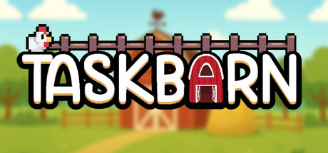
Taskbarn scored 78/100 on Steam Analyzer — Good for a Casual capsule. Top priority fix: [uniqueness_polish] Highlight the taskbar mechanic visually—consider showing a partial taskbar edge or window frame element to reinforce the core selling point and visual distinction.

Capsule scores by dimension

  • Genre Clarity: 8/10 — Clear cozy farming idle game. The pixel-art barn, colorful animals, and pastoral sky background immediately signal a casual farming or animal-raising game. At tiny size, the barn silhouette and cartoon animals remain recognizable, clearly positioning this as a wholesome, low-stakes simulation. The cheerful color palette and cute aesthetic align perfectly with cozy idle game expectations.
  • Title Readability: 9/10 — Excellent legibility across all sizes. TASKBARN uses bold, chunky sans-serif lettering with clean white fill and black outline that maintains perfect clarity from full to tiny size. The title is positioned prominently above the barn scene on a stable background, avoiding texture clutter. Even at 120x45 thumbnail size, every letterform remains distinct and the word is instantly readable.
  • Contrast & Color: 8/10 — Strong pop with vibrant palette. The image uses bright sky blue, warm grass green, and red barn accents that create excellent value separation against the dark Steam background (#1b2838). The white title text with black outline pops sharply in grayscale testing, and the barn's warm reddish-brown silhouette contrasts cleanly against the lighter sky. Minor loss of points because some mid-tone details (animal colors, fence texture) compress slightly at tiny size, but core elements remain visible.
  • Uniqueness & Polish: 7/10 — Solid craft with clear premise hook. The pixel-art style is executed cleanly with consistent line weight and color blocking, and the core concept of a taskbar-resident barn is genuinely distinctive and memorable. The composition tells a clear story—animals on a fence within a barn—that differentiates it from generic farming games. However, the visual execution, while competent, doesn't reach premium polish seen in top indie titles; it reads as well-made indie work rather than standout artistry.
  • Brand Consistency: 7/10 — Cohesive pixel aesthetic identity. The retro pixel-art style is consistent throughout the capsule, with uniform sprite proportions, color palette, and line rendering that establishes a recognizable visual identity. The barn-and-animals motif is iconic for the brand concept and would be memorable across marketing materials. The style aligns with the game's cozy indie positioning, though it does not introduce a signature character or unique symbol beyond the barn itself that screams instant recognition.
  • Composition: 8/10 — Well-balanced with strong focal hierarchy. The barn is the clear primary subject, centered and prominent, with the title anchored confidently above without edge-hugging risk. Animals are distributed across the foreground to add visual interest without competing for attention, and the grassy midground and sky background create clear depth layering. At small and tiny sizes, the composition remains readable with no element becoming lost, and the placement of the barn allows safe margins on all sides for Steam cropping.

What works

  • Title legibility at all sizes. Bold, high-contrast TASKBARN text with white fill and black outline reads perfectly even at 120x45 pixels, ensuring instant recognition during quick scrolls.
  • Clear genre and gameplay hook. Pixel-art barn with cute animals immediately communicates cozy idle farming game, and the taskbar premise is visually supported by the barn-on-screen composition.
  • Strong value contrast. Bright pastoral sky, grass, and barn red create excellent separation against the dark Steam background both in full color and grayscale.
  • Consistent retro-indie aesthetic. Uniform pixel-art rendering style and warm color palette establish a cohesive, recognizable visual identity aligned with cozy game expectations.

What hurts the capsule

  • Generic pixel-art execution. While competent, the art style is a well-worn indie convention that doesn't push craft or visual storytelling beyond functional competence.
  • Limited character or symbol distinctiveness. The barn and generic cartoon animals lack a signature character or memorable mascot that could serve as a strong brand anchor across marketing.
  • Minimal visual storytelling depth. The capsule communicates the game type clearly but doesn't hint at unique mechanics (like the taskbar customization) that differentiate it from dozens of other farm sims.

Priority fixes

  1. [uniqueness_polish] Highlight the taskbar mechanic visually—consider showing a partial taskbar edge or window frame element to reinforce the core selling point and visual distinction.
  2. [brand_consistency] Introduce a signature character or animal mascot with distinct personality traits (color, pose, expression) that could anchor brand recognition across marketing materials.
  3. [composition] Add subtle atmospheric detail (clouds, small foreground elements, or depth cues) to increase visual richness and prevent the scene from reading as flat at small sizes.

Store copy priority fixes

  1. [feature_communication] Expand the Prestige/New Season explanation to clarify what resets and what carries over, and quantify the reward improvement (e.g., 'unlock 25% faster production gains').
  2. [feature_communication] Add one sentence to the Upgrade System bullet explaining progression depth, such as 'Unlock dozens of upgrades across multiple tiers to gradually boost your farm's efficiency.'
  3. [feature_communication] Define 'dibbles' in a parenthetical on first mention: 'earn dibbles—the in-game currency used to grow and improve your animals.'

Related guides

Steam app ID: 4005830 · Tags: Casual, Idler, Simulation, Cozy, Relaxing