Scoring genre clarity...

Tape Over: Night Shift capsule

Tape Over: Night Shift

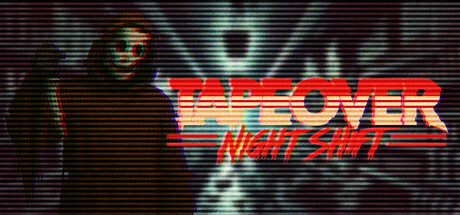
In Tape Over: Night Shift, you play as a clerk working alone in a convenience store at midnight. With a VHS-inspired visual style and an increasingly unsettling atmosphere, survive as your nightly tasks spiral into unspeakable horrors.

Immersive SimLife SimAction-Adventure
Dead Tape StudioComing soon

Tape Over: Night Shift scores 73/100 — better than 56% of Steam capsules we've analysed (n=22,658).

Released Coming soon · By Dead Tape Studio

Quick text summary

Tape Over: Night Shift scored 73/100 on Steam Analyzer — Good for a Steam capsule. Top priority fix: [contrast_color] Add a subtle rim light or edge highlight to the dark hooded figure to separate it from the background and improve silhouette clarity at tiny and grayscale viewing

Capsule scores by dimension

  • Genre Clarity: 7/10 — Horror survival night shift vibe. The masked/hooded dark figure on the left immediately signals horror or thriller, and the VHS scanline texture reinforces a retro horror tone. The subtitle 'Night Shift' hints at a work-setting survival game, which aligns well with the genre. At tiny size the figure silhouette and glitchy aesthetic still read as horror, though the simulation/clerk angle is not communicated visually.
  • Title Readability: 7/10 — Bold retro title reads at small. The main title 'TAPE OVER' uses a large, bold 80s-style gradient font with good size hierarchy and reads clearly at full and small sizes. The subtitle 'NIGHT SHIFT' is smaller and uses a slightly thinner italic style that becomes harder to parse at tiny size. The chromatic aberration glitch effect on the lettering adds character but slightly reduces crispness at the smallest viewing sizes.
  • Contrast & Color: 7/10 — Dark figure pops on dark background. The warm red-orange gradient of the title text contrasts well against the dark teal-green scanline background, creating a strong color separation. The hooded figure on the left is very dark and blends somewhat into the dark background, with only facial highlight detail separating it. In grayscale the title still reads due to value contrast, but the figure loses definition at tiny size against the dark field.
  • Uniqueness & Polish: 8/10 — Distinctive VHS retro horror aesthetic. The combination of VHS scanlines, chromatic aberration, a 1980s action-movie-style title treatment, and a sinister masked figure creates a distinctive and cohesive identity that stands out from generic horror capsules. This aesthetic hook is memorable and feels intentional rather than templated, closely matching the game's actual premise. Compared to genre peers like Buckshot Roulette or Content Warning, it has a stronger aesthetic commitment.
  • Brand Consistency: 8/10 — Cohesive VHS horror identity. The CRT scanline texture, glitch chromatic effects, retro neon typography, and dark atmospheric palette all reinforce a unified VHS-era horror brand. The teal-green scanline background paired with the red-orange title creates a signature palette that should carry across other assets. The dark hooded figure serves as a recurring identity anchor that would be recognizable across thumbnails.
  • Composition: 7/10 — Figure left, title right balance. The composition uses a classic left-subject, right-title split that creates clear visual hierarchy and avoids clutter. The dark figure anchors the left side while the bold title commands the center-right, and the scanline texture fills the background without competing. At small size the layout still reads cleanly, though the figure becomes a dark blob and the subtitle risks being lost; the title placement is safe from Steam crop margins.

What works

  • Strong retro horror aesthetic. The VHS scanline texture and chromatic aberration glitch effects create an immediately recognizable and distinctive visual identity that matches the game's tone perfectly.
  • Bold title contrast against background. The red-orange gradient 'TAPE OVER' lettering pops clearly against the dark teal scanline background and remains readable at small capsule size.
  • Effective subject silhouette. The hooded dark figure on the left establishes an immediate threat and horror tone that communicates the unsettling atmosphere even at reduced sizes.
  • Coherent internal brand cohesion. Every visual element from palette to texture to typography reinforces the same 1980s VHS horror identity without any inconsistent elements breaking the theme.

What hurts the capsule

  • Figure blends into dark background. The hooded figure is very dark against a dark background and loses silhouette definition in grayscale or at tiny size, reducing its impact as a focal point.
  • Subtitle nearly unreadable at tiny size. 'NIGHT SHIFT' in the smaller italic treatment becomes illegible at 120x45 thumbnail size, losing an important context cue about the game's setting.
  • Genre simulation aspect not communicated. The clerk or convenience store simulation element is entirely absent from the visual, which may mislead potential buyers expecting pure horror rather than a horror-sim hybrid.
  • Limited depth layering. The background is relatively flat with scanlines but no real foreground-midground-background depth, making the composition feel slightly two-dimensional at full size.

Priority fixes

  1. [contrast_color] Add a subtle rim light or edge highlight to the dark hooded figure to separate it from the background and improve silhouette clarity at tiny and grayscale viewing
  2. [title_readability] Increase the size and weight of the 'NIGHT SHIFT' subtitle or apply a stronger drop shadow so it remains readable at small and tiny capsule sizes
  3. [genre_clarity] Incorporate a subtle environmental cue such as a convenience store shelf, security monitor, or neon sign element to communicate the simulation setting without disrupting the horror aesthetic
  4. [composition] Add a slight depth effect or atmospheric glow behind the figure to create foreground-background separation and prevent the overall image from reading as flat

Store copy priority fixes

  1. [feature_communication] Add a sentence explaining what 'unexpected events' entail—e.g., 'supernatural encounters,' 'reality distortions,' or 'unknown visitors'—to ground horror expectations.
  2. [uniqueness] Include a sentence articulating what makes Tape Over's psychological horror distinct from other immersive sims or horror games, such as a unique mechanic tied to the VHS theme or narrative structure.
  3. [feature_communication] Add a dedicated line mentioning the 'Multiple Endings' feature to emphasize replayability and increase perceived value.
  4. [genre_clarity] Clarify whether action-adventure elements include combat, stealth, puzzle-solving, or are primarily atmospheric; currently the action tag feels disconnected from the copy's horror-only focus.

Related guides

Steam app ID: 4026260