Scoring genre clarity...
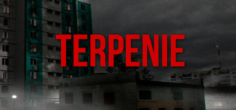
In the gloomy atmosphere of post-Soviet everyday life, routine tasks like cleaning, cooking, and exploring your own room hide something much darker. Survive and uncover the truth before the maniac comes for you.
Free to PlayMostly Positive(41)
HorrorAdventureWalking Simulator
ChugunovkosOct 17, 2025