Scoring genre clarity...
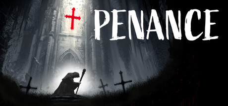
A contemplative narrative horror experience. Purify cursed objects through rhythmic prayers. Your Faith protects you, your Guilt consumes you. 50 objects will unveil the truth hidden behind the abbey's walls. In the darkness of the Middle Ages, will you find redemption or damnation?
$2.99Positive(12)
Psychological HorrorAtmosphericHorror
Scriptorium ArtisApr 30, 2026