Scoring genre clarity...

Loop: Anomaly Lab capsule

Loop: Anomaly Lab

You have arrived at a research facility to rescue your younger sister. You’ve received information that she is on the 10th floor of the facility, but will you be able to reach her?

$1.996 user reviews
HorrorAdventurePsychological Horror
Hun Spark StudioNov 4, 2025

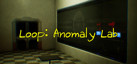
Loop: Anomaly Lab scores 70/100 — better than 36% of Horror capsules (n=3,118).

6 user reviews · $1.99 · Released Nov 4, 2025 · By Hun Spark Studio

Quick text summary

Loop: Anomaly Lab scored 70/100 on Steam Analyzer — Good for a Horror capsule. Top priority fix: [uniqueness_polish] Introduce a distinctive visual hook or character silhouette in the scene that sets Loop: Anomaly Lab apart from generic facility aesthetics and creates memorable brand identity.

Capsule scores by dimension

  • Genre Clarity: 7/10 — Mystery adventure setting clear. The institutional interior with a chalkboard, sterile walls, and eerie atmosphere clearly signals a narrative adventure or mystery game rather than action or combat-focused genre. At tiny size, the industrial setting and confined space remain readable, though the specific gameplay loop is not immediately evident from visuals alone.
  • Title Readability: 8/10 — Yellow italic title stands out. The title 'Loop: Anomaly Lab' uses bright yellow italic text with clean letterspacing that contrasts sharply against the dark institutional background. At tiny size, the title remains legible due to its high saturation and simple sans-serif italic treatment, though the colon and subtitle may blur slightly.
  • Contrast & Color: 8/10 — Strong value separation throughout. The bright yellow title pops decisively against the dark green and black institutional setting, creating clear silhouette hierarchy. The checkerboard floor pattern and warm beige walls provide mid-tone depth that frames the darker chalkboard, maintaining visual separation even at small sizes without muddiness.
  • Uniqueness & Polish: 6/10 — Competent but familiar institutional aesthetic. The design uses a common found-footage or SCP-inspired institutional setting with sterile corridors and eerie atmosphere, which feels somewhat archetypal for indie psychological horror or mystery games. While the execution is clean and the lighting is atmospheric, the core visual concept does not immediately distinguish it from other facility-based indie adventures.
  • Brand Consistency: 6/10 — Cohesive interior but generic identity. The capsule establishes a consistent institutional aesthetic with warm yellows, institutional greens, and dark blacks that work together internally, but lacks a memorable iconic symbol, character, or signature motif that would make the brand recognizable. The rendering style and color palette feel appropriate to the genre but not distinctly branded.
  • Composition: 7/10 — Clear focal hierarchy with good depth. The composition uses layered depth with a foreground checkerboard floor, midground doorway and walls, and background chalkboard, creating visual hierarchy that reads well at small sizes. The title is positioned in the upper-center-right area with clear separation from background noise, though at tiny size some spatial relationships flatten slightly.

What works

  • High-contrast yellow title. The bright saturated yellow italic text creates immediate visual pop against the dark institutional palette and remains legible even at thumbnail sizes.
  • Atmospheric institutional setting. The sterile corridor interior with checkerboard floor, eerie lighting, and mysterious chalkboard effectively communicate a narrative mystery or psychological adventure tone.
  • Layered compositional depth. Multiple spatial planes from floor to background establish clear visual hierarchy and prevent flatness at reduced sizes.

What hurts the capsule

  • Generic facility aesthetic. The institutional interior lacks distinctive visual identity and feels similar to existing SCP-inspired or found-footage indie games, reducing memorability.
  • No iconic brand element. The capsule contains no recognizable character, symbol, or signature motif that could establish brand recognition or differentiation.
  • Subtitle may blur at tiny size. The 'Lab' portion and subtitle spacing risks becoming illegible at the smallest thumbnail dimensions due to fine letterform detail.

Priority fixes

  1. [uniqueness_polish] Introduce a distinctive visual hook or character silhouette in the scene that sets Loop: Anomaly Lab apart from generic facility aesthetics and creates memorable brand identity.
  2. [title_readability] Add a subtle outline or glow to the yellow title text to ensure the subtitle 'Lab' remains readable at thumbnail sizes without loss of clarity.
  3. [brand_consistency] Establish a signature visual motif—such as a recurring symbol on the chalkboard, unique lighting color, or character element—that could be recognized across future materials.

Store copy priority fixes

  1. [feature_communication] Rewrite the Game Progression section to explain what an anomaly is and how it manifests (e.g., 'Anomalies—strange distortions, sounds, or environmental shifts—lurk in each floor') so players understand the detection challenge.
  2. [hook_strength] Replace the procedural opening with an atmospheric hook that establishes tone: open with a sensory or unsettling detail about the facility (e.g., 'The research facility feels wrong. Empty. Watching.') before revealing the rescue objective.
  3. [uniqueness] Add a sentence explaining what is distinctive about this facility, the anomalies, or the detection mechanic that sets it apart from other psychological horror or walking simulator games.
  4. [tone_match] Infuse the detailed description with language that matches the surreal and psychological horror tags—use evocative phrasing instead of instructional steps to create unease and curiosity.

Related guides

Steam app ID: 4035280 · Tags: Horror, Adventure, Psychological Horror, Walking Simulator, Surreal