Scoring genre clarity...
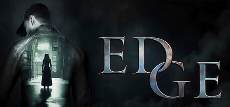
Edge capsule

Edge

Alex is supposed to just meet his girlfriend at a club. An ordinary evening, an ordinary city, an important meeting with people who can change his future. But the road to the club turns into a real nightmare.

$3.99Mixed(12)
Psychological HorrorSimulationThriller
TEStudioOct 27, 2025

Edge scores 73/100 — better than 66% of Psychological Horror capsules (n=2,167).

Mixed (12 reviews) · $3.99 · Released Oct 27, 2025 · By TEStudio

Quick text summary

Edge scored 73/100 on Steam Analyzer — Good for a Psychological Horror capsule. Top priority fix: [uniqueness_polish] Add a distinctive character silhouette trait or iconic object (e.g., recognizable clothing, pose, or held item) that ties directly to the protagonist Alex or the club setting to increase memorability.

Capsule scores by dimension

  • Genre Clarity: 7/10 — Psychological thriller with adventure hints. The capsule communicates mystery and unease through the silhouette of a figure in a lit doorway and dark atmospheric framing, which align with the psychological thriller tone described. At TINY size, the figure and ominous setting remain recognizable, though it could read as generic horror rather than specifically an adventure-simulation hybrid about an ordinary evening gone wrong.
  • Title Readability: 8/10 — Bold metallic title, clear at all sizes. The title 'EDGE' is rendered in large, dimensional metallic lettering with a blue-to-copper gradient that contrasts well against the dark background. Even at TINY size the word remains legible due to its size and value separation, though the decorative metallic effect adds visual weight that maintains readability at small scales.
  • Contrast & Color: 8/10 — Strong dark-light separation, moody palette. The capsule uses a deep teal and black background with a bright white-green light source emanating from the central doorway, creating clear value separation that pops against the Steam dark background. The silhouetted figure maintains strong edge definition in grayscale, and the metallic title adds warm highlight that breaks the cool color dominance effectively.
  • Uniqueness & Polish: 7/10 — Polished cinematic mood, moderately distinctive. The composition and lighting suggest professional art direction with a clear cinematic quality—the lit doorway is an effective visual metaphor for the game's premise. However, the core conceit of a figure approaching a mysterious light is fairly common in indie game marketing, placing it as well-executed but not distinctly memorable compared to genre leaders like DREDGE or Slay the Princess.
  • Brand Consistency: 6/10 — Coherent mood, limited identity anchors. The capsule maintains internal consistency through a unified dark-teal color palette and cinematic lighting style. Without reference to the 10 available store screenshots, there are no obvious iconic character details, motifs, or signature visual elements that create a memorable brand identity—the figure is generic rather than a recognizable protagonist.
  • Composition: 8/10 — Clear focal point, balanced layout, safe margins. The composition uses strong depth layering with the silhouetted figure in the foreground, architectural space in the midground, and the lit doorway as the clear focal point drawing the eye. The title is positioned in the right third without crowding edges, and key elements avoid the unsafe margin areas, maintaining clarity at SMALL and TINY sizes through intentional hierarchy.

What works

  • Strong atmospheric lighting. The green-white light from the doorway creates a clear focal point and value contrast that reads instantly even at thumbnail size.
  • Legible metallic title design. The large, dimensional 'EDGE' lettering remains readable across all viewing sizes due to its scale and gradient against the dark background.
  • Professional cinematic composition. Depth layering and focal point hierarchy guide the eye effectively without clutter or scattered attention.

What hurts the capsule

  • Generic silhouette character. The figure lacks distinctive proportions, clothing, or pose cues that would make this character memorable or tied to the game's unique premise.
  • Limited brand identity signals. Beyond the atmospheric mood, there are no iconic motifs, symbols, or visual signatures that would make this capsule recognizable as 'Edge' specifically.
  • Moody but familiar visual trope. The figure-approaches-light-in-darkness concept is a well-worn indie game visual that doesn't stand out against competitors like DREDGE or The Invincible.

Priority fixes

  1. [uniqueness_polish] Add a distinctive character silhouette trait or iconic object (e.g., recognizable clothing, pose, or held item) that ties directly to the protagonist Alex or the club setting to increase memorability.
  2. [brand_consistency] Establish and apply a signature visual motif or color accent (beyond atmospheric teal) that could anchor the game's identity and appear consistently across other marketing materials.
  3. [genre_clarity] Consider adding a subtle UI element, neon sign, or environmental detail that reinforces the urban nightlife setting and adventure-sim premise rather than pure psychological horror.

Store copy priority fixes

  1. [feature_communication] Rewrite the 'Game features' section in a cohesive, atmospheric voice; replace flippant descriptions with concrete gameplay details (e.g., 'Explore non-Euclidean spaces that shift as you navigate', 'Piece together fragmented memories through environmental storytelling') and remove technical notes like Steam Deck controls from the marketing copy.
  2. [hook_strength] Expand the short description to hint at the game's unique hook beyond the generic nightmare setup—clarify whether this is about navigating impossible geometry, unraveling a psychological mystery, or experiencing a descent into altered consciousness.
  3. [uniqueness] Add a differentiator paragraph that explains what sets this game apart (e.g., 'Unlike traditional horror games, Edge prioritizes X over Y' or 'The only game where [specific mechanic or story device]').
  4. [tone_match] Remove or reframe the casual features list to match the dark, immersive tone of the narrative setup, or segregate technical/bonus content into a separate 'Developer Notes' section below the main marketing copy.

Related guides

Steam app ID: 4036740 · Tags: Psychological Horror, Simulation, Thriller, Adventure, Idler