Scoring genre clarity...
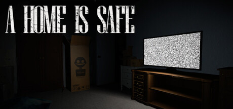
A Home Is Safe is a 3D survival horror game where a retro firmware update is your only hope of stopping T.O.M, home security robot turned killer. Split your focus between a tense computer interface and nerve-wracking first-person survival, rebuilding T.O.M.'s psyche as you evade the imposing threat.
$7.994 user reviews
HorrorRetroRobots
Beto DamianOct 28, 2025