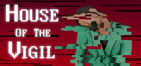
House of the Vigil scores 72/100 — better than 51% of Horror capsules (n=3,118).

Quick text summary

House of the Vigil scored 72/100 on Steam Analyzer — Good for a Horror capsule. Top priority fix: [uniqueness_polish] Add a distinctive visual element (iconic object, character silhouette detail, or signature symbol) that would be recognizable across multiple marketing materials

Capsule scores by dimension

  • Genre Clarity: 7/10 — Adventure horror atmosphere clear. The pixelated figure and decrepit house structure immediately signal a horror adventure game with retro aesthetics. At tiny size, the green corrupted figure and red atmospheric background create an uncanny tone that reads as psychological horror, though the exact subgenre (adventure vs. pure horror) is slightly ambiguous without context.
  • Title Readability: 8/10 — Bold pixelated text highly legible. The white blocky sans-serif title 'HOUSE OF THE VIGIL' maintains excellent readability at all sizes due to strong contrast against the deep red background and generous letter spacing. Even at tiny thumbnail size, the stacked layout and thick letterforms remain clearly parseable, though the tagline area is not visible at reduced sizes.
  • Contrast & Color: 8/10 — Strong value separation and pop. The bright white title and sickly green pixelated figure contrast sharply against the dark maroon background, creating excellent silhouette clarity and visual separation. The grayscale test confirms strong light-dark values that prevent muddy mid-tones, and the color palette feels intentionally unsettling rather than muddled.
  • Uniqueness & Polish: 7/10 — Retro pixel art with atmospheric edge. The deliberate pixel-art corruption effect on the figure and the strategic color choice (sickly green against crimson) demonstrate intentional art direction that avoids generic horror clichés. The composition feels crafted rather than templated, though the overall execution is solid competent work rather than standout premium craft.
  • Brand Consistency: 6/10 — Cohesive retro style, limited identity. The pixelated aesthetic and unsettling color palette are internally consistent and align with the game's visual identity based on the store description context. However, without a distinctive character, logo, or iconic motif, the branding relies heavily on genre expectations rather than a uniquely memorable identity marker.
  • Composition: 7/10 — Clear hierarchy with smart layout. The title anchors the left side with strong hierarchy, while the corrupted figure occupies the right-center as a clear focal point that draws the eye and conveys the core threat. The layout is well-balanced and avoids clutter, though the figure's position near the right edge could risk minor cropping on some display formats.

What works

  • Excellent title contrast and legibility. White blocky text on deep red maintains crisp readability even at tiny thumbnail sizes with no letterform collapse.
  • Atmospheric color palette choice. The sickly green figure against maroon background creates immediate unease and visual distinctiveness appropriate to the horror adventure tone.
  • Clear focal point hierarchy. The corrupted figure on the right provides an immediate visual anchor that communicates the core threat without competing with the title.

What hurts the capsule

  • Generic horror pixel-art trope. While well-executed, the corrupted sprite effect is a familiar visual shorthand in indie horror that doesn't create a uniquely memorable brand identity.
  • Limited visual storytelling depth. The capsule conveys atmosphere and tone but lacks narrative or mechanic hints beyond 'something is wrong,' offering less specificity than top-tier comparables.
  • Right-edge figure positioning risk. The corrupted figure sits close to the right margin and may suffer slight crop loss depending on Steam's display format variations.

Priority fixes

  1. [uniqueness_polish] Add a distinctive visual element (iconic object, character silhouette detail, or signature symbol) that would be recognizable across multiple marketing materials
  2. [composition] Shift the corrupted figure slightly left to ensure safe margins and prevent potential cropping on narrower display formats
  3. [brand_consistency] Introduce a recurring visual motif or UI element that differentiates this capsule's identity from generic pixel-horror templates

Store copy priority fixes

  1. [uniqueness] Add a sentence articulating what makes this game's mystery or mechanics distinct—e.g., 'Unlike typical haunted house games, you must piece together [specific mechanic or story element] while managing your sanity' or 'the house actively changes as you explore it.'
  2. [hook_strength] Rewrite the opening line to lead with a concrete, distinctive hook—e.g., 'Trapped in a shape-shifting Victorian manor, babysitter Anna must navigate impossible architecture and uncover the dark ritual that binds the house to its child prisoner' instead of the generic 'babysitting job gone wrong.'
  3. [feature_communication] Expand the mechanics paragraph to explain what 'point-and-click sequences' and 'environmental investigation' actually entail—e.g., 'examine objects for clues, solve environmental puzzles to unlock new rooms, and make dialogue choices that reveal the house's secrets.'
  4. [audience_targeting] Clarify the target audience tone—either emphasize 'mature horror narrative' for adults or add 'family-friendly spooky adventure' if the Family Sharing category signals a broader age range; resolve the tonal mismatch.

Related guides

Steam app ID: 4041110 · Tags: Horror, Isometric, Pixel Graphics, Female Protagonist, Adventure