Scoring genre clarity...
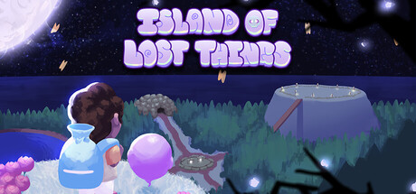
Play as Eric, a spirit medium, who is navigating the space between life and death. Help trapped souls by recovering items from their past, reconnecting them with their lives, and guiding them to make the ultimate decision: return to life or pass on to whatever comes next.
Free to Play3 user reviews
ExplorationAction-AdventureCasual
Andrea Mendez, Megan Eaton, Haley Currence, Brittney Nickerson, Wendy Prantner, Jonathan Foo, Andrew Naimou, Johnathan WuDec 12, 2025