Scoring genre clarity...

Prescription: Madness capsule

Prescription: Madness

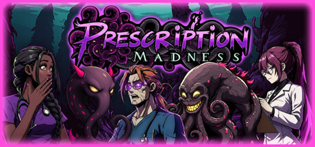
You’re a snarky sentient tentacle in a chaotic hospital. Possess humans and creatures, befriend the right weirdos, and decide humanity’s fate in this dark humor visual novel where every character is a potential pawn… or pal.

$5.59
Visual NovelStory RichSingleplayer
LlamaplayMar 18, 2026

Prescription: Madness scores 70/100 — better than 30% of Steam capsules we've analysed (n=22,658).

$5.59 · Released Mar 18, 2026 · By Llamaplay

Quick text summary

Prescription: Madness scored 70/100 on Steam Analyzer — Good for a Steam capsule. Top priority fix: [composition] Establish a single dominant focal point by pushing the central protagonist or tentacle creature larger and reducing the scale of flanking characters to create clearer hierarchy at small sizes.

Capsule scores by dimension

  • Genre Clarity: 7/10 — Dark horror visual novel vibes. The comic-style character lineup with shocked human expressions, tentacled monster creatures, and a hospital-adjacent white coat figure strongly implies a narrative-driven or visual novel experience with dark humor. The tentacle monsters and dramatic reactions communicate the horror-comedy tone well at full size. At tiny size, the monster silhouettes and panicking characters still suggest a story-heavy game, though the specific hospital/simulation angle is completely lost.
  • Title Readability: 7/10 — Readable at full, fades tiny. The title 'Prescription Madness' uses a decorative purple swirling font with tentacle-style letterforms that reads clearly at full header size with good contrast against the dark background. At small capsule size the word 'Prescription' becomes somewhat strained due to the ornate letterforms, and at tiny thumbnail size only 'Madness' remains partially legible while 'Prescription' collapses into an indistinct swirl. The tentacle motif integrated into the logo is thematically clever but hurts functional readability at reduced sizes.
  • Contrast & Color: 7/10 — Strong pink-purple pop on dark. The vivid magenta and purple palette pops effectively against Steam's dark #1b2838 background, with the glowing pink rim lighting on characters creating solid separation from the dark teal-grey environment. The monster creatures unfortunately share a similar dark value range as the background, causing their silhouettes to partially blend at tiny size. In grayscale the human characters still separate well but the creature mass in the center becomes murky.
  • Uniqueness & Polish: 7/10 — Charming style, familiar layout. The hand-drawn comic art style with expressive character faces and the tentacle-as-protagonist concept is genuinely distinctive and memorable, standing apart from typical visual novel capsules in the genre. The character group shot format is fairly conventional for the visual novel space, and the busy composition with five characters plus two creatures creates some visual crowding that reduces perceived polish. Compared to benchmarks like Slay the Princess which uses a singular striking visual hook, this capsule feels energetic but slightly unfocused.
  • Brand Consistency: 8/10 — Cohesive palette and character identity. The magenta, purple, and dark teal palette is strongly consistent throughout the image, and the tentacle motif appears in both the creatures and the logo typography, creating a recognizable internal identity. The comic illustration style is uniform across all characters with consistent line weight and coloring approach. The sentient tentacle concept is well-signaled as a recurring brand motif, giving the capsule a memorable identity cue that should carry across store assets.
  • Composition: 6/10 — Crowded group shot, weak hierarchy. The horizontal character lineup fills the frame edge to edge with five human characters and two creature figures competing for attention simultaneously, making it difficult to identify a single primary focal point even at full size. The title is placed in the upper center which is a reasonable choice, but the busy character arrangement below creates equal visual weight across the entire canvas. At small and tiny sizes the composition collapses into an undifferentiated mass of figures with no single element commanding attention first.

What works

  • Distinctive tentacle brand motif. The tentacle creature concept is echoed in both the logo typography and the monster characters, creating a cohesive visual identity that is genuinely memorable.
  • Strong color palette contrast. The magenta and purple tones pop clearly against Steam's dark background, giving the capsule immediate visual energy during a quick scroll.
  • Expressive character reactions. The shocked and panicked human facial expressions effectively communicate dark humor and narrative stakes at a glance.
  • Genre-appropriate dark horror comedy tone. The combination of cartoonish monsters and melodramatic human poses accurately signals the horror-comedy visual novel genre.

What hurts the capsule

  • No single focal point at small sizes. The five-character group lineup gives equal visual weight to every figure, causing the composition to collapse into noise at tiny thumbnail size.
  • Title illegible at tiny size. The decorative tentacle-style lettering in 'Prescription' becomes unreadable at approximately 120x45 pixels due to its ornate complexity.
  • Dark creatures blend into background. The two monster creatures share a similar dark value with the teal-grey background, weakening their silhouette separation especially at reduced sizes and in grayscale.
  • Hospital simulation angle not communicated. Despite the white coat character, nothing in the image clearly signals the simulation or hospital management layer of the game, missing a key genre differentiator.

Priority fixes

  1. [composition] Establish a single dominant focal point by pushing the central protagonist or tentacle creature larger and reducing the scale of flanking characters to create clearer hierarchy at small sizes.
  2. [title_readability] Add a thicker solid outline or drop shadow behind the 'Prescription' wordmark to maintain legibility of the letterforms when the capsule is viewed at 120x45 pixels.
  3. [contrast_color] Brighten or add a lighter rim highlight to the monster creature silhouettes so they separate clearly from the dark background in grayscale and at tiny size.
  4. [genre_clarity] Introduce a subtle visual cue tying the concept to the hospital setting, such as a pill bottle, medical cross, or chart prop, to reinforce the simulation and hospital context without adding clutter.

Store copy priority fixes

  1. [feature_communication] Expand the Character Possession bullet with a concrete example: 'Character Possession: NPC dialogue will sometimes block your progress—use your tentacle powers to possess them, hijack the conversation, and steer events your way.'
  2. [genre_clarity] Either clarify what 'Simulation' mechanics exist (hospital management? day-cycle systems?) in one sentence, or remove the genre tag if it doesn't apply.
  3. [feature_communication] Add a brief sentence to the Mysteries bullet explaining what solving them unlocks: 'Uncover character backstories and viral secrets that reshape ending possibilities.'

Related guides

Steam app ID: 4074610