Scoring genre clarity...
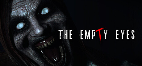
The Empty Eyes is a first-person psychological horror experience that immerses you in an investigation steeped in mystery. Every step inside the house brings you closer to a hidden truth, while tension mounts and fear takes root in your mind.
$8.99Mostly Positive(59)
HorrorIndiePsychological Horror
99 Grados GamesJan 15, 2026