Scoring genre clarity...
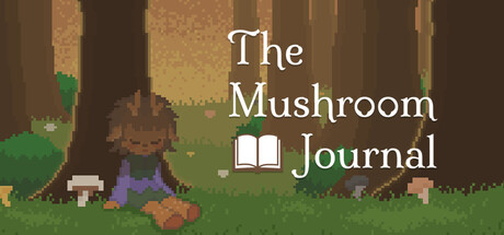
The Mushroom Journal is a Single-Player RPG, that takes you on an adventure to Mush Meadows. Mush Meadows is a mushroom-centered village, where you will have to help your neighbours by identifying and collecting them to uncover the mysteries that may lie under trading table.
Free to PlayPositive(30)
RPGEducation2D
MageBerryDec 13, 2025