Scoring genre clarity...

TORNBLADE capsule

TORNBLADE

TORNBLADE is a dark action game combining top-down exploration with direct side-scroll combat, inspired by the uncompromising spirit of classic games from the 80s and 90s, and shaped by Slavic and Celtic atmosphere.

Action RPGSide ScrollerTop-Down
MUELLER Productions Sp. z o.o.Coming soon

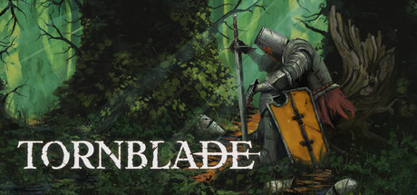
TORNBLADE scores 70/100 — better than 30% of Steam capsules we've analysed (n=22,658).

Released Coming soon · By MUELLER Productions Sp. z o.o.

Quick text summary

TORNBLADE scored 70/100 on Steam Analyzer — Good for a Steam capsule. Top priority fix: [contrast_color] Add a subtle rim light or vignette brightening around the knight silhouette to increase value separation from the mid-tone forest background, especially in grayscale.

Capsule scores by dimension

  • Genre Clarity: 8/10 — Dark medieval action RPG clear. The center-right armored knight holding a sword and shield in a moody forest setting immediately communicates dark fantasy action RPG. The weathered armor, red cloak, and brooding pose suggest a souls-like or challenging action game tone. At tiny size the knight silhouette and forest backdrop still read as dark medieval fantasy, though the specific subgenre nuance is slightly lost.
  • Title Readability: 7/10 — Bold serif reads at most sizes. TORNBLADE is set in a clean, large serif-style white font in the bottom-left with a subtle dark backing from the forest floor, giving reasonable contrast. At full size it reads clearly and confidently. At tiny size the letters compress but the word shape is still distinguishable, though the T-O-R-N-B-L-A-D-E letterforms can blur together slightly against the mid-tone forest background.
  • Contrast & Color: 6/10 — Muted palette limits pop on Steam. The overall palette is dominated by desaturated greens, grays, and browns, which creates an atmospheric tone but results in low value contrast against Steam's dark #1b2838 background. The yellow shield provides the strongest accent color and helps anchor the knight visually. In grayscale, the knight and background mid-tones merge at tiny size, reducing silhouette separation and making the image feel flat during a quick scroll.
  • Uniqueness & Polish: 7/10 — Painterly style with strong atmosphere. The hand-drawn or painterly illustration style sets it apart from photorealistic competitors and communicates an indie craft quality. The composition has intentional storytelling — a lone battered knight resting in a mysterious forest — which hints at a melancholic, atmospheric narrative. Compared to genre benchmarks like Lies of P or Senua's Saga, the capsule feels distinctly artisanal, though the muted color palette and relatively static pose limit its visual punch.
  • Brand Consistency: 7/10 — Cohesive dark folk fantasy identity. The painterly illustration style, muted earthy palette, and Slavic-Celtic dark forest atmosphere create a coherent internal identity that aligns well with the described game tone. The armored knight with worn gear serves as a recognizable protagonist motif. The title font choice complements the medieval aesthetic without feeling generic, suggesting an intentional art direction that would likely extend across store screenshots.
  • Composition: 7/10 — Knight focal point, decent hierarchy. The knight occupies roughly the right two-thirds of the image as the clear primary subject, with the title placed bottom-left creating a balanced diagonal visual flow. The forest background provides atmospheric depth without overwhelming the foreground subject. At small size the composition holds reasonably well, but the title sitting very close to the bottom-left edge risks being clipped or losing context, and the center-left forest area creates some dead space that dilutes focus.

What works

  • Distinctive painterly art style. The hand-illustrated look immediately differentiates TORNBLADE from photorealistic competitors in the dark action RPG space.
  • Strong genre iconography in knight pose. The battered armored knight with sword and shield communicates dark fantasy action RPG at a glance, even at small sizes.
  • Yellow shield accent color. The yellow shield provides the single strongest value contrast point on the character, helping anchor the focal point during quick scroll.
  • Atmospheric storytelling. The lone resting knight in a moody forest tells a brief emotional story that implies a melancholic, challenging tone consistent with the game description.

What hurts the capsule

  • Muted palette blends into Steam background. The desaturated green-gray color scheme lacks sufficient brightness or saturation contrast to pop against Steam's #1b2838 dark background during quick browsing.
  • Low silhouette separation at tiny size. In grayscale at 120x45 the knight's armor tones merge with the mid-tone forest, weakening the primary subject's readability.
  • Title placement near bottom edge risks crop. The TORNBLADE text sitting at the very bottom-left is vulnerable to Steam capsule cropping and loses contrast where forest floor tones are darkest.
  • Static pose limits immediate energy. A resting or crouching knight conveys atmosphere but lacks the dynamic action energy that high-performing genre competitors use to signal exciting gameplay.

Priority fixes

  1. [contrast_color] Add a subtle rim light or vignette brightening around the knight silhouette to increase value separation from the mid-tone forest background, especially in grayscale.
  2. [title_readability] Add a thicker drop shadow or semi-transparent dark underlay behind TORNBLADE text to ensure legibility against variable forest floor tones at tiny size.
  3. [composition] Shift the title slightly upward and inward from the bottom-left edge to protect it from Steam capsule cropping and improve safe-zone positioning.
  4. [contrast_color] Introduce a slightly warmer or more saturated ambient light source in the scene to differentiate the overall palette from Steam's cold dark background.

Store copy priority fixes

  1. [hook_strength] Rewrite the short description opening to lead with the lone knight's corruption or the dual-perspective combat mechanic as a verb-forward hook (e.g., 'Survive brutal combat and explore a decaying realm as a knight consumed by dark affliction, where two perspectives reveal different truths') instead of naming the game first.
  2. [uniqueness] Add a sentence explicitly comparing the dual-perspective system to other action RPGs—explain what the player gains from switching between exploration and side-scroll combat that a single-view game does not offer.
  3. [audience_targeting] Insert a sentence early in the detailed description that signals difficulty, pacing, or intended player skill level (e.g., 'designed for players who relish challenging combat and environmental storytelling' or 'rewards careful exploration and quick reflexes').
  4. [feature_communication] Expand the 'Progression & Combat' section with one concrete example of how gear or abilities change tactical options (e.g., 'Heavy armor increases durability but slows dodge speed; light gear favors evasion tactics').

Related guides

Steam app ID: 4084180