Scoring genre clarity...
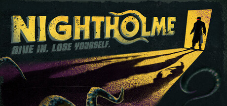
Nightholme capsule

Nightholme

Team up or strike out alone to hunt an eldritch Gloomfiend in a city crawling with horrors. Channel corruption and transform into a monstrous Grimspawn for devastating bursts of power. But beware. Madness is patient, and you look delicious. Survive the run. Take the prize. No one leaves unchanged.

HorrorMultiplayerOpen World
Studio EllipsisTo be announced

Nightholme scores 73/100 — better than 67% of Horror capsules (n=3,252).

Released To be announced · By Studio Ellipsis

Quick text summary

Nightholme scored 73/100 on Steam Analyzer — Good for a Horror capsule. Top priority fix: [title_readability] Remove or simplify VENI VIDI VICIOUS tagline to reduce visual clutter and improve focus at thumbnail scales.

Capsule scores by dimension

  • Genre Clarity: 7/10 — Dark action with eldritch horror tone. The silhouette of a hunched creature with an elongated form and the purple-to-orange gradient strongly signals supernatural horror-action gameplay. At tiny size, the creature shape and ominous color palette read as eldritch/dark action, though specific mechanics like transformation or corruption aren't immediately evident. The flowing energy lines and monstrous form communicate danger and otherworldly threat effectively.
  • Title Readability: 8/10 — Bold yellow title, readable at all sizes. NIGHTHOLME in large yellow capital letters contrasts sharply against the dark background and remains fully legible at small and tiny sizes. The all-caps sans-serif design is clean and functional. Tagline text 'VENI VIDI VICIOUS' is decorative and notably less readable at tiny size, but the primary title dominates and carries sufficient weight.
  • Contrast & Color: 8/10 — Strong value separation, vivid gradient pop. The bright yellow title and orange-to-purple gradient create excellent contrast against the dark #1b2838 background. The creature silhouette maintains clear edges through color separation and subtle glow effects. In grayscale, the light values of the title and mid-gradient tones separate well from the dark background, ensuring readability and visual pop even at thumbnail scale.
  • Uniqueness & Polish: 7/10 — Polished dark aesthetic, competent but familiar. The execution is clean with intentional gradient work, glow effects, and a cohesive purple-orange palette that feels purposeful and well-rendered. However, the eldritch-corruption-monster aesthetic is common in horror-action releases, and the capsule does not clearly communicate the unique mechanic of transformation into Grimspawn or team-play hunting focus. The visual storytelling conveys mood but not clear competitive differentiation.
  • Brand Consistency: 6/10 — Consistent dark horror aesthetic, minimal identity. The color palette and creature design are internally coherent and match the dark eldritch horror direction established by the game description. However, there are no strong iconic character designs, recurring motifs, or signature visual elements that would be immediately recognizable as Nightholme-specific on future marketing materials. The style reads as polished but generic within the dark-action subgenre.
  • Composition: 8/10 — Clear hierarchy, centered creature focal point. The creature silhouette is the primary focal point, centrally positioned and dominant in the composition. Title sits in the upper region with strong separation. The flowing energy lines and gradient create depth and guide the eye naturally without clutter. At small and tiny sizes, the layout holds together well with the creature remaining the clear primary subject and the title clearly legible above.

What works

  • Excellent title contrast and legibility. Large yellow capital letters maintain full readability at all sizes including tiny thumbnails, providing strong brand clarity.
  • Strong color-to-background pop. The purple-to-orange gradient and yellow title create vivid value separation that reads immediately against dark Steam backgrounds.
  • Clean composition hierarchy. Creature silhouette as clear primary focal point with title above prevents visual confusion and guides eye naturally.

What hurts the capsule

  • Tagline text unreadable at scale. VENI VIDI VICIOUS becomes illegible at tiny size and adds visual noise without communicating essential information.
  • Generic eldritch-horror aesthetic. The dark creature and corruption visual language is common across horror-action releases, offering limited memorability or brand differentiation.
  • Core mechanic unclear from visuals. Transformation into Grimspawn and team hunting loop are not visually communicated; the capsule reads as standard monster-hunting rather than distinctive premise.

Priority fixes

  1. [title_readability] Remove or simplify VENI VIDI VICIOUS tagline to reduce visual clutter and improve focus at thumbnail scales.
  2. [uniqueness_polish] Incorporate visual hint of the transformation mechanic or dual-threat dynamic (e.g., human figure with corruption overlay) to differentiate from generic eldritch horror.
  3. [brand_consistency] Introduce a distinctive character silhouette, symbol, or color accent that signals Nightholme specifically and aids long-term recognition.

Store copy priority fixes

  1. [feature_communication] Add a sentence or bullet explaining what happens when madness fills—does it lock transformations, alter perception, reduce control, trigger permanent debuffs?—to ground the mechanic in gameplay consequence rather than flavor alone.
  2. [feature_communication] Clarify the progression curve and unlock schedule with one concrete example (e.g., 'Unlock new Grimspawn archetypes every 5 successful runs') to help players understand the long-term reward loop and investment timeline.
  3. [genre_clarity] Insert a brief sentence in the short description or opening paragraph that signals the Souls-like difficulty and permadeath or punishment systems, if they exist, to set correct expectations for the audience.

Related guides

Steam app ID: 4108680 · Tags: Horror, Multiplayer, Open World, Action, Survival