Scoring genre clarity...

The Heritage capsule

The Heritage

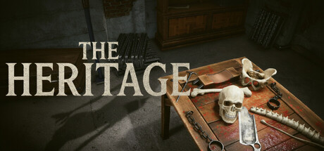
A long-forgotten house becomes your inheritance. But as you wander its dark corridors and solve its eerie puzzles, you soon realize this legacy isn’t yours alone. Uncover the hidden secrets and face the true nature of what you’ve inherited.

$1.595 user reviews
AdventurePuzzleHidden Object
StopMountain StudioNov 20, 2025

The Heritage scores 65/100 — better than 11% of Steam capsules we've analysed (n=22,658).

5 user reviews · $1.59 · Released Nov 20, 2025 · By StopMountain Studio

Quick text summary

The Heritage scored 65/100 on Steam Analyzer — Solid for a Steam capsule. Top priority fix: [contrast_color] Add a subtle cool-to-warm vignette or a single accent light source (e.g. a candle glow hitting the skull) to increase value contrast and help the image pop against the #1b2838 Steam background.

Capsule scores by dimension

  • Genre Clarity: 7/10 — Dark mystery horror adventure implied. The skull, chains, surgical tools, and dimly lit room on a wooden table immediately communicate a dark, eerie atmosphere consistent with horror-adjacent adventure or mystery. At tiny size the skull remains a recognizable icon that anchors the genre to something macabre and investigative. However, it could blur with escape-room or horror puzzle genres, so precise subgenre communication is slightly ambiguous.
  • Title Readability: 7/10 — Readable at full, strains at tiny. The serif title 'THE HERITAGE' uses large, high-contrast white lettering against the mid-tone grey wall background, which works well at full and small sizes. At tiny size (120x45) 'THE' becomes quite small and may lose legibility, though 'HERITAGE' in its larger weight still reads adequately. No tagline or secondary text clutters the composition.
  • Contrast & Color: 6/10 — Muted palette limits pop on dark UI. The warm brown tones of the wooden table and the desaturated grey wall create a cohesive but low-saturation palette that does not strongly pop against Steam's #1b2838 dark background. The skull and white title text provide the main contrast anchors, but in a quick scroll the overall image reads as dark and muddy. In grayscale the skull separates reasonably well, but the chain and tools blend into the table surface.
  • Uniqueness & Polish: 6/10 — Competent but genre-familiar staging. The still-life composition of macabre objects on a table is a recognizable visual trope in horror and dark mystery games, giving it a slightly template feel compared to top-tier capsules like DREDGE or Slay the Princess which have a more distinctive visual hook. The render quality appears solid and the scene is carefully arranged, but there is no immediately memorable or unique selling point visible that distinguishes it from similar atmospheric horror titles.
  • Brand Consistency: 6/10 — Coherent dark realism, no strong icon. The dark realist rendering style, muted desaturated palette, and focus on aged objects feel internally consistent with a Victorian or gothic horror identity. However, there is no signature character, motif, or color accent that would make this brand immediately recognizable in a library or return visit. The skull could function as a recurring brand symbol but is not stylized enough to be iconic.
  • Composition: 7/10 — Strong diagonal table, clear focal skull. The wooden table serves as a strong diagonal anchor leading the eye from bottom-left to the skull as the primary focal point at center-right, with the title occupying the upper-left negative space of the grey wall. This two-zone split between title area and object area is effective and avoids clutter. At small size the skull remains the clear focal element, though the chains and tools in the foreground edge area risk being cropped or becoming visual noise at tiny size.

What works

  • Clear genre cues via skull and tools. The skull, chains, and surgical instruments immediately signal a dark mystery or horror-adjacent experience without requiring text.
  • Effective title placement on clean background. Placing 'THE HERITAGE' against the uncluttered grey wall region ensures strong readability at full and small sizes.
  • Diagonal table composition creates depth. The angled table creates a natural foreground-to-background depth that prevents the image from feeling flat.
  • Skull as stable tiny-size focal anchor. Even at 120x45 the skull retains enough size and contrast to serve as a recognizable central element.

What hurts the capsule

  • Muted palette competes poorly on Steam dark UI. The overall desaturated brown and grey tones lack enough saturation or value contrast to pop against #1b2838 during a fast scroll.
  • No distinctive visual hook or unique identity. The still-life table composition is familiar in the dark mystery genre and does not offer a memorable or differentiated visual selling point.
  • Foreground clutter at tiny size. The chains and scattered tools near the bottom edge become indistinct visual noise at 120x45, reducing clarity.
  • No signature brand motif or recognizable icon. There is no stylized character, logo mark, or recurring symbol that would make the game recognizable across thumbnails and return visits.

Priority fixes

  1. [contrast_color] Add a subtle cool-to-warm vignette or a single accent light source (e.g. a candle glow hitting the skull) to increase value contrast and help the image pop against the #1b2838 Steam background.
  2. [uniqueness_polish] Introduce one distinctive visual element or stylized treatment — such as a ghostly overlay, a symbolic motif, or a more dramatic lighting angle — to differentiate from generic dark mystery capsules.
  3. [title_readability] Increase the weight or add a subtle dark drop shadow to 'THE' so both words remain legible when the image is reduced to tiny thumbnail size.
  4. [brand_consistency] Stylize or isolate the skull as a recurring brand symbol with a subtle distinctive treatment so it functions as a recognizable identity mark across all marketing assets.

Store copy priority fixes

  1. [feature_communication] Add a concrete example of puzzle-solving: 'Piece together diary entries hidden throughout the house to unlock locked rooms' or 'Examine objects in detailed first-person view to find clues about what happened.' This clarifies the hidden-object and puzzle mechanics.
  2. [uniqueness] After the Features section, add 1-2 sentences that differentiate this game: e.g., 'What sets The Heritage apart is its focus on unraveling a personal family mystery rather than generic supernatural scares—every puzzle solved brings you closer to understanding your own bloodline.' This positions the inheritance angle as a core differentiator.
  3. [audience_targeting] Add a brief line signaling player expectations: 'Best suited for players who enjoy slow-burn psychological narratives and logic puzzles over action. Expect 3–5 hours of atmospheric exploration.' This helps self-select the right audience and set expectations.

Related guides

Steam app ID: 4116230