Scoring genre clarity...

Fears to Fathom® - Scratch Creek capsule

Fears to Fathom® - Scratch Creek

After noticing bone-chilling similarities to an episode of Fears to Fathom, Tessa and Marcus decide to share their own experience. Scratch Creek is an exclusively online co-op experience.

$7.99Mostly Positive(2,538)
HorrorCo-opAdventure
RayllJun 10, 2026

Fears to Fathom® - Scratch Creek scores 72/100 — better than 50% of Horror capsules (n=3,268).

Mostly Positive (2,538 reviews) · $7.99 · Released Jun 10, 2026 · By Rayll

Quick text summary

Fears to Fathom® - Scratch Creek scored 72/100 on Steam Analyzer — Good for a Horror capsule. Top priority fix: [genre_clarity] Add a visual element that hints at co-op gameplay or character presence to communicate the multiplayer adventure angle and differentiate from solo horror titles.

Capsule scores by dimension

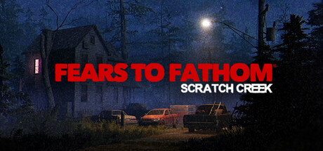
  • Genre Clarity: 7/10 — Horror adventure clearly signaled. The nighttime rural setting, abandoned house silhouette, eerie atmosphere with moon glow, and red warning-style title all communicate a horror experience. At TINY size, the dilapidated house and dark woods remain recognizable genre markers, though the co-op adventure angle is not visually evident from the capsule alone.
  • Title Readability: 8/10 — Bold red title reads at all sizes. The main title 'FEARS TO FATHOM' in bright red sans-serif font contrasts sharply against the dark blue night sky and reads clearly at FULL, SMALL, and TINY sizes. The secondary text 'SCRATCH CREEK' in white below maintains legibility but becomes slightly softer at TINY scale due to thinner letterforms and smaller size relative to the primary title.
  • Contrast & Color: 8/10 — Strong dark-light separation effective. The bright red title and glowing moon create excellent value contrast against the deep blue-black landscape background. The warm amber lighting from the central structure and the cool blue moonlit surroundings establish clear visual hierarchy that survives grayscale conversion and remains readable at small sizes despite the inherently dark palette.
  • Uniqueness & Polish: 6/10 — Competent horror setup lacks distinction. The composition—abandoned house at night, moonlight, barren trees—follows familiar horror game visual language seen in genre titles. While the execution is clean and the mood is cohesive, the scene does not communicate a unique mechanic or distinctive visual hook that separates it from other atmospheric horror adventures; it reads as a well-executed but conventional haunted location.
  • Brand Consistency: 7/10 — Consistent horror franchise aesthetic. The capsule aligns well with the Fears to Fathom franchise identity through consistent use of eerie rural nighttime settings and the signature red title treatment. The visual language is recognizable as part of the series brand, though no episode-specific character or motif appears to make this individual entry distinctly memorable beyond the established franchise look.
  • Composition: 7/10 — Balanced layout with clear hierarchy. The structure is well-organized with the house and environment occupying the lower-middle ground, the moon as a secondary focal point in the upper third, and the title positioned centrally for prominence. At TINY size the composition remains readable with the central warm-lit structure guiding attention, though the title placement slightly overlaps the upper landscape which could improve separation clarity.

What works

  • Strong title contrast and readability. The bright red 'FEARS TO FATHOM' text pops decisively against the dark blue background at all viewing scales, including TINY thumbnail size.
  • Clear atmospheric genre communication. The nighttime rural horror setting with abandoned architecture and moonlight immediately signals the horror-adventure genre expectation.
  • Cohesive mood and lighting design. The interplay between cool blue moonlit tones and warm amber structure lighting creates visual depth and professional atmosphere.

What hurts the capsule

  • Generic haunted location visual. The abandoned house-at-night scene lacks a distinctive mechanic or visual hook that differentiates this episode from standard horror game tropes.
  • Co-op gameplay not visually evident. The capsule communicates solo horror experience rather than the exclusive online co-op selling point mentioned in the description.
  • Subtitle readability diminishes at TINY. The secondary 'SCRATCH CREEK' text loses legibility at thumbnail size due to its smaller scale and thinner weight compared to the main title.

Priority fixes

  1. [genre_clarity] Add a visual element that hints at co-op gameplay or character presence to communicate the multiplayer adventure angle and differentiate from solo horror titles.
  2. [uniqueness_polish] Introduce a distinctive visual element or environmental detail unique to Scratch Creek location to increase memorability and series identity beyond generic haunted house aesthetic.
  3. [title_readability] Increase outline or background panel behind 'SCRATCH CREEK' subtitle to improve legibility at TINY thumbnail sizes without losing overall layout balance.

Related guides

Steam app ID: 4121170 · Tags: Horror, Co-op, Adventure, Multiplayer, Psychological Horror