The Forsaken Tomb scores 72/100 — better than 48% of Psychological Horror capsules (n=2,167).

Quick text summary

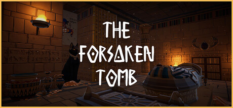
The Forsaken Tomb scored 72/100 on Steam Analyzer — Good for a Psychological Horror capsule. Top priority fix: [genre_clarity] Add a visible anomaly or perception-test visual element (e.g., a subtle object that appears wrong or out of place) to clearly signal the core mechanic at small sizes.

Capsule scores by dimension

  • Genre Clarity: 7/10 — Clear puzzle-adventure tone established. The dimly lit tomb interior with scattered objects, shelves, and a central figure clearly signals an exploration or puzzle game rather than action or combat. At TINY size, the architectural framing and indoor setting remain readable, though the specific 'anomaly-spotting' mechanic is not visually apparent from the scene alone. The aesthetic leans toward atmospheric adventure/mystery rather than pure simulation.
  • Title Readability: 8/10 — Bold title legible at all sizes. THE FORSAKEN TOMB uses a strong white serif font with clear letter forms positioned in the center third of the composition, maintaining excellent contrast against the darker background. At SMALL and TINY sizes, the title remains fully readable due to generous letter spacing and high value separation. The geometric, slightly angular letterforms hold their shape through downscaling.
  • Contrast & Color: 8/10 — Strong value separation, warm lighting focus. The capsule employs a dark brown and black tomb interior contrasted with bright orange-yellow accent lighting on the left side and warm glowing elements, creating clear value hierarchy. The white title pops decisively against the mid-tone background, and the figure silhouette reads cleanly in grayscale due to distinct lighting separation. At TINY size, the contrast remains effective and the composition does not collapse into murk.
  • Uniqueness & Polish: 7/10 — Atmospheric and intentional, slightly familiar. The composition shows strong craft with deliberate lighting design, environmental storytelling through props (shelves, objects, architectural detail), and a cohesive mood that feels premium and purposeful. However, the tomb exploration aesthetic is relatively common in indie games, and the scene does not immediately communicate the 'anomaly-spotting' core mechanic that distinguishes this game. The execution is solid but the visual hook feels somewhat archetypal for the adventure genre.
  • Brand Consistency: 6/10 — Cohesive mood, no clear signature identity. The capsule maintains internal consistency in its warm-lit, decaying tomb aesthetic and monochromatic serif typography, suggesting a recognizable mood if seen again. However, there are no distinctive character motifs, symbols, or signature color treatments that immediately mark this as The Forsaken Tomb rather than a generic tomb exploration game. The identity is functional but not distinctly memorable.
  • Composition: 7/10 — Balanced layout, clear focal point. The title occupies the center-right area with the central figure and lit shelving on the left, creating a balanced asymmetrical composition with clear depth and layering. The white text acts as a strong anchor over the mid-tone wall, drawing the eye immediately, while environmental details guide attention without competing. At SMALL size the layout holds well, though at TINY size the figure details blur into the background slightly, reducing secondary interest.

What works

  • Title contrast and legibility. White serif text with strong spacing reads clearly at all sizes against the darker background, ensuring immediate recognition in quick scroll.
  • Atmospheric lighting design. Warm orange and yellow accent lighting creates visual interest and clear value separation that prevents the dark scene from feeling flat or murky.
  • Environmental storytelling. Shelves, scattered objects, and architectural detail suggest exploration and investigation without feeling cluttered or random.

What hurts the capsule

  • Generic tomb aesthetic. The indistinct interior setting does not visually communicate the unique 'anomaly-spotting' mechanic, making the capsule feel like a standard adventure game.
  • Lack of memorable branding. No distinctive character, symbol, or signature visual element creates lasting brand recognition or differentiation from other indie exploration games.
  • Figure silhouette loses detail at tiny size. The central character and its pose become difficult to parse at TINY thumbnail size, reducing the human interest and secondary focal point.

Priority fixes

  1. [genre_clarity] Add a visible anomaly or perception-test visual element (e.g., a subtle object that appears wrong or out of place) to clearly signal the core mechanic at small sizes.
  2. [uniqueness_polish] Introduce a distinctive visual motif or icon (such as a recurring symbol, artifact, or stylized anomaly indicator) that becomes the capsule's signature identity cue.
  3. [composition] Increase the size or contrast of the central figure or add a secondary point of interest to prevent the eye from dwelling too long on the title alone at SMALL size.

Store copy priority fixes

  1. [feature_communication] Add explicit explanation of what "Multiple Endings" means and how player choices shape outcomes, since this tag is listed but completely absent from the copy.
  2. [uniqueness] Clarify the specific difference between Normal Mode and Escape Mode with concrete examples of how the gameplay loop differs between the two.
  3. [tone_match] Remove or integrate the "Charitable Giving" line into the footer or a separate section to preserve atmospheric coherence in the main copy.
  4. [feature_communication] Expand on anomaly types with 2-3 concrete examples (e.g., 'objects disappearing, colors shifting, proportions warping') to help readers visualize the gameplay.

Related guides

Steam app ID: 4125470 · Tags: Psychological Horror, Horror, Puzzle, Psychological, Exploration