Scoring genre clarity...

FUTURO DARKO RACER capsule

FUTURO DARKO RACER

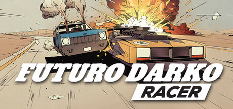
The game takes place in post-apocalyptic wastelands, where every race is a fight for survival. To win, you must outrun your opponents or simply destroy them! But beware — ruthless judges are watching to enforce the rules. If anyone catches you cheating, you’ll become the target and be eliminated.

RacingCombat RacingShooter
FDR TEAMTo be announced

FUTURO DARKO RACER scores 72/100 — better than 44% of Steam capsules we've analysed (n=22,658).

Released To be announced · By FDR TEAM

Quick text summary

FUTURO DARKO RACER scored 72/100 on Steam Analyzer — Good for a Steam capsule. Top priority fix: [title_readability] Increase the size and weight of 'RACER' within its badge so it remains legible at 120x45, or integrate it directly into the main logo lockup at similar scale

Capsule scores by dimension

  • Genre Clarity: 8/10 — Clear combat racing genre. Two vehicles colliding on a road with a fireball explosion in the top right immediately communicates vehicular combat racing. The comic-book art style and action pose of the cars fighting side-by-side on a highway reinforces the post-apocalyptic action racing theme well. At tiny size the collision between two cars and the explosion still reads, making genre unmistakable even at 120x45.
  • Title Readability: 7/10 — Readable at full, marginal at tiny. The bold white italic 'FUTURO DARKO' lettering with a dark drop shadow reads clearly at full and small sizes, placed on a relatively clean lower portion of the image. The smaller 'RACER' subtitle in a red-outlined box is readable at small size but collapses at tiny 120x45 where it becomes an indistinct smudge. The strong italic weight of the main title helps it survive the squint test reasonably well.
  • Contrast & Color: 7/10 — Warm tones pop on dark background. The warm orange and tan vehicle colors contrast well against the light beige-gray road and the explosion's orange-yellow bloom creates strong value separation in the upper right. Against Steam's dark #1b2838 background the overall capsule reads well due to the light road surface creating a clear boundary. In grayscale the cars remain distinguishable from each other and the background, though the blue-gray vehicle on the left blends slightly with cooler tones.
  • Uniqueness & Polish: 7/10 — Distinctive comic-book art style. The hand-drawn comic-book illustration style with bold outlines, cel-shading, and halftone-adjacent rendering is a clear differentiator from photorealistic racing capsules like Forza or F1. The action scene feels dynamic and purpose-built rather than templated, and the stylized explosion adds energy. However the composition and concept remain fairly conventional for a vehicular combat game, keeping it from reaching truly standout territory.
  • Brand Consistency: 7/10 — Coherent pulp comic identity. The thick black outlines, warm sandy palette, and action-comic rendering style create a cohesive identity that would be recognizable across store assets. The 'FUTURO DARKO' name combined with the retro-muscle-car aesthetic signals a consistent post-apocalyptic pulp tone. The logo treatment with italic bold font and red 'RACER' badge reinforces a branded visual language, though the identity cues are not yet iconic enough to be instantly recalled.
  • Composition: 7/10 — Dynamic two-car focal point. The two colliding cars occupy the center-left and center-right creating a strong horizontal tension that draws the eye naturally to the impact zone. The title is placed at the bottom in a clean white lower band area, avoiding the busy explosion and car detail, which is a smart compositional choice. At small size the car-on-car action reads well, but the bottom title band takes up roughly a third of the vertical space which slightly compresses the action scene at tiny sizes.

What works

  • Comic-book art style differentiator. The cel-shaded, thick-outlined illustration style immediately separates this from photorealistic racing games on the Steam store.
  • Explosion adds energy and depth. The orange fireball in the top-right corner creates a strong diagonal visual lead-in and communicates combat stakes instantly.
  • Title placement on clean background zone. Placing 'FUTURO DARKO RACER' on the lighter lower portion of the image avoids competing with the busy action above and ensures decent legibility.
  • Genre reads at tiny size. Two cars in collision with an explosion still communicates vehicular combat racing even at 120x45 pixels.

What hurts the capsule

  • 'RACER' subtitle collapses at tiny size. The smaller red-badge 'RACER' text becomes unreadable at 120x45 and appears as a smudged box, losing the full title at the critical thumbnail size.
  • Blue-gray car lacks contrast separation. The left vehicle's cool blue-gray tones blend with the overall neutral background palette in grayscale, weakening its silhouette read at small sizes.
  • Composition is generic for the genre. Two cars side-by-side on a road is a common visual trope for racing games and doesn't communicate the unique survival-race-judge mechanic described in the game concept.
  • Title band consumes vertical real estate. The large white title area at the bottom compresses the action scene, reducing its impact especially at small and tiny crop sizes.

Priority fixes

  1. [title_readability] Increase the size and weight of 'RACER' within its badge so it remains legible at 120x45, or integrate it directly into the main logo lockup at similar scale
  2. [contrast_color] Add a stronger dark outline or drop shadow to the left blue-gray vehicle to improve its silhouette separation from the background in grayscale and at tiny size
  3. [uniqueness_polish] Consider incorporating a visual hint of the judge or enforcement mechanic — such as an authority vehicle or symbol — to communicate the unique survival-race ruleset and differentiate from generic combat racing
  4. [composition] Reduce the vertical height of the title text band slightly to allow the action scene more breathing room and improve crop resilience at small sizes

Store copy priority fixes

  1. [feature_communication] Replace 'extensive tuning and improvements' with specific examples: e.g., 'Customize armor, weapon loadouts, and engine performance—each upgrade unlocks different combat styles and race strategies.' [hook_strength] Lead the detailed description with the risk-betting core mechanic: e.g., 'In Futuro Darko Racer, cash and vehicles are collateral. Every race escalates stakes—win big or lose everything.'
  2. [uniqueness] Deepen the comic book connection by explaining visual or narrative payoff: e.g., 'Encounter characters and story beats lifted from Krzysztof Nowak's FUTURO DARKO comic, expanding the universe with new wasteland factions and lore.'
  3. [tone_match] Rewrite the 'Why it's worth it' section to match the gritty voice of the rest of the copy instead of using generic adjectives; use phrases like 'Wager your way up the wasteland hierarchy' or 'Become legend or ash—your choice.'

Related guides

Steam app ID: 4132090