Scoring genre clarity...

Dwarf Tavern capsule

Dwarf Tavern

Manage an underground tavern tucked away in a side alley of an ancient dwarven mining city, where rough but jovial miners gather to fill bellies and lift their voices, mugs, and sometimes their fists.

$4.992 user reviews
CasualSimulationCooking
simulinatiNov 24, 2025

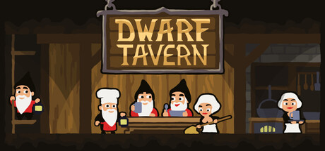
Dwarf Tavern scores 78/100 — better than 82% of Casual capsules (n=10,153).

2 user reviews · $4.99 · Released Nov 24, 2025 · By simulinati

Quick text summary

Dwarf Tavern scored 78/100 on Steam Analyzer — Good for a Casual capsule. Top priority fix: [uniqueness_polish] Consider adding a subtle gameplay hint such as a coin purse, mug clinking detail, or fist-fight gesture to reinforce the management and jovial conflict themes mentioned in the description.

Capsule scores by dimension

  • Genre Clarity: 8/10 — Strong tavern management sim cues. The wooden tavern storefront with the hanging sign, multiple dwarven characters lined up at a counter, and casual festive atmosphere immediately communicate a cozy management/simulation game. At tiny size, the iconic tavern setting and gathered dwarves remain readable and genre-appropriate, though specific gameplay mechanics are not explicitly shown through UI hints.
  • Title Readability: 9/10 — Excellent legibility at all sizes. The 'DWARF TAVERN' title uses a bold, chunky serif font in warm gold against a dark wood background with a strong gray border frame that ensures separation from background noise. At tiny and small sizes, the text remains crisp and immediately readable due to high contrast, thick letterforms, and the contained sign design protecting it from blend-in.
  • Contrast & Color: 8/10 — Strong warm-cool separation. The gold and cream tones of the tavern sign and characters pop distinctly against the dark teal-gray background, creating clear value separation even in grayscale. The wooden interior warm browns contrast well with the cooler background, and the small characters maintain silhouette clarity at all viewing sizes.
  • Uniqueness & Polish: 7/10 — Charming pixel art with clear identity. The pixel art style is clean and intentional, with a distinctive whimsical dwarven aesthetic and warm color palette that communicates a cozy, lighthearted tone rather than generic fantasy. The scene conveys character and charm but follows familiar pixel-art conventions seen in comparable indie sims, landing it as polished rather than standout.
  • Brand Consistency: 7/10 — Coherent dwarven tavern branding. The capsule establishes a consistent visual identity with the iconic tavern sign, warm wood tones, recognizable dwarven character silhouettes, and a unified pixel-art rendering style that would be identifiable in other brand touchpoints. The color palette and character design feel cohesive, though the presentation is thematically expected rather than uniquely iconic.
  • Composition: 8/10 — Well-balanced scene with clear hierarchy. The hanging sign anchors the top third as the primary focal point, the tavern counter and grouped dwarves form a strong central composition, and the flanking background buildings provide context without clutter. At small and tiny sizes, the eye settles naturally on the tavern storefront and the gathering of characters, with safe margins preserved and no critical elements cut at edges.

What works

  • Title readability and framing. The 'DWARF TAVERN' sign with its defined border and high-contrast gold lettering remains perfectly legible at tiny size, making immediate recognition effortless.
  • Cohesive pixel art style. Consistent clean linework and unified warm color palette create a polished, charming aesthetic that communicates quality and intent.
  • Strong compositional focal point. The tavern storefront naturally draws the eye at all viewing sizes, supported by surrounding scene elements that provide context without competing for attention.
  • Genre-appropriate visual storytelling. Gathered dwarves, tavern setting, and casual festive atmosphere immediately convey a cozy management sim without confusion.

What hurts the capsule

  • Generic scene composition. While charming, the tavern storefront view is a familiar visual trope in indie games and does not communicate a unique selling point or distinctive mechanic.
  • Limited differentiation from genre peers. The pixel art style, though well-executed, follows established indie conventions and does not stand out as distinctly premium compared to top-tier sims in the reference list.
  • No explicit gameplay hint. The capsule does not include UI elements, management screens, or visual cues that hint at the specific tavern-management mechanics that might set this apart.

Priority fixes

  1. [uniqueness_polish] Consider adding a subtle gameplay hint such as a coin purse, mug clinking detail, or fist-fight gesture to reinforce the management and jovial conflict themes mentioned in the description.
  2. [contrast_color] Ensure the warm gold title and tavern hues maintain maximum separation from the background in compressed viewing; consider slightly increasing the border definition if display scaling reduces clarity.
  3. [composition] Test the capsule at actual Steam thumbnail size to confirm all character details and the storefront sign remain visually distinct and that no edge elements risk cropping.

Store copy priority fixes

  1. [feature_communication] Expand the detailed description to briefly explain cooking and brewing mechanics—e.g., 'Combine ingredients to craft unique recipes' or 'Manage cook timing and drink fermentation'—to clarify depth.
  2. [hook_strength] Rewrite the short description's opening to lead with the core verb: 'Build and manage an underground tavern for dwarves in a mining city, where...' to signal gameplay immediately.
  3. [uniqueness] Add a sentence highlighting what makes this tavern management distinct, such as 'Chaotic tavern events like brawls and rowdy celebrations set it apart from traditional management sims' or compare to similar games.

Related guides

Steam app ID: 4133700 · Tags: Casual, Simulation, Cooking, Dwarves, Indie