Scoring genre clarity...
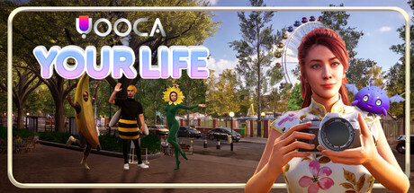
Yooca: Your Life capsule

Yooca: Your Life

Build your dream life in Yooca, a cozy multiplayer life sim set in a vibrant online city. Express yourself through deep avatar and home customization, bond with your loyal Yooca companion, and join a heartwarming community. From mini-games to chilling with friends, how will you live your best live?

Free to Play
Life SimCozyCharacter Customization
Youniverse Games Sdn. Bhd.Coming soon

Yooca: Your Life scores 70/100 — better than 26% of Life Sim capsules (n=1,099).

Free to Play · Released Coming soon · By Youniverse Games Sdn. Bhd.

Quick text summary

Yooca: Your Life scored 70/100 on Steam Analyzer — Good for a Life Sim capsule. Top priority fix: [uniqueness_polish] Introduce a signature visual element or distinctive color accent (e.g., Yooca companion creature, iconic location landmark) that appears consistently in branding to elevate from generic to memorable.

Capsule scores by dimension

  • Genre Clarity: 7/10 — Life sim gameplay evident but soft. The capsule clearly communicates a cozy life simulation through the relaxed pose, avatar customization focus (character holding camera), and vibrant casual setting with NPCs in the background. At tiny size, the character and street scene still read as a social/lifestyle game, though the specific 'multiplayer city life sim' angle softens compared to more genre-iconic imagery like farming, cooking, or clearly defined mechanics.
  • Title Readability: 8/10 — Strong title hierarchy, readable at small. The 'YOOCA' logo at top left is clean and legible with good contrast against the sky/foliage background. 'YOUR LIFE' in large, bright white text sits prominently below and reads clearly at small and tiny sizes. The tagline placement is unobtrusive and does not interfere with the core title legibility, though at tiny size only the main logo and 'YOUR LIFE' remain immediately readable.
  • Contrast & Color: 8/10 — Bright character stands out well. The protagonist's warm-toned skin, vibrant red hat, and light clothing create strong value separation against both the green foliage and dark Steam background. The character silhouette reads clearly even at small sizes due to the light foreground subject against darker mid and background layers. Color saturation is well-controlled and the focal character pops without overwhelming the scene.
  • Uniqueness & Polish: 6/10 — Competent but leans generic casual. The capsule demonstrates solid craft with clean lighting and a cohesive scene composition, but visually reads as a stock life-sim aesthetic rather than distinctive. The character pose, park setting, and casual dress-up focus are functional and recognizable, but lack a memorable hook or signature visual that distinguishes it from other cozy sims like Palia or similar titles. The photography prop (character holding camera) hints at gameplay but feels more decorative than central.
  • Brand Consistency: 6/10 — Soft identity, character-led recognition. The capsule relies on the protagonist's presence as the primary identity signal, with the distinct red beanie and approachable appearance as semi-memorable cues. The 'YOOCA' wordmark has a rounded, friendly typeface that aligns with casual sim branding. However, there are no iconic symbols, motifs, or distinctive palette that would anchor strong brand recall without the character present, making internal cohesion functional but not deeply memorable.
  • Composition: 7/10 — Clear focal point, well-balanced layout. The character occupies the right side of the frame as a strong primary focal point, with supporting NPCs and park scenery on the left providing context without competing for attention. Title sits safely at top left with ample margin. At tiny size the character remains the dominant read and the background street activity provides visual interest without clutter. The depth layering (foreground character, midground NPCs, background foliage) is clean and readable across all viewing sizes.

What works

  • High-contrast character silhouette. The protagonist's light clothing and red hat create strong visual separation against the darker background, ensuring clear focal point recognition even at tiny thumbnail size.
  • Clean title placement and legibility. YOOCA logo and YOUR LIFE text are positioned on a relatively controlled background region with good spacing, maintaining readability across all viewing sizes without collision with scene elements.
  • Balanced composition with depth. Foreground, midground (NPCs), and background (foliage) are layered effectively to guide the eye and create visual interest without scattering focus.

What hurts the capsule

  • Generic life-sim aesthetic. The park setting and casual character pose lack distinctive visual hooks that would differentiate this from other cozy sims in the same genre, reducing premium feel.
  • Weak brand identity signals. No iconic symbols, color signature, or memorable motif independent of the character presence make future brand recognition uncertain without strong art direction evolution.
  • Camera prop feels decorative. The character holding a camera hints at gameplay but reads more as a styling choice than a core mechanic clarifier, potentially confusing core loop communication.

Priority fixes

  1. [uniqueness_polish] Introduce a signature visual element or distinctive color accent (e.g., Yooca companion creature, iconic location landmark) that appears consistently in branding to elevate from generic to memorable.
  2. [genre_clarity] Consider adding subtle UI elements or gameplay hints (mini-game icons, companion presence, customization swatches) to more clearly communicate the depth of systems beyond casual avatar dressing.
  3. [brand_consistency] Develop a stronger iconic symbol or mascot character that could anchor brand recognition independent of the main protagonist to increase internal cohesion.

Store copy priority fixes

  1. [feature_communication] Clarify controller support status in a prominent note near the short description (e.g., 'Full controller support coming in Early Access') to resolve the tag contradiction.
  2. [hook_strength] Add a second sentence to the short description highlighting what makes Yooca mechanically or tonally different from other life sims, e.g., 'Your Yooca companion reacts to every moment, making progression feel deeply personal.'
  3. [genre_clarity] Briefly describe the two featured mini-games inline (e.g., 'Barista Challenge rhythm mini-game, Rhythm Nova beat-matching') to illustrate activity variety.
  4. [uniqueness] In the Game Highlights section, add a bullet point that explicitly positions Yooca against competitor games (e.g., 'Like Animal Crossing, but your companion grows with you and reacts to your choices in real-time').

Related guides

Steam app ID: 4138870 · Tags: Life Sim, Cozy, Character Customization, Online Co-Op, Building