Scoring genre clarity...

Flash Knight Nymphelia capsule

Flash Knight Nymphelia

A selfie-obsessed-girl-turned-transforming-heroine fights against an evil organization in a powered suit fueled with her stress from hiding her true self from public!

$17.995 user reviews
RPGStrategyAnime
midnight pleasureMar 13, 2026

Flash Knight Nymphelia scores 70/100 — better than 34% of RPG capsules (n=3,544).

5 user reviews · $17.99 · Released Mar 13, 2026 · By midnight pleasure

Quick text summary

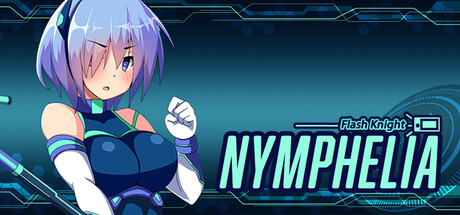
Flash Knight Nymphelia scored 70/100 on Steam Analyzer — Good for a RPG capsule. Top priority fix: [uniqueness_polish] Incorporate a visual cue that hints at the 'selfie obsessed' mechanic (e.g., phone UI frame, mirror reflection, or camera flash element) to differentiate from generic powered-suit anime games and communicate unique selling point.

Capsule scores by dimension

  • Genre Clarity: 7/10 — Anime action RPG clear. The powered suit, glowing cyan tech accents, and combat-ready pose immediately signal action-oriented gameplay with sci-fi/tech themes. The anime character style and neon HUD elements read as JRPG or action game at full size, though at TINY size the visual language becomes more generic anime rather than distinctly communicating RPG or strategy mechanics. Genre messaging is strong but doesn't uniquely differentiate this from other anime action titles.
  • Title Readability: 8/10 — Cyan glowing title strong. The 'NYMPHELIA' title uses bright cyan/turquoise glow that contrasts sharply against the dark background, with clean sans-serif letterforms and a tech-styled underline. At SMALL size (231x87) the title remains clearly readable with good spacing and the tech UI frame around it. At TINY (120x45) the text remains legible due to its bright color and size dominance, though fine details of the decorative frame blur slightly but don't compromise core text clarity.
  • Contrast & Color: 8/10 — Strong cyan pop clean. The bright cyan/turquoise title and character accent colors create excellent value separation against the dark teal-blue background (#1b2838 equivalent). The character's light hair and pink/blue color palette have good separation from the background despite some dark clothing, and the glowing neon effects amplify readability. In grayscale the composition maintains clear silhouettes with the character and title elements standing out distinctly.
  • Uniqueness & Polish: 6/10 — Competent anime aesthetic. The capsule demonstrates solid technical craft with the character render, glow effects, and UI framing that suggests a polished game. However, the overall visual language—anime girl in powered suit with neon accents—is a familiar trope in the indie RPG and action game space, and the capsule doesn't visually communicate the unique 'selfie-obsessed transforming heroine' hook or the thematic stress-fueled mechanic. The design feels competent but doesn't establish a distinctive identity that would stick in memory among similar titles.
  • Brand Consistency: 6/10 — Character icon potential. The character design and cyan/tech color palette provide internal cohesion and could form a recognizable icon if maintained across storefronts, but without visibility of the 5 store screenshots it is unclear whether this identity is consistently reinforced elsewhere. The character pose and style are memorable, but there are no other obvious brand cues (logo, symbol, motif) that would make this instantly recognizable as 'Flash Knight Nymphelia' rather than a generic anime action game. Consistency appears intact but identity strength is moderate.
  • Composition: 7/10 — Character focused well. The character occupies the center-left to center space with clear primary focus, while the title 'NYMPHELIA' anchors the right side, creating good left-to-right hierarchy and balance. At SMALL and TINY sizes the character silhouette remains the dominant focal point and the title text is prominent without competing. The tech UI frame and neon effects add depth layering, though at TINY size some of the decorative border detail fades; the core composition survives downsizing well but the frame elements become less impactful at tiny sizes.

What works

  • Bright cyan title contrast. The neon turquoise 'NYMPHELIA' text pops immediately against the dark background and remains readable at SMALL and TINY sizes due to high value contrast and bold letterform weight.
  • Strong character focal point. The anime character design and pose is the clear visual anchor at all sizes, with clean silhouette separation and bright accent colors that guide the eye naturally.
  • Coherent tech-anime aesthetic. The powered suit, glowing effects, and neon UI frame create internal stylistic cohesion and a professional finish that suggests a polished game.

What hurts the capsule

  • Generic anime trope. The 'anime girl in powered suit' visual is familiar across many indie action RPGs, lacking distinctive visual language that communicates the unique selfie-obsessed heroine hook.
  • Weak unique identity signal. There is no iconic symbol, motif, or brand mark (beyond the character) that would make this instantly recognizable as 'Flash Knight Nymphelia' versus other similar titles.
  • Frame detail fades at tiny. The decorative tech UI border and fine line details around the title become muddled at TINY size, reducing the premium crafted feel slightly.

Priority fixes

  1. [uniqueness_polish] Incorporate a visual cue that hints at the 'selfie obsessed' mechanic (e.g., phone UI frame, mirror reflection, or camera flash element) to differentiate from generic powered-suit anime games and communicate unique selling point.
  2. [brand_consistency] Introduce an iconic symbol or logo (e.g., a stylized phone icon, selfie motif, or stress-meter visual) that can anchor brand identity across storefronts and become instantly recognizable.
  3. [composition] Ensure decorative frame elements are simplified or optimized so fine detail remains legible at TINY size (120x45) without loss of premium polish perception.

Store copy priority fixes

  1. [hook_strength] Rewrite the short description to lead with the core gameplay verb: 'Command a transforming heroine through turn-based board-game battles where stress fuels her power—the more she fights, the stronger she becomes' to front-load genre clarity and mechanical uniqueness.
  2. [feature_communication] Expand the gameplay section with 2-3 sentences explaining combat mechanics (turn order, damage/stress gain per attack, skill types), party composition (solo or squad?), and how PEACE value directly affects winning the map/chapter.
  3. [audience_targeting] Add a 1-sentence tag at the end of the detailed description targeting the intended audience: 'For anime and turn-based tactics fans who love character-driven stories and unconventional power systems.'
  4. [uniqueness] Insert a sentence comparing or positioning the game: 'Unlike traditional magical-girl games, your heroine's power scales with her emotional struggle, making every setback a strategic advantage.'

Related guides

Steam app ID: 4147930 · Tags: RPG, Strategy, Anime, JRPG, Turn-Based Combat