Scoring genre clarity...
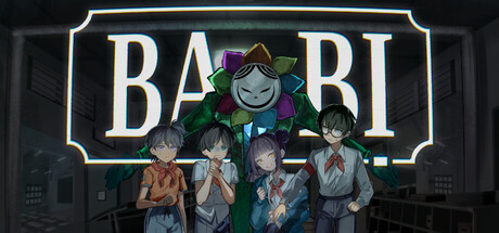
Ba Bị is the Boogeyman of Vietnamese folklore, the shadow that takes bad children away. You are one of four kids he has captured. Pass his twisted test in 15 mins to prove you’re a good child or pay the price. But the deeper you go, you realize this test was never really about grades.
$4.99Positive(40)
HorrorPsychological HorrorCrime
BaBị ElectricDec 12, 2025