Scoring genre clarity...

Little Rock Shop capsule

Little Rock Shop

Little Rock Shop is a casual clicker game all about rocks! Rockhound then polish those rocks! Donate to the museum to get upgrades, and sell the rest!

Early AccessExplorationCollectathon
Pacific Ember Studios, IncJul 14, 2026

Little Rock Shop scores 68/100 — better than 21% of Exploration capsules (n=5,125).

Released Jul 14, 2026 · By Pacific Ember Studios, Inc

Quick text summary

Little Rock Shop scored 68/100 on Steam Analyzer — Solid for a Exploration capsule. Top priority fix: [contrast_color] Increase saturation or introduce a warm accent color (ochre, rust, or deep teal) to create stronger silhouette separation from the dark background and improve tiny-size readability.

Capsule scores by dimension

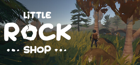
  • Genre Clarity: 7/10 — Clear exploration and collection vibe. The outdoor hiking setting with rocks and geological focus immediately communicates exploration and gathering mechanics. At tiny size, the character on a hillside with natural landscape reads as adventure/casual exploration rather than action or combat. The rock/mineral theme is visually present but not dominantly explicit at small sizes, relying on context to fully land.
  • Title Readability: 8/10 — Strong hierarchy with clean legibility. Title text 'LITTLE ROCK SHOP' uses bold white sans-serif with excellent contrast against the sky background, maintaining readability at small and tiny sizes. The decorative dots around 'SHOP' add personality without compromising clarity. Word spacing and scale hierarchy work well, though at tiny size the dots become less distinct and the full meaning depends on recognizing 'SHOP' as the key term.
  • Contrast & Color: 7/10 — Warm naturals with adequate separation. The outdoor scene features warm earth tones (browns, greens, sky blues) that provide reasonable contrast against the dark Steam background #1b2838. The white text pops cleanly, and the character silhouette separates from mid-tones, though the overall palette is naturally muted rather than vibrant. In grayscale, the title maintains clarity but the landscape loses some visual punch at tiny size.
  • Uniqueness & Polish: 6/10 — Competent but thematically niche. The capsule presents a cohesive outdoor adventure aesthetic with intentional typography and character placement, avoiding template feel. However, the visual hook is modest—hiking/geology is a narrow theme that doesn't immediately signal a standout mechanic or unique selling point beyond the 'rocks plus shop' premise. Craft is solid but not memorable or distinctive compared to the benchmark list.
  • Brand Consistency: 6/10 — Internal coherence without iconic anchor. The natural world palette and character style are internally consistent, and the 'Little Rock Shop' wordplay suggests a coherent brand identity. However, without access to repeated brand motifs or a signature visual element (character design, color symbol, or icon), the capsule lacks a recognizable identity cue that would distinguish it in a store listing. The tone is friendly but not distinctive.
  • Composition: 7/10 — Balanced landscape with clear focal hierarchy. The composition places the character as a secondary focal point in the lower-middle landscape, with the title anchored in the upper-left to upper-center region with clean sky background. This avoids the cluttered center and allows title breathing room. At small size, the composition reads well with clear foreground/midground/background separation, though at tiny size the character becomes less distinct and the landscape compresses into a generic naturalistic blur.

What works

  • Title contrast and placement. Bold white sans-serif text positioned on clear sky background ensures legibility at all sizes, with decorative dots adding personality without sacrificing readability.
  • Genre intent clarity. Outdoor hiking setting with character and natural landscape immediately communicates exploration and casual adventure without visual confusion.
  • Composition depth. Layered landscape with distinct foreground, midground, and background creates visual interest and safe margins for title placement.

What hurts the capsule

  • Lack of iconic visual hook. The capsule presents a competent outdoor scene but lacks a memorable character, symbol, or color motif that would signal uniqueness in quick scroll.
  • Muted color palette impact. Natural warm tones work internally but don't provide strong separation from the Steam dark background, limiting visual pop and quick recognition.
  • Rock/mineral theme underexplored. Despite the shop being fundamentally about rocks and geology, the capsule doesn't visually emphasize geological specimens or the core shop mechanic, relying on title context.

Priority fixes

  1. [contrast_color] Increase saturation or introduce a warm accent color (ochre, rust, or deep teal) to create stronger silhouette separation from the dark background and improve tiny-size readability.
  2. [uniqueness_polish] Add a distinctive visual element such as a unique rock/mineral motif, character design feature, or visual metaphor that signals the core shop+geology premise at small size.
  3. [genre_clarity] Include a subtle UI hint or object (shop counter, rock sample, lapidary tool) in the scene to explicitly signal the shop and crafting mechanics beyond hiking alone.

Store copy priority fixes

  1. [hook_strength] Rewrite the short description opening to lead with the most compelling verb and emotional resonance: e.g., 'Hunt for rare geological treasures, craft them into beautiful jewelry, and grow your rock shop from ruin to thriving community hub.'
  2. [feature_communication] Expand the crafting section to explicitly explain progression: 'Unlock new carving techniques and jewelry designs as you level your lapidary skills, unlocking higher-value items and new customer types.'
  3. [audience_targeting] Add a line specifying playtime, complexity level, or session structure: e.g., 'Perfect for 15-30 minute sessions or relaxed long-play sessions—play at your own pace with no time pressure or combat.'
  4. [uniqueness] Articulate why this rock-focused experience stands apart: e.g., 'The only shop game where geology is the core—discover real mineral varieties, learn authentic lapidary techniques, and cater to a community obsessed with stones.'

Related guides

Steam app ID: 4205970 · Tags: Exploration, Shop Keeper, Sandbox, Casual, Character Customization