Scoring genre clarity...
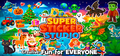
Create cozy sticker art, personalize greeting cards & comics! The perfect Sticker Book Game for Kids, Toddlers & adults. Drag & drop cute stickers from Christmas, Farm, Dinosaurs, Space, Knights, Halloween, Ocean, Construction & more. Relaxing creative fun for kids and adults – design, share, enjoy!
$7.99
Family FriendlyIndieSimulation
McpeppergamesDec 22, 2025