Scoring genre clarity...
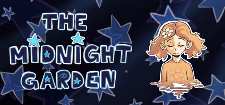
Children wake to whispers coming from their wardrobes, voices that call them from inside telling them to enter. Some even tell wild stories, all describing a place they call the “Midnight Garden”. A story driven rpg blending fairytale and nightmares.
$2.993 user reviews
RPGAction RPGInteractive Fiction
MonstrrApr 25, 2026