FloraLumina scores 80/100 — better than 84% of Idler capsules (n=1,270).

Quick text summary

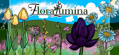
FloraLumina scored 80/100 on Steam Analyzer — Good for a Idler capsule. Top priority fix: [title_readability] Increase title font weight or add subtle outline to maintain legibility at tiny size without losing elegance

Capsule scores by dimension

  • Genre Clarity: 9/10 — Peaceful gardening sim instantly clear. The capsule communicates casual gardening through abundant hand-drawn flowers, lush green grass, and a serene pastoral setting with blue sky. At tiny size, the diverse flora arrangement and soft color palette immediately signal a relaxing, nature-focused game rather than action or strategy. The whimsical flower designs and peaceful composition leave no ambiguity about genre.
  • Title Readability: 8/10 — Elegant script, solid at small. The title 'FloraLumina' is rendered in an elegant black script font centered above the garden scene with strong white contrast. At small size it remains legible, though the decorative font loses some clarity at tiny size due to thin letterforms; however, the placement on a clean sky region helps readability. The ornamental style fits the premium, whimsical aesthetic without collapsing completely at thumbnail scale.
  • Contrast & Color: 8/10 — Vibrant palette pops well. The capsule features a bright, saturated color scheme with vivid greens, purples, blues, and white flowers that stand out strongly against the dark Steam background. The sky gradient and flower colors create excellent value separation across the composition. At tiny size, the dark purple bloom and bright daisies maintain distinct silhouettes, ensuring visual pop during quick scroll.
  • Uniqueness & Polish: 8/10 — Hand-drawn charm and premium craft. The artwork demonstrates clear hand-drawn quality with intentional illustration style, varied flower designs, and cohesive artistic direction that feels premium and distinctive. The central dark purple bloom and asymmetrical flower arrangement showcase thoughtful composition rather than generic asset placement. Compared to top indie games like Tiny Glade and Moonstone Island, this maintains strong visual identity with careful attention to palette harmony and botanical variety.
  • Brand Consistency: 7/10 — Cohesive art style, recognizable identity. The capsule establishes a clear visual identity through consistent hand-drawn illustration, a signature soft pastel-to-vibrant color palette, and recurring botanical motifs. The whimsical flower designs and peaceful aesthetic would be recognizable across marketing materials and screenshots. The art direction is coherent, though without strong iconic characters or symbols beyond the distinct purple bloom that could serve as a logo anchor.
  • Composition: 8/10 — Clear hierarchy, balanced focal point. The dark purple bloom positioned left-center serves as a strong primary focal point, with white daisies and yellow tulips supporting the composition without competing. Foreground flowers anchor the bottom, sky occupies the upper third, and green grass creates a clear midground layer. At small and tiny sizes, the focal point hierarchy remains intact, though the right-side elements (right daisies) approach edge territory without critical loss.

What works

  • Genre clarity at all sizes. The peaceful gardening theme is instantly recognizable even at tiny thumbnail scale due to abundant, distinctive flowers and pastoral setting.
  • Strong hand-drawn aesthetic. The illustration quality and botanical variety elevate the capsule above generic asset templates and establish premium visual identity.
  • Excellent color contrast. Vibrant purples, blues, greens, and whites pop clearly against the dark Steam background while maintaining soft, cohesive palette harmony.
  • Clear focal point hierarchy. The central dark purple bloom guides attention naturally without scattered emphasis, maintaining readability at reduced sizes.

What hurts the capsule

  • Title font loses crispness at tiny. The decorative script letterforms become thin and slightly fuzzy at thumbnail scale, reducing legibility despite good contrast.
  • Right-side elements close to edge. The cluster of white daisies on the far right sits near the crop boundary, risking partial cutoff on some Steam display contexts.
  • Limited iconic visual anchor. While visually cohesive, the capsule lacks a memorable character, logo, or symbol that would serve as a persistent brand marker across contexts.

Priority fixes

  1. [title_readability] Increase title font weight or add subtle outline to maintain legibility at tiny size without losing elegance
  2. [composition] Shift the rightmost daisies inward to create safe margin space and prevent edge cropping
  3. [brand_consistency] Consider introducing a subtle logo or recurring visual motif that anchors the brand identity across store assets

Store copy priority fixes

  1. [uniqueness] Add a sentence explaining the mechanic impact of weather: e.g., 'Flowers respond uniquely to sunlight and moonlight, meaning your garden is never static—same flowers grow differently at dawn vs. dusk, creating reasons to keep watching and tending.'
  2. [feature_communication] Clarify the monetization model for shop upgrades in a single phrase like 'cosmetic decorations and growth-boosting upgrades' to remove ambiguity about pay-to-win concerns.
  3. [hook_strength] Revise the opening line to lead with the core differentiator: 'Design a living garden where sunlight, moonlight, and weather dynamically shape how your hand-drawn flowers grow—then watch it flourish at your own pace' to make the mechanic immediately appealing.

Related guides

Steam app ID: 4222800 · Tags: Idler, Cozy, Casual, Hand-drawn, Time Management