Scoring genre clarity...

By Myself capsule

By Myself

A 2D horror and psychological-horror game based on puzzles and mysteries to uncover the truth about a child left alone. Engaging mechanics, a memorable story, and original soundtracks.

$0.993 user reviews
RPGExplorationPuzzle
UDStudioMar 6, 2026

By Myself scores 70/100 — better than 34% of RPG capsules (n=3,544).

3 user reviews · $0.99 · Released Mar 6, 2026 · By UDStudio

Quick text summary

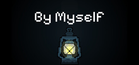
By Myself scored 70/100 on Steam Analyzer — Good for a RPG capsule. Top priority fix: [uniqueness_polish] Introduce a child silhouette, shadow, or hand reaching toward or holding the lantern to visually communicate the 'child left alone' core narrative and differentiate from generic object-on-black templates.

Capsule scores by dimension

  • Genre Clarity: 7/10 — Pixel horror with mystery vibe. The pixelated lantern centered in frame immediately reads as an atmospheric, lonely object—fitting for a psychological-horror puzzle game about isolation. The muted dark palette and solitary object composition reinforce introspection and unease, though at tiny size the lantern silhouette is clear but the specific horror-puzzle subgenre is only implied, not explicit. Genre reads reliably at small and full size but lacks UI or character cues that would nail indie-horror recognition instantly.
  • Title Readability: 8/10 — Clean pixel font, strong placement. The title 'By Myself' uses a crisp, all-caps pixel typeface positioned in the upper third with excellent contrast against the near-black background. At full and small sizes it reads cleanly with good letter separation; at tiny size the text remains legible though individual letterforms begin to compress slightly. Strategic top placement keeps it away from the focal-point lantern and safe from Steam crop margins.
  • Contrast & Color: 8/10 — High value separation, clear silhouette. The pale cream-yellow lantern with teal-gray metal frame creates strong luminance contrast against the pure black background, reading clearly as a distinct object at all sizes. The warm glow inside the lantern provides internal visual depth without losing silhouette integrity. Grayscale mental test confirms excellent value separation—the lantern would remain the clear focal point even in monochrome, and no muddy mid-tones compromise edge clarity.
  • Uniqueness & Polish: 6/10 — Minimal, competent, but generic. The pixelated lantern is cleanly rendered and thematically appropriate for a lonely-child mystery narrative, but the composition—single centered object on black void—is a common minimalist template across indie games. While the execution is polished, there is no distinctive art direction, character presence, or visual storytelling hook that sets it apart from dozens of other indie-horror capsules using similar solitary-object strategies. The lantern alone does not communicate a unique mechanic or memorable selling point.
  • Brand Consistency: 6/10 — Isolated lantern, no recurring identity. The lantern is thematically consistent with the game's isolation and mystery premise, but in isolation it lacks iconic character, symbol, or signature visual motif that would build recognizable brand identity across store pages. Without reference to the five available screenshots, there are no internal design cues—color palette, typography treatment, or recurring asset—that suggest a cohesive visual language beyond the single lantern. The minimalist approach is intentional but does not yet establish memorable brand recognition.
  • Composition: 7/10 — Centered focal point, good balance. The lantern sits in a perfectly centered vertical hierarchy with title above and black void below, creating immediate visual clarity and a single dominant focal point at all sizes. Safe margins protect all key elements from Steam's crop boundaries; the title and lantern both sit well within safe zones. At tiny size the composition remains readable with zero competition or clutter, though the centered symmetry is formulaic and the lower third sits partially unused, which could feel slightly imbalanced to some viewers.

What works

  • Title legibility at all sizes. Crisp pixel font with strong contrast and clear spacing maintains full readability from full header down to tiny thumbnail without degradation.
  • High contrast focal point. Pale lantern with internal glow reads as a distinct, luminous object against near-black background across all viewing conditions including grayscale.
  • Safe margins and composition stability. Centered vertical hierarchy keeps title and lantern well within Steam's crop zones with zero risk of important elements being cut off at any aspect ratio.

What hurts the capsule

  • Generic minimalist template. The single-object-on-black composition is overused in indie horror and does not distinguish this capsule from competitors like Dredge or similar mystery games.
  • No visual storytelling or unique hook. The lantern alone does not hint at the game's core mechanic, child protagonist, or psychological-horror angle—it is a thematic placeholder rather than a signature visual.
  • Lack of recurring brand identity. No iconic character, color palette, or symbol system is visible that could build consistency across store pages and establish long-term brand recognition.

Priority fixes

  1. [uniqueness_polish] Introduce a child silhouette, shadow, or hand reaching toward or holding the lantern to visually communicate the 'child left alone' core narrative and differentiate from generic object-on-black templates.
  2. [brand_consistency] Establish a signature color accent or secondary motif (e.g., a faint compass rose, puzzle symbol, or warm orange underglow) that can be threaded through store screenshots to build cohesive brand identity.
  3. [composition] Add subtle atmospheric detail (e.g., faint fog, distant window outline, or subtle texture gradation) to the lower void to fill unused real estate and add visual depth without introducing clutter at tiny size.

Store copy priority fixes

  1. [uniqueness] Replace generic claims ("memorable," "original") with one concrete differentiator—e.g., 'the only game where timer failures permanently alter the house layout' or 'a non-linear puzzle structure that changes based on which items you find first.'
  2. [hook_strength] Revise the short description to lead with the atmospheric hook from the detailed description (e.g., 'A psychological horror where silence itself is the enemy as you uncover mysteries while trapped in your own home') rather than feature listing.
  3. [audience_targeting] Add one explicit signal about player profile or difficulty expectation—e.g., 'For players who love story-driven horror and don't mind psychological tension' or specify if this is beginner-friendly or hardcore-focused.

Related guides

Steam app ID: 4226680 · Tags: RPG, Exploration, Puzzle, Cute, Top-Down