Scoring genre clarity...
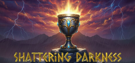
The world has been plunged into Eternal Darkness, and the Ancient Shadows have awakened, consuming everything in their path. According to Elder legends, only the Elixir of Light can dispel the darkness and banish evil back into the void.
$0.497 user reviews
RPGMatch 3Casual
Reanim GamesDec 20, 2025