Scoring genre clarity...
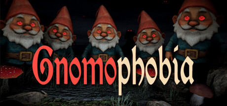
Gnomophobia is an unsettling escape-horror game where gnomes stalk you through a themed forest, staying frozen only while you’re watching them. Follow the chain of visual clues hidden in notes, outsmart the gnomes’ relentless pursuit, and find the way out of the forest!
$2.994 user reviews
Psychological HorrorSurvival HorrorWalking Simulator
Void ChamberDec 26, 2025