Scoring genre clarity...
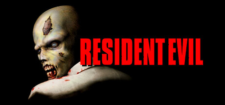
Resident Evil (1996) capsule

Resident Evil (1996)

Your squad has been choppered to a remote mansion to investigate a bio-experiment gone wrong. You’re plunged straight into a deathtrap. Arm yourself, solve puzzles, and unearth mysteries. But beware: every move you make draws you deeper into the deadly embrace of Resident Evil.

$9.99Very Positive(91)
Survival HorrorActionAdventure
CAPCOM Co., Ltd., GOG.comApr 1, 2026

Resident Evil (1996) scores 90/100 — better than 100% of Survival Horror capsules (n=1,308).

Very Positive (91 reviews) · $9.99 · Released Apr 1, 2026 · By CAPCOM Co., Ltd.

Quick text summary

Resident Evil (1996) scored 90/100 on Steam Analyzer — Excellent for a Survival Horror capsule. Top priority fix: [genre_clarity] Consider subtle background environmental cues (mansion architecture detail, biohazard symbol) to hint at investigation and puzzle-solving beyond pure combat threat.

Capsule scores by dimension

  • Genre Clarity: 9/10 — Horror action immediately clear. The grotesque zombie-like creature with decayed flesh, exposed eye socket, and menacing pose instantly signals survival horror. The visceral makeup and aggressive posture communicate danger and combat-focused gameplay at all sizes, including tiny thumbnail where the skull silhouette and pale coloring remain unmistakable.
  • Title Readability: 10/10 — Bold iconic text perfectly legible. Large red sans-serif 'RESIDENT EVIL' dominates the composition with exceptional contrast against the black background and pale character. Text remains fully readable and striking at small and tiny sizes due to thick letterforms, generous spacing, and strategic placement in the upper-right safe zone without obscuring the focal point.
  • Contrast & Color: 9/10 — Strong value separation throughout. Pale zombie face, red title text, and black void background create clear three-point contrast hierarchy that survives grayscale conversion. The bright flesh tones and vivid red lettering pop sharply against the dark background, maintaining silhouette clarity and edge definition even at tiny thumbnail size during quick scroll.
  • Uniqueness & Polish: 8/10 — Iconic horror imagery distinctive. The character design is recognizable and memorable as a series-defining visual from the 1996 original, with careful makeup detail and professional cinematography that elevates it beyond generic zombie fare. While straightforward in approach, the execution is polished and immediately distinctive within horror action genre, though it follows a classic formula rather than innovating new visual language.
  • Brand Consistency: 9/10 — Signature series visual identity. This image is the canonical key art for Resident Evil 1996 and establishes the franchise's visual DNA: grotesque bioweapon aesthetic, stark high-contrast lighting, and bold red title treatment. The style is instantly recognizable as Resident Evil and would be consistent across promotional materials, maintaining strong brand identity signals through the zombie creature design and color palette.
  • Composition: 9/10 — Clear focal hierarchy with breathing room. The zombie creature anchors the left and center space as dominant focal point while the title text occupies the right upper quadrant without competing, creating natural eye flow. Strong depth separation between character and void background prevents clutter, safe margins protect all elements from Steam cropping, and the asymmetrical balance feels intentional and premium across all viewing sizes.

What works

  • Iconic memorable character. The grotesque zombie creature is instantly recognizable as Resident Evil 1996 key art and serves as a strong brand identity anchor that differentiates from generic horror competitors.
  • Exceptional title contrast and scale. Bold red sans-serif text maintains perfect legibility at all sizes including tiny thumbnail, with strategic upper-right placement that avoids competing with the focal character.
  • Genre immediately communicated. The decayed makeup, exposed features, and menacing pose leave no ambiguity about survival horror gameplay at even the smallest thumbnail resolution.
  • Professional premium presentation. Clean cinematographic lighting, polished makeup effects, and careful composition create a high-quality perception that signals AAA production value.

What hurts the capsule

  • Minimal visual storytelling. The capsule shows threat and aesthetic but does not communicate core gameplay mechanics like puzzles, investigation, or squad-based tactics that differentiate RE from other action horror games.
  • Static pose limits dynamism. The stationary character pose with crossed arms is intimidating but less dynamic than action-focused competitors like Black Myth: Wukong or Helldivers 2 that show movement or tactical positioning.

Priority fixes

  1. [genre_clarity] Consider subtle background environmental cues (mansion architecture detail, biohazard symbol) to hint at investigation and puzzle-solving beyond pure combat threat.
  2. [uniqueness_polish] Evaluate whether adding gameplay-relevant UI elements or atmospheric effects (RE series laser grid, ammunition counter, or map interface) would enhance distinctiveness without cluttering the iconic character.

Store copy priority fixes

  1. [feature_communication] Condense the graphics settings section into one paragraph: 'Enhanced graphics include new rendering options (windowed mode, anti-aliasing, aspect ratio correction) and improved timing for cutscenes' rather than technical specification lists.
  2. [uniqueness] Add a sentence after 'uncut' explaining the value: e.g., 'Experience the uncut original that defined survival horror, now with modernized graphics and controls for contemporary players.'
  3. [audience_targeting] Insert a clarifying phrase in the short description to signal replay value: 'Choose from two protagonists with unique abilities and storylines' to help players understand longevity.
  4. [hook_strength] Move the tagline 'Evil Has a New Address. Yours.' to immediately after the short description setup rather than burying it, for punchier first impression.

Related guides

Steam app ID: 4249100 · Tags: Survival Horror, Action, Adventure, Horror, Survival