Scoring genre clarity...
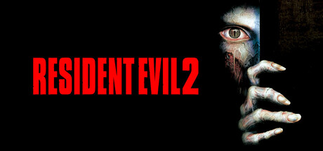
Resident Evil 2 (1998) capsule

Resident Evil 2 (1998)

Command Leon S. Kennedy, a rookie cop who stumbles onto the carnage reporting for his first duty, or play as Claire Redfield, desperately searching for her missing brother. Cutting edge 3-D accelerated graphics that create a terrifying, photo-realistic experience.

$9.99Very Positive(113)
Survival HorrorActionHorror
CAPCOM Co., Ltd., GOG.comApr 1, 2026

Resident Evil 2 (1998) scores 90/100 — better than 100% of Survival Horror capsules (n=1,308).

Very Positive (113 reviews) · $9.99 · Released Apr 1, 2026 · By CAPCOM Co., Ltd.

Quick text summary

Resident Evil 2 (1998) scored 90/100 on Steam Analyzer — Excellent for a Survival Horror capsule. Top priority fix: [uniqueness_polish] Consider incorporating a subtle environmental or character detail (e.g., a hint of Raccoon City police station or Leon/Claire silhouette) to deepen narrative communication without sacrificing the iconic hand design.

Capsule scores by dimension

  • Genre Clarity: 9/10 — Horror action immediately recognizable. The grotesque hand, pale eye, and survival horror visual language are unmistakable at all sizes. Even at tiny thumbnail size, the eerie pale flesh and iconic horror pose communicate 'dark action-horror' without ambiguity. The imagery perfectly establishes survival horror genre expectations.
  • Title Readability: 10/10 — Bold title stands out at all sizes. RESIDENT EVIL 2 in bright red block lettering against pure black background maintains perfect legibility from full size down to tiny 120×45 thumbnail. The high-contrast color choice, bold sans-serif weight, and clean isolation on black ensure zero loss of readability under quick scroll conditions. Strategic left-side placement keeps text away from the competing hand imagery on the right.
  • Contrast & Color: 9/10 — Extreme value separation and silhouette. Bright red title and pale white/cream flesh tones create maximum contrast against the pure black background (#1b2838 baseline). The grayscale squint test shows clear silhouette separation—the hand and eye remain distinct even when color information collapses. Strong lighting on the flesh element creates depth and ensures the subject never blends into the dark field.
  • Uniqueness & Polish: 8/10 — Iconic horror imagery with restrained craft. The mysterious hand emerging from darkness with a single glowing eye is a memorable, signature horror visual that feels intentional and premium. While the design is relatively minimal, it avoids generic template feel through strong thematic focus and visual storytelling—this is horror cinema, not stock art. The restraint and focus on a single unsettling detail elevates it above generic horror treatments.
  • Brand Consistency: 9/10 — Instantly recognizable RE2 identity. The pale corpse-like hand, single eye, and blood-red title font are consistent with Resident Evil 2's established horror branding and visual language from the 1998 release. The color palette and grotesque-yet-elegant minimalism align with the franchise's photorealistic horror positioning. This capsule could be identified as Resident Evil 2 specifically due to these iconic visual markers.
  • Composition: 9/10 — Clear hierarchy with balanced negative space. The title occupies strong left-third real estate while the hand and eye anchor the right side, creating natural balance without clutter. The composition uses substantial black space effectively to let the horror imagery breathe and prevents visual overload. At small and tiny sizes, the focal point remains clear—the eye draws attention while the title reads instantly without competing for prominence.

What works

  • Title legibility at all sizes. Red bold sans-serif on pure black maintains perfect readability from full resolution down to 120×45 thumbnail with zero degradation.
  • Strong genre communication. Grotesque pale hand and eye immediately signal survival horror without any ambiguity, even in a brief scroll.
  • Iconic franchise recognition. The specific visual combination is unmistakably tied to RE2's horror identity and would be recognizable across multiple viewings.
  • Excellent contrast strategy. Pure black background with bright red and pale cream creates maximum value separation that reads in both color and grayscale.

What hurts the capsule

  • Minimal visual storytelling scope. The capsule shows a generic horror hand rather than distinctive character or setting that hints at RE2's unique plot—Leon and Claire's stories are invisible.
  • Limited visual depth layering. The composition relies on silhouette and contrast rather than rich foreground-midground-background layering, feeling slightly flat despite strong graphic design.

Priority fixes

  1. [uniqueness_polish] Consider incorporating a subtle environmental or character detail (e.g., a hint of Raccoon City police station or Leon/Claire silhouette) to deepen narrative communication without sacrificing the iconic hand design.
  2. [composition] Evaluate whether a subtle texture or atmospheric fog in the black background could add dimensionality while maintaining the stark contrast that makes the title readable.

Store copy priority fixes

  1. [feature_communication] Replace the bulk of technical settings documentation with 1-2 sentences describing core gameplay (e.g., 'Solve environmental puzzles, manage limited ammo, and navigate zombie-infested police stations in real-time combat and exploration').
  2. [hook_strength] Move or expand the Extreme Battle Mode description into the short description or opening paragraph to reinforce replayability and appeal beyond nostalgia.
  3. [audience_targeting] Add a brief orientation sentence early in the detailed description for newcomers (e.g., 'New to Resident Evil 2? Experience the landmark 1998 survival horror that defined the genre, now enhanced for modern PCs.').
  4. [uniqueness] Clarify the value of the GOG partnership and explain why 'both original U.S. and Japanese versions' matter to players, or consolidate technical improvements into a single 'Quality of Life' section that does not monopolize the copy.

Related guides

Steam app ID: 4249110 · Tags: Survival Horror, Action, Horror, Adventure, Zombies