Scoring genre clarity...

MeltyFlow: A Cozy Desktop Lava Lamp capsule

MeltyFlow: A Cozy Desktop Lava Lamp

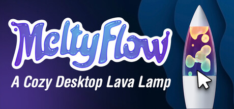
A cozy desktop lava lamp you can shape, touch, and customize. Watch glowing liquid melt and flow, nudge it like a digital fidget, and use timers and a minimalistic to-do list to support focus while adding warm ambience to your workspace.

$2.99Positive(21)
Desktop CompanionRelaxingCasual
Raffaele PiccaFeb 13, 2026

MeltyFlow: A Cozy Desktop Lava Lamp scores 82/100 — better than 66% of Desktop Companion capsules (n=86).

Positive (21 reviews) · $2.99 · Released Feb 13, 2026 · By Raffaele Picca

Quick text summary

MeltyFlow: A Cozy Desktop Lava Lamp scored 82/100 on Steam Analyzer — Good for a Desktop Companion capsule. Top priority fix: [title_readability] Remove or significantly enlarge the tagline text, or reposition it to ensure it remains readable at small sizes—consider moving it above the main title or integrate it into a secondary treatment

Capsule scores by dimension

  • Genre Clarity: 8/10 — Clear utility-casual hybrid identity. The lava lamp visual immediately communicates a desktop utility with cozy, relaxing vibes. The animated lava lamp icon on the right side is the core visual hook that distinguishes this from generic productivity software, and it reads clearly even at tiny size. The tagline 'A Cozy Desktop Lava Lamp' reinforces the genre positioning, though at tiny size only the lava lamp silhouette carries the message.
  • Title Readability: 8/10 — Strong title with minor tagline loss. The 'MeltyFlow' logo is bold, stylized, and maintains legibility at small and tiny sizes due to its thick outline and high contrast against the dark background. The tagline text 'A Cozy Desktop Lava Lamp' becomes difficult to read at tiny size but the main title remains clear. The purple-to-white gradient outline on the logo provides excellent separation from the dark blue background.
  • Contrast & Color: 9/10 — Excellent value separation and vibrancy. The neon purple MeltyFlow logo pops dramatically against the dark blue gradient background, with strong value contrast that persists in grayscale. The colorful lava lamp on the right (greens, yellows, purples) creates bright focal points that stand out clearly even at tiny size. The white outline treatment on the logo and the lamp's bright highlights ensure no muddiness or blending into the background.
  • Uniqueness & Polish: 8/10 — Distinctive style with premium craft. The neon-styled typography and glowing lava lamp create a cohesive, memorable aesthetic that sets this apart from typical desktop utility capsules. The lava lamp illustration shows intentional detail (layered colors, glow effects, cursor icon) that communicates both the product and its interactive nature. The design feels intentional and polished rather than templated, though it operates within familiar cozy-casual conventions.
  • Brand Consistency: 7/10 — Coherent identity with iconic element. The lava lamp serves as a strong brand anchor that would be instantly recognizable across store pages and marketing materials. The purple neon aesthetic creates a consistent visual signature, and the overall warm-meets-modern color palette (purple, gold, green on dark blue) supports brand recall. Without seeing all store screenshots, the strong lava lamp motif suggests good internal consistency across the brand ecosystem.
  • Composition: 9/10 — Balanced hierarchy with clear focal point. The title occupies the left-center with the lava lamp on the right creating perfect compositional balance without clutter or dead space. The eye naturally reads the large title first, then gravitates to the distinctive lava lamp illustration, establishing a clear visual hierarchy. The safe margins around all edges protect important elements from Steam's cropping, and the design remains legible and effective at all tested sizes from full header to tiny thumbnail.

What works

  • Neon logo pops brilliantly. The purple-outlined 'MeltyFlow' text with white inner glow creates exceptional contrast against the dark blue background and remains instantly readable at tiny sizes.
  • Lava lamp is iconic visual anchor. The illustrated lava lamp on the right side immediately communicates the product's purpose and creates a memorable brand element that would be recognizable across touchpoints.
  • Strong compositional balance. The left-right placement of title and lamp creates natural visual balance with no wasted space, and the design hierarchy guides the eye effectively from text to illustration.
  • Genre identity clear at all sizes. Even at tiny thumbnail size, the neon aesthetic combined with the lava lamp silhouette successfully communicates 'cozy desktop utility' without ambiguity.

What hurts the capsule

  • Tagline unreadable at tiny size. The 'A Cozy Desktop Lava Lamp' text becomes illegible at thumbnail size and provides no meaningful information at that scale, making it potential wasted real estate.
  • Limited brand consistency signals. While the lava lamp is strong, there are no other recurring visual elements (character, symbol, or pattern) that extend the brand identity beyond this single illustration.

Priority fixes

  1. [title_readability] Remove or significantly enlarge the tagline text, or reposition it to ensure it remains readable at small sizes—consider moving it above the main title or integrate it into a secondary treatment
  2. [brand_consistency] Establish a secondary brand motif (cursor icon, particle effect, or geometric element) that appears consistently across store screenshots to strengthen overall brand recognition beyond the lava lamp alone

Store copy priority fixes

  1. [feature_communication] Add a brief feature summary paragraph early in the detailed description listing the main features: '19 designs, 40+ presets, full customization, focus timers, to-do list, and sharing' to help skimmers grasp the scope immediately.
  2. [audience_targeting] Add one sentence explicitly naming the target audience: 'Perfect for remote workers, students, creatives, and anyone seeking calm focus during their workday' to strengthen immediate relevance.
  3. [uniqueness] Strengthen the 'only game where' angle by adding a comparison statement such as 'Unlike passive screensavers, MeltyFlow responds to your touch and remembers your personal creations' to clarify why this is different from alternatives.
  4. [hook_strength] Consider rephrasing the opening to lead with interaction first: 'Touch, shape, and customize a glowing lava lamp that responds to your hands and supports your focus' to emphasize the tactile hook even more prominently.

Related guides

Steam app ID: 4255630 · Tags: Desktop Companion, Relaxing, Casual, Atmospheric, Utilities