Scoring genre clarity...
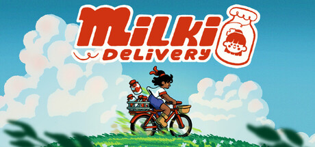
Milki Delivery capsule

Milki Delivery

Rebuild a community one bottle at a time in this tiny delivery adventure with your pet cow Milki. Gather resources and upgrade your barn, then bike along dirt paths, breezy meadows, and seaside cliffs to bring fresh milk back to the sleepy countryside.

AdventureExplorationCozy
Blibloop, Doot2026

Milki Delivery scores 85/100 — better than 98% of Adventure capsules (n=8,231).

Released 2026 · By Blibloop

Quick text summary

Milki Delivery scored 85/100 on Steam Analyzer — Excellent for a Adventure capsule. Top priority fix: [title_readability] Ensure the 'DELIVERY' tagline remains equally bold and outlined as the main 'Milki' text to maintain logo cohesion at tiny sizes, or consider reducing its visual weight intentionally.

Capsule scores by dimension

  • Genre Clarity: 8/10 — Clear casual delivery adventure. The capsule immediately communicates a cozy delivery/farming simulation through the bicycle, character on grass, pastoral sky, and the Milki Delivery branding with a milk bottle icon. At tiny size, the silhouette of the character on bike against bright sky reads as outdoor adventure, and the milk bottle logo reinforces the resource delivery theme. The whimsical art style and pastel colors align perfectly with indie casual gaming expectations.
  • Title Readability: 9/10 — Bold, legible logo design. The 'Milki Delivery' logo uses a strong red-orange italic typeface with crisp white outlines that contrasts sharply against the teal-blue background. At small and tiny sizes, the logo remains highly readable due to thick letterforms, wide letter spacing, and the distinctive milk bottle icon on the right that reinforces brand identity instantly. The compact logo placement in the upper portion leaves no ambiguity even at thumbnail size.
  • Contrast & Color: 9/10 — Excellent value separation throughout. The composition uses a bright teal-blue sky as a clean backdrop that creates strong contrast with the warm red-orange logo, white clouds, and the character's dark silhouette in the middle ground. The green grass layer and figure pop clearly against the sky in both full and tiny sizes, and the grayscale test confirms distinct value separation across all major elements. The limited but purposeful palette prevents muddy mid-tones and ensures silhouettes read clearly at any viewing size.
  • Uniqueness & Polish: 8/10 — Charming art style, intentional craft. The capsule displays a cohesive hand-drawn or stylized aesthetic with clean vector-like rendering, warm pastel colors, and a gentle whimsical tone that feels premium and distinct from generic farming sims. The character riding a bicycle with cargo, the fluffy cumulus clouds, and the branded milk bottle all communicate a specific visual identity and core mechanic—countryside delivery—rather than generic farming. The overall execution suggests intentional art direction and avoids cheap asset vibes or template look.
  • Brand Consistency: 8/10 — Recognizable identity with signature elements. The Milki Delivery logo, milk bottle icon, pastoral color palette (teal sky, green grass, warm orange), and whimsical character art form a cohesive internal identity that would be recognizable across store pages. The illustration style is consistent with the branded logo treatment, and the cheerful tone is reinforced by the character pose, cloud shapes, and overall composition. The milk bottle and bicycle are iconic motifs that anchor brand recognition without relying on external references.
  • Composition: 9/10 — Strong focal hierarchy and balance. The logo anchors the top-left region with strategic placement on a controlled background, while the character-on-bicycle occupies the clear focal center against the bright sky, creating excellent primary and secondary hierarchy. The clouds and grass frame the composition naturally without clutter, and safe margins protect all key elements from Steam cropping. At tiny size, the eye naturally reads logo first, then center character, then supporting elements—a textbook example of effective spatial composition.

What works

  • Logo contrast and legibility. The red-orange italic typeface with white outline delivers instant readability at all sizes and creates strong separation from the teal background, making brand recognition immediate.
  • Clear focal hierarchy. The character-on-bicycle in the center creates a strong primary focal point, supported by logo placement and framing clouds that naturally guide eye movement without competing elements.
  • Cohesive visual identity. The whimsical art style, pastoral palette, and iconic milk bottle reinforce a distinctive, premium feel that communicates both the delivery mechanic and cozy adventure tone consistently.
  • Value contrast across sizes. The bright teal sky, dark character silhouette, white logo, and green grass maintain excellent silhouette separation and readability even when viewing at thumbnail size or in grayscale.

What hurts the capsule

  • Character detail loss at tiny size. The fine details of the character figure (clothing, facial features) become indistinct at tiny sizes, though the overall silhouette still reads clearly as a person on a vehicle.
  • Tagline placement and readability. The small 'DELIVERY' text below 'Milki' in the logo becomes harder to parse at tiny size and could compete slightly with the primary logo impact, though the milk bottle icon partially compensates.

Priority fixes

  1. [title_readability] Ensure the 'DELIVERY' tagline remains equally bold and outlined as the main 'Milki' text to maintain logo cohesion at tiny sizes, or consider reducing its visual weight intentionally.
  2. [composition] Verify all edge elements (clouds, grass) remain safely within Steam's safe crop zone to prevent accidental clipping on storefront carousel views.
  3. [contrast_color] Test the capsule on actual Steam dark background (#1b2838) to confirm the teal sky separation is as strong as the current bright mockup background suggests.

Store copy priority fixes

  1. [feature_communication] Expand the delivery/resource loop in the detailed description: specify what resources you gather for Milki, how barn upgrades work, and what tangible progression looks like over the 2-3 hour arc.
  2. [uniqueness] Add a sentence explicitly comparing this to other cozy sims or delivery games, or highlight a specific mechanic (e.g., "the only cozy delivery game where your pet cow's happiness affects your delivery routes" or similar) that makes it distinct.
  3. [feature_communication] Clarify the bike upgrade system: explain 1-2 concrete examples of what you unlock (new paths, speed, storage) so players understand the progression loop beyond just "upgrade your bike."

Related guides

Steam app ID: 4259360 · Tags: Adventure, Exploration, Cozy, Hand-drawn, Life Sim