Scoring genre clarity...

Pilot 6174: Orbital Survival  capsule

Pilot 6174: Orbital Survival

Navigate star systems using real orbital mechanics. Pilot a cockpit with controls inspired by the Apollo command module. Manage heat, energy, and trajectory.

FlightPhysicsRoguelike
Kotge Astroworks Inc.2027

Pilot 6174: Orbital Survival scores 77/100 — better than 77% of Steam capsules we've analysed (n=22,658).

Released 2027 · By Kotge Astroworks Inc.

Quick text summary

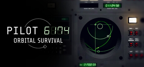
Pilot 6174: Orbital Survival scored 77/100 on Steam Analyzer — Good for a Steam capsule. Top priority fix: [title_readability] Increase subtitle font size or remove ORBITAL SURVIVAL tagline to prioritize PILOT 6174 legibility at TINY size

Capsule scores by dimension

  • Genre Clarity: 8/10 — Strong sci-fi simulation identity. The orbital mechanics display with green targeting vectors, cockpit instrumentation, and Apollo-inspired control panel clearly communicate a space simulation. At TINY size, the circular orbital diagram and technical UI elements remain recognizable as a space navigation game, distinguishing it from action or strategy games. The aesthetic strongly signals hard sci-fi simulation over narrative-driven indie games.
  • Title Readability: 7/10 — Readable with minor size stress. PILOT 6174 in clean sans-serif maintains legibility at SMALL and TINY sizes with adequate contrast against the dark cockpit background. The subtitle ORBITAL SURVIVAL is smaller but readable at SMALL size; however, at TINY size it becomes challenging to parse. The monospace-style typography reinforces the technical theme but the two-line layout takes up substantial horizontal space on the capsule.
  • Contrast & Color: 8/10 — Excellent value separation. Bright green targeting reticles and text pop strongly against the dark cockpit interior and black background, creating clear silhouette separation. White title text contrasts sharply with the dark left panel, and the glowing green orbital diagram dominates the center with high saturation. At TINY size, the green-on-dark and white-on-dark remain distinctly readable without muddy midtones.
  • Uniqueness & Polish: 8/10 — Distinctive technical authenticity. The capsule commits to an authentic Apollo-era cockpit aesthetic with detailed instrument panels, realistic button layouts, and functional UI rather than generic sci-fi tropes. The orbital mechanics visualization is a genuine core mechanic hook that differentiates it from casual or action-heavy indie titles. The craftsmanship in panel details and green vector graphics feels premium, though the overall approach is narrowly specialized.
  • Brand Consistency: 8/10 — Coherent technical identity. The capsule establishes a consistent hard-sci-fi identity through monospace typography, Apollo-inspired hardware aesthetic, and technical instrumentation throughout. The green accent color paired with dark panels and white text would be instantly recognizable as this game's visual signature. The rendering style is cohesive between the cockpit hardware and orbital display, reinforcing a unified brand voice.
  • Composition: 7/10 — Clear hierarchy with layout stress. The orbital diagram anchors the right side as the primary focal point with strong green emphasis, while the title occupies the left panel in a supporting but clear role. At SMALL size, the two-zone split (left text, right diagram) reads effectively with good balance. At TINY size, the layout compresses and the title and diagram compete slightly for attention, though the green center still dominates the read.

What works

  • Strong genre signaling through mechanics. The orbital targeting vectors and Apollo-inspired cockpit immediately communicate hard sci-fi simulation without ambiguity.
  • Excellent contrast and pop. Green on dark and white on dark values create crisp edges and strong silhouettes that hold at every viewing size.
  • Authentic technical aesthetic. Detailed instrument panels and realistic button layouts feel premium and differentiate the game from generic sci-fi templates.
  • Cohesive visual identity. Consistent monospace typography, green accent palette, and hardware styling create a memorable brand signature.

What hurts the capsule

  • Subtitle unreadable at tiny size. ORBITAL SURVIVAL becomes illegible at TINY thumbnail size due to small point size and mid-value contrast.
  • Title layout horizontal compression. Two-line title placement on the left panel creates inefficient space usage and competes with the right-side focal point at small sizes.
  • Limited color palette breadth. Reliance on green-white-black, while thematic, offers less visual interest than top-tier indie game capsules like Balatro or Dave the Diver.

Priority fixes

  1. [title_readability] Increase subtitle font size or remove ORBITAL SURVIVAL tagline to prioritize PILOT 6174 legibility at TINY size
  2. [composition] Consolidate title into single line or reposition to lower left to reduce horizontal competition with the orbital diagram focal point
  3. [contrast_color] Consider a secondary accent color (warm orange or cyan) to add visual richness and match the dynamic quality of top-tier genre competitors

Store copy priority fixes

  1. [feature_communication] Clarify the FREMI as either an enemy faction, corrupting anomaly, or environmental threat in a single sentence within the opening paragraph to anchor the world-building.
  2. [hook_strength] Add one sentence to the short description that stakes the player's personal goal (escape, rescue, discovery) to make the run feel purposeful beyond survival mechanics.
  3. [uniqueness] In the MANAGEMENT WARFARE section, add a sentence explicitly contrasting this approach to typical space sims: 'Unlike arcade space games, every joule of power and degree of heat matters' or similar to reinforce differentiation.
  4. [feature_communication] Expand on the verb-noun command system with one concrete example (e.g., 'DEPLOY RADIATOR' or 'CHARGE RAILGUN') to make tactile controls tangible rather than abstract.

Related guides

Steam app ID: 4262800