Scoring genre clarity...

A Sinister Glitch capsule

A Sinister Glitch

You're a punk hacking into the cameras and devices of an abandoned building. Except it's not really abandoned, and whatever inhabits it senses your presence and plans to eliminate you.

$1.99
HorrorPuzzleHacking
LynxMar 22, 2026

A Sinister Glitch scores 65/100 — better than 14% of Horror capsules (n=3,119).

$1.99 · Released Mar 22, 2026 · By Lynx

Quick text summary

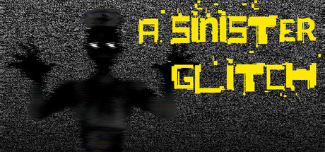
A Sinister Glitch scored 65/100 on Steam Analyzer — Solid for a Horror capsule. Top priority fix: [uniqueness_polish] Introduce a distinctive visual hook or iconic element (character silhouette variant, unique symbol, or signature effect) that differentiates this from generic cyber-horror games.

Capsule scores by dimension

  • Genre Clarity: 7/10 — Cyber-horror with hacking theme clear. The silhouetted figure with raised arms suggests technological manipulation or hacking, reinforced by glitch visual effects and pixelated yellow text that clearly communicate a digital/cyber aesthetic. At tiny size, the glitch effect and figure pose still read as tech-horror, though the specific 'hacking strategy' subgenre is less obvious than pure action games would be.
  • Title Readability: 6/10 — Bold yellow text mostly readable small. The title 'A SINISTER GLITCH' uses high-contrast bright yellow pixelated font on dark background with good separation at full size. At tiny size the letters remain distinguishable due to bold weight and neon saturation, though fine pixel details blur slightly; the tagline readability drops significantly at smallest scale, but main title survives with acceptable clarity.
  • Contrast & Color: 8/10 — Strong yellow-black separation reads well. Bright saturated yellow (#FFFF00 approximate) against dark grayscale textured background creates strong value contrast that holds at all sizes. The silhouetted black figure reads cleanly against the noisy background, and the glitch particles maintain visual pop through color saturation rather than relying on subtle tonal shifts, which translates well to tiny thumbnail viewing.
  • Uniqueness & Polish: 6/10 — Competent glitch effect, generic execution. The pixelated/glitch overlay and neon yellow typography are thematically appropriate and signal indie polish, but the execution feels standard within cyberpunk-horror games; the silhouetted pose and grayscale texture are common tropes in this space. The concept aligns well with the game's premise, but the visual presentation lacks a distinctive artistic signature that would make it memorable against peers like DREDGE or Content Warning.
  • Brand Consistency: 5/10 — Minimal consistent identity signals present. The yellow-and-black color scheme and glitch aesthetic appear cohesive internally, but without reference to the 20 store screenshots, it's unclear if this establishes a recognizable brand motif unique to A Sinister Glitch. The stark silhouette and pixelated effects could apply to many indie games; no iconic character, logo mark, or distinctive palette that screams 'this game' is immediately apparent at first viewing.
  • Composition: 7/10 — Clear focal point with good safe margins. The silhouetted figure occupies strong left-center position with title anchored upper-right, creating clear hierarchy and focal point that reads well at all sizes including tiny thumbnail. Safe margins are respected; no critical elements hug dangerous edges, and the composition survives Steam's cropping resilience testing; glitch particles float freely without blocking the primary subject.

What works

  • Yellow-black contrast pops at all sizes. The bright saturated yellow text and glitch effect maintain clear separation from the dark background even at tiny 120×45 thumbnail scale.
  • Strong focal point and composition hierarchy. Silhouetted figure on left with title right-aligned creates clear visual balance and guides the eye intuitively without clutter.
  • Thematically aligned glitch visual effect. Pixelated overlay and digital artifacts directly reinforce the hacking/cyber-intrusion gameplay premise.

What hurts the capsule

  • Generic silhouette feels overused in genre. Raised-arm figure pose and grayscale treatment are common visual shorthand that don't distinguish this game from other cyber-horror indie titles.
  • No visible brand identity or iconic element. No character, symbol, logo, or unique color signature emerges that would make this instantly recognizable as A Sinister Glitch versus similar games.
  • Noisy background texture competes for attention. While contrast works, the grainy overlay adds visual noise that slightly dilutes the clean modernity implied by the glitch theme.

Priority fixes

  1. [uniqueness_polish] Introduce a distinctive visual hook or iconic element (character silhouette variant, unique symbol, or signature effect) that differentiates this from generic cyber-horror games.
  2. [brand_consistency] Establish a recognizable color accent or motif (beyond yellow) that appears consistently across all promotional materials and becomes synonymous with the brand.
  3. [composition] Add subtle layering or depth cues (glow halo, foreground element, or secondary shape) to create more visual hierarchy and polish without sacrificing tiny-size readability.

Store copy priority fixes

  1. [feature_communication] Replace the series-focused middle section with concrete descriptions of 2-3 specific hacking puzzles or mechanics the player will encounter—e.g., 'bypass firewall locks by matching circuit patterns' or 'coordinate camera angles to reach sealed rooms'—to show actual gameplay.
  2. [hook_strength] Rewrite the detailed description opening to merge the character setup with a gameplay conflict—e.g., 'As you hack deeper into the facility's systems, the entity grows aware. You have minutes to find the anomaly before it locks you out—or worse.' This sustains the tension from the short description.
  3. [audience_targeting] Add a sentence explicitly positioning difficulty level and player type, such as 'designed for puzzle enthusiasts who enjoy methodical exploration with mounting pressure' or 'ideal for strategy players who prefer stealth and problem-solving over reflexes.'
  4. [uniqueness] Identify one mechanic or design choice that differentiates this from other hacking/puzzle games—e.g., 'the only hacking game where your digital presence has real-world consequences' or 'combines spatial puzzle logic with atmospheric horror' (if applicable based on tags).

Related guides

Steam app ID: 4268420 · Tags: Horror, Puzzle, Hacking, Arcade, First-Person