Scoring genre clarity...

The Lucky Stray Cat - 招财猫 - Mèo Chiêu Tài capsule

The Lucky Stray Cat - 招财猫 - Mèo Chiêu Tài

“The Lucky Stray Cat” is a hybrid Dungeon Crawler and Visual Novel, told through an urban horror narrative reminiscent of Junji Ito’s storytelling style.

$1.59No user reviews
RPGAdventureInteractive Fiction
DIG GamesJan 21, 2026

The Lucky Stray Cat - 招财猫 - Mèo Chiêu Tài scores 60/100 — better than 0% of RPG capsules (n=3,544).

No user reviews · $1.59 · Released Jan 21, 2026 · By DIG Games

Quick text summary

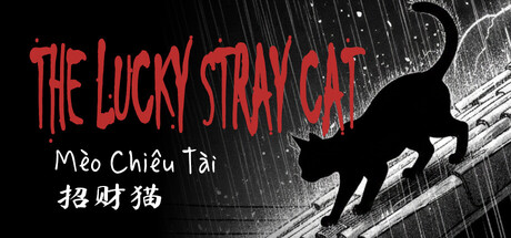
The Lucky Stray Cat - 招财猫 - Mèo Chiêu Tài scored 60/100 on Steam Analyzer — Solid for a RPG capsule. Top priority fix: [genre_clarity] Introduce visual elements that hint at horror tone or dungeon crawler setting—add subtle UI bars, dark atmospheric texture, or urban decay details to the background to align capsule with Junji Ito horror and RPG gameplay pillars.

Capsule scores by dimension

  • Genre Clarity: 5/10 — Cat silhouette implies action, mixed messaging. The black cat silhouette and dynamic pose suggest action or adventure, but the visual hybrid of urban horror, dungeon crawler, and visual novel is not clearly communicated at any size. At tiny size, you see a cat and red text but cannot discern dungeon crawler mechanics, RPG combat depth, or the Junji Ito horror influence that should anchor genre expectations. The Chinese/Vietnamese text adds cultural identity but does not clarify gameplay.
  • Title Readability: 7/10 — English title clear, secondary text struggles. THE LUCKY STRAY CAT in red bold lettering reads well at full and small sizes with strong contrast against the dark background and white linework. However, the white tagline text and Asian language variants (招財貓, Mèo Chiêu Tài) are small and struggle to maintain legibility at tiny thumbnail size, becoming a blur of secondary information. At tiny size, only the main red title remains clearly readable.
  • Contrast & Color: 7/10 — Red title pops well, background texture soft. The bright red title text creates strong value separation from the dark #1b2838 Steam background and reads instantly in quick scroll. The black cat silhouette is crisp and holds separation against the white linework pattern. However, the background linework texture is soft and mid-tone, creating some visual noise that slightly competes with the focal cat and title rather than receding cleanly. In grayscale, contrast remains solid but the background loses definition.
  • Uniqueness & Polish: 6/10 — Cultural icon present but generic execution. The lucky cat (maneki-neko) is a culturally distinct and recognizable symbol with built-in visual storytelling potential, and the red-on-black color choice feels intentional. However, the execution is relatively straightforward—a silhouette, linework background, and bold sans-serif title without distinctive art style, particle effects, or visual hooks that would elevate it above a competent template. The concept is strong but the visual treatment feels safe and functional rather than premium or memorable.
  • Brand Consistency: 5/10 — Icon recognizable, palette narrow, identity soft. The lucky cat motif and multilingual branding (English/Chinese/Vietnamese) create some internal identity signals and cultural specificity. The red and black palette is consistent throughout the visible capsule design. However, without reference to the five store screenshots, the capsule does not project a strong signature art style, memorable character, or visual language that would make it immediately recognizable as a distinct game—it reads more as a symbolic icon with limited personality extension.
  • Composition: 6/10 — Centered cat, balanced layout, minor hierarchy clash. The black cat silhouette positioned in the right-center area serves as the primary focal point and maintains clear hierarchy at all sizes. The red title occupies the left and top safely away from edges. However, the composition feels somewhat static with the cat and title occupying separate zones rather than creating depth layering or visual flow. The linework background is largely decorative and does not guide the eye or reinforce the focal point. At small and tiny sizes, the layout reads cleanly but without dynamic energy or compositional tension that would elevate engagement.

What works

  • Red title contrast strong. The bright red THE LUCKY STRAY CAT text pops instantly against dark Steam background and remains readable at all sizes including tiny thumbnails.
  • Cultural icon immediately recognizable. The lucky cat (maneki-neko) is a universally understood symbol that communicates fortune, charm, and Asian cultural context at a glance.
  • Clean cat silhouette and edge definition. The black cat shape is crisp and holds separation well against the background linework, maintaining clear silhouette readability at small sizes.

What hurts the capsule

  • Genre intent obscured by visual minimalism. The capsule does not communicate dungeon crawler mechanics, RPG depth, or Junji Ito horror mood—only a lucky cat and bold title, leaving genre ambiguous.
  • Secondary text illegible at tiny size. The white Chinese and Vietnamese taglines become unreadable blur at thumbnail scale, wasting brand differentiation opportunity.
  • Generic linework background lacks storytelling. The soft white pattern fills space decoratively but does not reinforce game mood, horror tone, or urban setting implied by the narrative.
  • Static composition without visual flow. The cat and title occupy separate zones with no depth layering, dynamic pose interplay, or compositional direction that draws the eye and creates energy.

Priority fixes

  1. [genre_clarity] Introduce visual elements that hint at horror tone or dungeon crawler setting—add subtle UI bars, dark atmospheric texture, or urban decay details to the background to align capsule with Junji Ito horror and RPG gameplay pillars.
  2. [title_readability] Remove or scale down the secondary Vietnamese and Chinese text, or if culturally essential, integrate them as a cohesive secondary lockup below the main title in readable point size for small/tiny sizes.
  3. [uniqueness_polish] Enhance the cat with distinctive art style—add UI elements, add aura/glow effects, integrate thematic color treatment, or pose it in a way that hints at the horror-RPG hybrid rather than static silhouette.
  4. [composition] Reposition elements to create visual flow and depth—overlay the title across the cat or layering the linework to guide the eye from title through cat to background, creating compositional tension at all sizes.

Store copy priority fixes

  1. [feature_communication] Expand the Key Features section with 1-2 sentence descriptions of each mechanic—e.g., 'Explore hand-crafted urban dungeons with resource scarcity and environmental storytelling' or 'Engage turn-based combat against grotesque monsters inspired by urban legends'—to help players understand gameplay depth.
  2. [uniqueness] Replace the Junji Ito reference with a concrete statement of differentiation, such as 'The game's urban horror unfolds as the consequences of fortune become increasingly twisted and personal' or 'Personality quizzes shape story outcomes, blending character analysis with dungeon progression'.
  3. [audience_targeting] Add a single sentence clarifying the intended player: 'Best for fans of visual novels and atmospheric dungeon crawlers who appreciate dark comedy and body horror' or 'Designed for story-driven players seeking slow-burn horror with strategic combat breaks'.
  4. [genre_clarity] Correct or reorganize tags to match the actual gameplay—either remove Point & Click and 2D Platformer if not present, or expand copy to explain how they integrate into the hybrid structure.

Related guides

Steam app ID: 4270080 · Tags: RPG, Adventure, Interactive Fiction, JRPG, Point & Click