Scoring genre clarity...

Flowers to Honey capsule

Flowers to Honey

A cozy incremental where you choose how your bees evolve, plant flowers, guide your hive, and grow a thriving honey empire.

IdlerIncrementalCasual
ThinKING Cat Games2026

Flowers to Honey scores 85/100 — better than 94% of Idler capsules (n=1,301).

Released 2026 · By ThinKING Cat Games

Quick text summary

Flowers to Honey scored 85/100 on Steam Analyzer — Excellent for a Idler capsule. Top priority fix: [genre_clarity] Add subtle honeycomb pattern or hive silhouette in background to reinforce the incremental/empire-building layer beyond just nature theme

Capsule scores by dimension

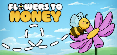
  • Genre Clarity: 8/10 — Clear casual simulation, bee theme strong. The cartoon bee on a flower, combined with the whimsical art style and bright pastoral setting, immediately signals a cozy, friendly incremental/simulation game. The bee's pose and flower interaction clearly communicate nature and growth mechanics. At tiny size, the bee silhouette and flower remain recognizable, though fine details blur.
  • Title Readability: 9/10 — Excellent contrast and clarity. The title 'FLOWERS TO HONEY' uses a bold, yellow outlined font with white fill that stands out sharply against the blue sky background. The text maintains full legibility at small and tiny sizes due to strong value contrast and generous letter spacing. Clean, straightforward typography with no decorative collapse risk.
  • Contrast & Color: 9/10 — Strong separation, vibrant and readable. Bright yellow bee and magenta flower pop distinctly against the light blue sky and green grass base. The high saturation and clear value separation ensure the main subject reads clearly even in grayscale. White outline on title and character adds crisp silhouette definition that survives squinting and tiny-size viewing.
  • Uniqueness & Polish: 8/10 — Polished, charming, distinctive aesthetic. The clean cartoon illustration style with bold outlines, consistent character design, and intentional color choices convey premium indie craft rather than template asset use. The bee-to-flower composition directly visualizes the core game loop (flowers → honey), which is smart storytelling. Execution feels intentional and cohesive, avoiding generic casual game tropes.
  • Brand Consistency: 8/10 — Recognizable bee character, cohesive style. The distinctive cartoon bee with bold black outline, yellow body, and simple facial features creates an iconic character that would be recognizable across marketing materials and store screenshots. The warm, natural color palette and clean illustration style establish a consistent brand voice. The bee mascot serves as a strong identity anchor for the game's visual brand.
  • Composition: 9/10 — Excellent hierarchy and focal point. The bee-on-flower composition creates a clear primary subject in the center-right area with title anchoring the top. The layered background (sky, clouds, flower, grass) creates natural depth without clutter. Safe margins around all critical elements, title doesn't crowd edges, and the design remains balanced and readable across all sizes including Steam's aggressive cropping scenarios.

What works

  • Title legibility excellence. Bold yellow-white text with strong outline contrast reads perfectly at full, small, and tiny sizes without any degradation or collapse.
  • Strong visual hierarchy. The bee-flower composition with layered sky-grass background creates clear depth and naturally guides the eye to the main subject without scattered attention.
  • Iconic character design. The cartoon bee with consistent, bold-outline style is immediately memorable and establishes a distinctive brand identity that transcends the single capsule.
  • Color-to-background contrast. Vibrant yellow and magenta stand sharply against the blue-green palette, ensuring visibility against Steam's dark background and maintaining readability in grayscale.

What hurts the capsule

  • Flower positioning ambiguity. At tiny size, the magenta flower shape could benefit from slightly more definition; the thin pink petals risk subtle blur in lower-resolution contexts.
  • Limited mechanical visual hints. While the bee-flower metaphor communicates the core concept, there are no UI icons, resource counters, or gameplay mechanics visible that hint at the incremental/simulation depth.

Priority fixes

  1. [genre_clarity] Add subtle honeycomb pattern or hive silhouette in background to reinforce the incremental/empire-building layer beyond just nature theme
  2. [composition] Ensure all character outlines maintain 2-3px minimum thickness at tiny size to prevent petal and antenna dissolution in low-res contexts

Store copy priority fixes

  1. [uniqueness] Add a sentence explaining what makes bee evolution or flower placement unique compared to other idle games—e.g., 'Unlike typical idle games, your evolution choices permanently alter bee behavior, creating no two colonies that play the same' or specific examples of specialization paths.
  2. [feature_communication] Expand the permanent evolution section with concrete examples: what does specializing a bee into a 'forager' vs. 'builder' role actually do mechanically, and how does this alter resource gathering or colony layout?

Related guides

Steam app ID: 4289700 · Tags: Idler, Incremental, Casual, Relaxing, Cozy