Monster King scores 68/100 — better than 23% of RPG capsules (n=3,544).

Quick text summary

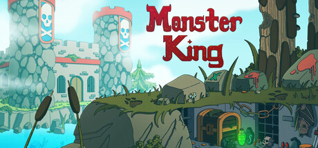
Monster King scored 68/100 on Steam Analyzer — Solid for a RPG capsule. Top priority fix: [uniqueness_polish] Introduce a distinctive protagonist character or iconic monster silhouette with a unique pose or attribute that becomes the capsule's visual signature.

Capsule scores by dimension

  • Genre Clarity: 7/10 — Classic fantasy RPG adventure clear. The castle architecture, lush landscape, and whimsical monster silhouettes in the midground immediately signal a fantasy adventure game with creature-collection mechanics. At tiny size, the turquoise castle towers and scattered creature shapes still read as a nostalgic fantasy world, though the specific 'monster capture' mechanic becomes less obvious without UI hints or a clear protagonist pose.
  • Title Readability: 8/10 — Bold title strong legibility. The 'Monster King' title is rendered in large, bold maroon letterforms with clean white outline that stands out clearly against the turquoise sky background at full size and remains readable at small size. At tiny size, the thick outline and high value contrast preserve letterform integrity, though some serifs compress slightly; the title does not collapse and remains identifiable.
  • Contrast & Color: 7/10 — Good separation with warm highlights. The composition uses a bright turquoise-cyan sky that provides strong value separation from the darker castle and monster silhouettes in the midground and foreground. Warm salmon-orange roofs and coral accents create secondary focal points that pop against both the sky and dark stone; however, the grayscale squint test reveals some mid-tone softness in the castle texture that slightly dulls overall silhouette sharpness against the Steam dark background.
  • Uniqueness & Polish: 6/10 — Competent pixel-art style generic. The retro pixel-art aesthetic and castle setting are well-executed but feel familiar in the indie game landscape, lacking a distinctive art hook or memorable visual signature that separates it from other casual RPGs. The scattered creature placement and landscape feel more like a generic fantasy scene than a cohesive visual story that communicates a unique selling point; the craft is solid but the concept reads as expected rather than surprising.
  • Brand Consistency: 6/10 — Pixel-art palette coherent internally. The color palette is internally consistent—turquoise water and sky, warm coral-salmon roofs, earthy greens and olives in vegetation—and the pixel-art rendering style applies uniformly across all visible elements. However, without distinctive character designs, iconic UI elements, or a signature motif visible, the capsule lacks memorable brand identity cues that would make 'Monster King' instantly recognizable in a crowded storefront; it reads as competent but non-iconic.
  • Composition: 7/10 — Clear layered depth good focal. The composition establishes clear depth with a bright background sky, mid-ground castle and towers, and foreground monster silhouettes and vegetation that guide the eye naturally. The title is positioned in the upper-right quadrant with breathing room, and the main castle remains centered and prominent at all sizes; however, at tiny size, the rightmost creatures and castle edges risk compression, and the lower left shows some dead space that could be better utilized.

What works

  • Title contrast and legibility. Bold maroon letterforms with white outline remain readable at small and tiny sizes against the bright turquoise background without needing additional refinement.
  • Depth layering and hierarchy. The composition uses clear foreground, mid-ground, and background elements that create visual depth and guide focus naturally to the castle centerpiece even at small viewing sizes.
  • Color cohesion and palette control. The warm-to-cool color balance (turquoise sky, coral accents, earthy tones) is internally consistent and supports the retro fantasy aesthetic without feeling chaotic or oversaturated.

What hurts the capsule

  • Generic fantasy theme. The castle, landscape, and scattered creatures feel like standard fantasy tropes without a distinctive visual hook or unique selling point that differentiates it from other indie RPGs.
  • Lack of memorable brand identity. No iconic character, symbol, or signature visual motif is visible that would make the capsule recognizable as 'Monster King' specifically if shown without the title.
  • Composition dead space lower left. The lower left quadrant contains underutilized empty space that could better balance the visual weight or introduce supporting visual story elements.

Priority fixes

  1. [uniqueness_polish] Introduce a distinctive protagonist character or iconic monster silhouette with a unique pose or attribute that becomes the capsule's visual signature.
  2. [brand_consistency] Add a recurring color accent or symbol (crown motif, glowing element, character mark) that could serve as a recognizable brand identifier across marketing materials.
  3. [composition] Redistribute lower-left empty space by shifting secondary creatures or adding environmental details that increase visual richness without creating clutter.

Store copy priority fixes

  1. [uniqueness] Add a specific differentiator in the short description, such as 'Catch and train over [X] unique monster species' or 'Discover secret evolutions and hidden battle techniques' to set it apart from other monster-capture games.
  2. [feature_communication] Expand the detailed description with one bullet-point list covering: team size, approximate playtime, number of monsters/locations, and one unique mechanic (e.g., a special evolution system or secret area). Current copy is too sparse.
  3. [hook_strength] Rewrite the opening line to emphasize an emotional or mechanical hook beyond nostalgia, e.g., 'Assemble your dream team of monsters and outsmart clever bosses in fast-paced turn-based duels' instead of relying on 'bite-sized' and 'retro-inspired.'

Related guides

Steam app ID: 4326830 · Tags: RPG, JRPG, Casual, Adventure, 2D