Scoring genre clarity...

Imperial Command capsule

Imperial Command

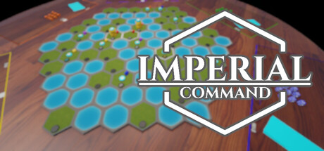
Imperial Command is a turn-based strategy board game inspired by classics like Risk. Conquer a hex-based map, build your economy, and battle friends or AI in multiplayer—fully playable on Steam Deck.

$4.99No user reviews
Tactical RPGTurn-Based TacticsWargame
Skie InteractiveFeb 27, 2026

Imperial Command scores 73/100 — better than 60% of Tactical RPG capsules (n=475).

No user reviews · $4.99 · Released Feb 27, 2026 · By Skie Interactive

Quick text summary

Imperial Command scored 73/100 on Steam Analyzer — Good for a Tactical RPG capsule. Top priority fix: [uniqueness_polish] Introduce a unique visual element such as a distinctive commander character, empire emblem, or thematic iconography that communicates Imperial Command's specific identity rather than generic board game aesthetics

Capsule scores by dimension

  • Genre Clarity: 8/10 — Strategy board game instantly clear. The hex-based game board dominates the background with cyan and green hexagonal tiles in a classic Risk-style layout, immediately communicating turn-based strategy gameplay. At TINY size, the hexagon pattern remains recognizable and the overall composition clearly reads as a tactical board game rather than action or RPG, though specific mechanics are not detailed.
  • Title Readability: 8/10 — Logo readable, white outline crisp. The white hexagonal badge frame with 'IMPERIAL COMMAND' text is rendered in a clean, sans-serif typeface with strong contrast against the warm brown background. At SMALL and TINY sizes, the logo remains legible due to the bold white outline and centered, uncluttered positioning, though minor serif detail becomes less distinct at thumbnail scale.
  • Contrast & Color: 8/10 — Strong value separation, vibrant accents. Cyan and green hexagons pop crisply against the warm brown game board surface, creating excellent silhouette clarity and visual hierarchy. The white logo frame provides strong separation from the background board, and the overall palette avoids muddy mid-tones that would collapse at tiny size.
  • Uniqueness & Polish: 7/10 — Competent board game aesthetic. The capsule presents a polished, thematic board game presentation with the hexagonal map and clean logo design, communicating the turn-based strategy core without generic filler. However, the composition relies on a straightforward tabletop photography angle rather than a distinctive visual hook or character that would elevate it above other strategy game capsules in the genre.
  • Brand Consistency: 6/10 — Functional but lacks distinctive identity. The hexagon motif and muted brown-cyan-green palette are internally consistent and appropriate for a board game aesthetic, but do not establish a memorable brand symbol or signature visual style. The logo is professional but could describe many turn-based strategy games, and without reference to the 11 available screenshots, uniqueness cues are limited to the hexagon pattern alone.
  • Composition: 7/10 — Clear focal point, safe margins. The white hexagonal logo is centered and commands attention, with the game board layered in the background to provide context and depth. At SMALL and TINY sizes, the logo remains the clear primary subject and does not risk Steam cropping, though the board texture detail becomes less readable at extreme reduction and the composition feels static rather than dynamic.

What works

  • Hex board immediately signals strategy. The cyan and green hexagonal game board is recognizable at all sizes and communicates turn-based strategy gameplay without ambiguity.
  • White logo achieves excellent contrast. The bold white outline of the hexagonal badge frame ensures the title remains legible and visually separated from the brown background even at tiny thumbnail scale.
  • Thematic consistency with board game aesthetic. The entire composition reinforces the turn-based strategy genre through tangible game board visuals rather than abstract or action-oriented imagery.

What hurts the capsule

  • Generic board game presentation. The capsule relies on standard tabletop photography and lacks a distinctive visual hook, character, or narrative element that would differentiate it from other indie strategy games.
  • Limited brand identity signals. The logo and palette do not establish a memorable symbol or signature style that would be recognizable in future marketing materials or sequels.
  • Static composition lacks visual storytelling. The centered logo over a flat board texture does not communicate gameplay depth, multiplayer competition, or the deck-building economy mechanics mentioned in the description.

Priority fixes

  1. [uniqueness_polish] Introduce a unique visual element such as a distinctive commander character, empire emblem, or thematic iconography that communicates Imperial Command's specific identity rather than generic board game aesthetics
  2. [composition] Add narrative or gameplay depth by incorporating a strategic element such as unit silhouettes, a faction identifier, or a dynamic action moment that hints at the multiplayer competitive core
  3. [brand_consistency] Develop a signature visual motif or icon that could serve as a recognizable brand symbol across store screenshots, social media, and future releases in the Imperial universe

Store copy priority fixes

  1. [uniqueness] Replace "inspired by classics like Risk" with a specific differentiator: e.g., "combines territory control with a factory-building economy" or "Risk meets economic strategy"—clarifying what makes this game mechanically distinct.
  2. [hook_strength] Add a sentence explaining the emotional payoff or strategic depth unique to Imperial Command after the opening hook to deepen curiosity beyond the mechanic list.
  3. [feature_communication] Expand the factory and economic upgrade section with one example of how resources translate to military advantage, so players understand the connection between economic and military strategy.

Related guides

Steam app ID: 4336710 · Tags: Tactical RPG, Turn-Based Tactics, Wargame, PvP, Strategy